
Pratt Graduate Communications Design
Visual Communications 2
Professor Kevin Gatta - Fall 2014
Visual Communications 2
Professor Kevin Gatta - Fall 2014
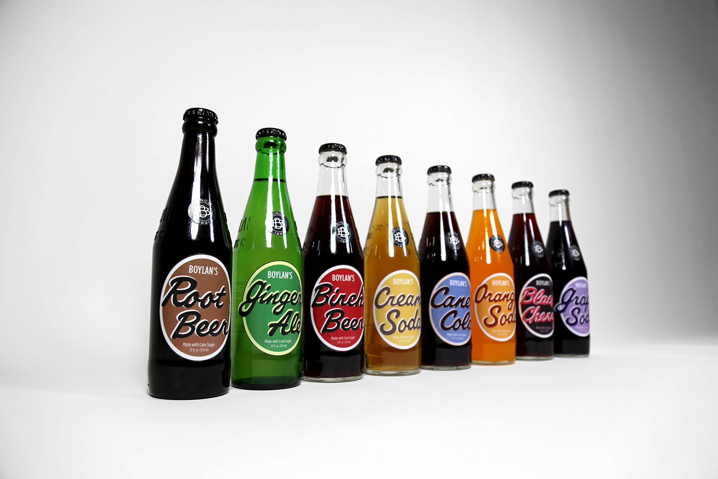
These are some images from my Visual Communications 2 project, which focused on rebranding an identity local to the New York City area; I chose Boylan Bottling as the identity I would rebrand.
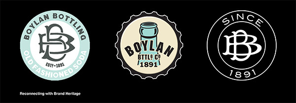
When I initially started this project in September of 2014, Boylan Bottling was using the logo pictured in the below center ('Boylan' written overtop a bluish bottle). The use of a bottle seemed a bit repetitive to me and after researching the company in depth, I came across their old brand signature (below left), which featured an original BB monogram that harkened back to their beginnings.
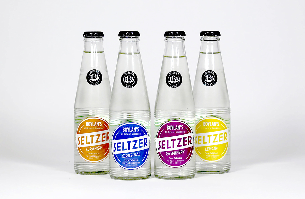
I have always enjoyed Boylan's natural cane sugar soda; growing up in New Jersey and living in New York, its one of those few authentic, and comforting treats that somehow managed to survive over 100 years, through the decades of fast-food and high-fructose corn syrup. When I saw the original monogram I immediately was attracted to the prospect of reconnecting Boylan with its heritage. My goal was to create one brand identity based on the original monogram, with three product lines under its umbrella that each spoke to a period of the brand's history-- Soda, their main draw, was based on a fun 50's style reminiscent of soda shops; Seltzer, took its personality from the art deco vibe of the 20's; and Tonic, the oldest of the beverages, has an identity going all the way back to the 1890's.
Celebrating a heritage that spans more than a century:
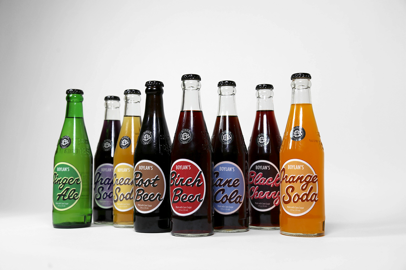
Soda - 1950's Style Influence


Seltzer - 1920's Style Influence
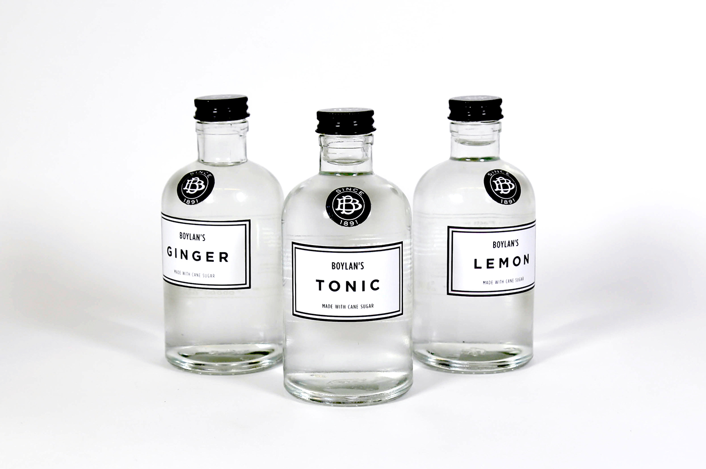
Tonic - 1890's Style Influence


Letterhead
I took the initial monogram, which can get somewhat typographically awkward, particularly at a smaller scale, and worked on refining and strengthening it to give it a more contemporary feel. It came as a jolting surprise to me however, about midway through the project, when I went to Boylan's website and found they had updated their branding-- and not just updated, but updated toward the same identity I was working on. At first I was a little disheartened, but I decided to continue onward because to me the identity-- particularly the BB monogram, still needed updating and refining.
In the end I was happy with the way the identity turned out-- below you can see a comparison of their current/updated logo/signature (left) compared to the one I created (right). You can also see a line up of the bottlecaps-- when I started the project they were still using the branding to the far left; midway through my project they switched to what is pictured in the center; my design is on the right.


Above are a few snaps from my process


