REST IN PEACE AL LAGO.
1989 ---- January 14th, 2015
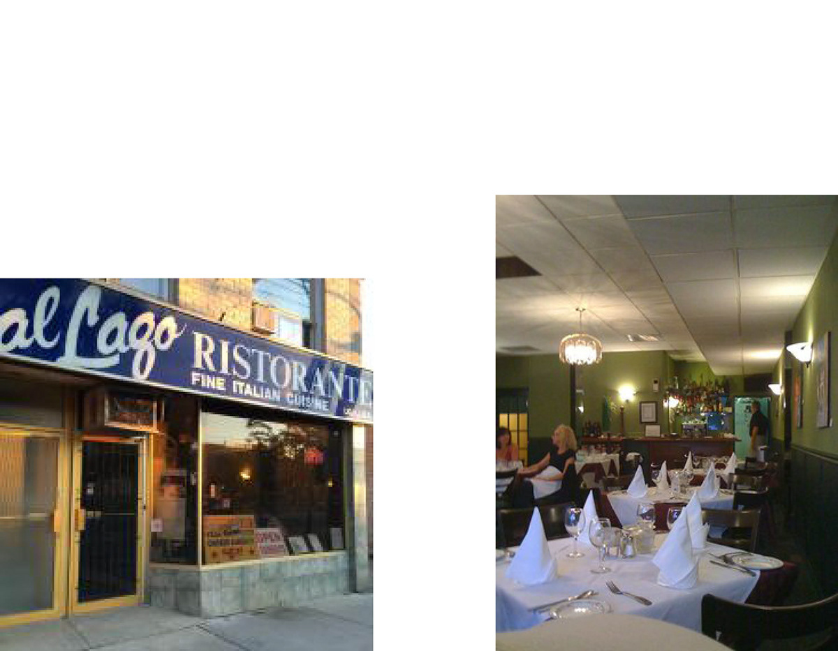
So my dad and I are looking for a decent place to eat, but we can't seem to find anything that looks right. As we're walking, we come across a small restaurant called Al Lago.
My first impressions were that it looked cozy and would put us on a nice personal level with our waiter, so we decide to eat here & are surprised to discover there is no menu, & that you simply ask for whatever you want to be made.
I decided to embrace this unique selling point and order penné with spicy sauce and bacon flavour (because I like spicy food and you cant go wrong with bacon). I can't remember what my dad ordered, but I'm sure it was mostly conservative. We each ordered a glass of wine, the bill came to about $60.00 CAD. We did not expect the price (since there are no menus), but looking back it seems like a reasonable deal.
This restaurant has high quality meals, customer service and is well-arranged, but the amateur business card, exterior signage and more made it obvious it needed a redesign.


The Blue colour choice is chosen in regards to water. Al Lago is italian for on the Lake, so it would make sense to use blue. The twisted roots give you a fairytale-esque feeling, as if all your responsibilties vanish whilst you are graced by the exceptional food Al Lago shares with its customers. The gradients represent the soft, smooth personality of the Waiters & waitresses, whilst the blue accent line traveling down each letter shows the logo can get dressed up for an expensive night out.


This logo is actually incomplete because I didnt like where it was going as it didnt carry over the cozy, comfortable feeling Al Lago is known for so well. This design might look better for an American fast food franchise such as Sonic, minus the descriptor text

Removing some elements gave me a logo that could actually work. This logo feels like a contendor because the subtle root design suggests a friendly circular form, reinforced with the descriptor messages of what Al Lago actually is, and when it was established. I made a bold design choice and removed Al, but I knew I could do better so I went back to the magical-esque logo, redesigned the root theme on the A and produced the perfect blend of stylization, comfort and trendiness through age. My favourite part about this one is the smiling face created from the o and the top story of the g, while sitting above a wide root which grins back at you and gives flow while looking friendly doing it. The crossbar of the uppercase A in Al echoes the design style of the terminal of the lowercase a in Lago.
Additionally, a simpler, one-colour logo can be used for smaller sizes.
The descriptor text was curved to echo the abundance of curves found in the root theme beneath the main focus of the logo.

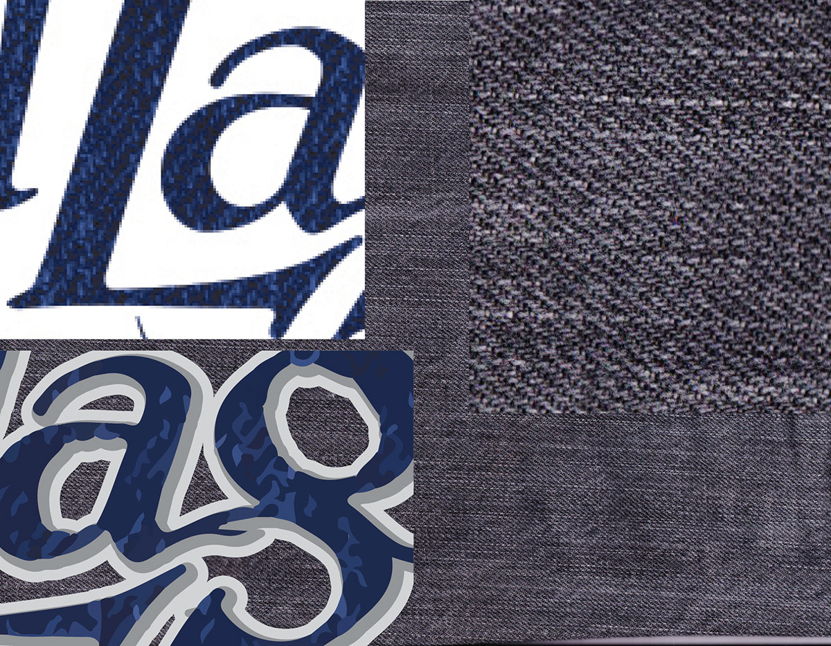
The development involved scanning a pair of my gray denim pants, colorizing them in Adobe Photoshop to a deep blue and eventually image-tracing my creation at low-fidelity in Adobe Illustrator. This gave an excellent emulation of water on a slightly windy day, kinda like the water you find in a... Lago!

The same design treatment was used for the FREE 5x7 inch fridge magnet souvenir given to paying customers upon departure. The phrase is associated with the USP of not having a menu. The one-colour logo is also used here to claim ownership.

The fruit is in the soup is a combination of 2 metaphors; the fruit being what we strive for and find beauty in as we wade through the soup; a man-made bowl containing everything that gets in our way and acts as recurring obstacles in day-to-day life.
I decided to include this on the reverse-side of the business card to suggest sophistication & food-for-thought, because at Al Lago, you get more than just food for your stomach.

Additional entertaining phrases are featured on the underside of the coasters. Not many people use coasters when drinking wine, which makes them speak more loudly to the customer. They may also be taken home as a souvenir if the customer asks politely, in which case the location and phone number are conveniently printed in case the customer misplaces the business card.

Bookman Oldstyle by Morris Benton

Eva Antiqua by Rudolf Koch
Thank you for taking interest in my work!


