

24 hours before Christmas day, my husband and I were scanning the shelves of Toys R Us, Target and Walmart in a frantic last-minute hunt for presents for his nine-year-old niece. I knew that Lauren loved horses, but I had no idea if My Little Pony circa 1983 was still a hot topic in 2013. That's when it hit me: Grown ups who don't have kids of their own find it hard to get an awesome gift for the little brats, since they have no idea about what's trending in the world of children's games and toys. That's when my idea for a gift-finding app was born.

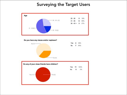

From the data collected, I created two personas. Here's the main persona I based the functionalities of the app on.

I searched for gift finding iOS mobile apps and couldn't really find a solid one. The closest were Amazon and Target. To perform a competitive audit, I set two measurements:
#1: Product search, including refining results by age, gender, interests
#2: Convenience of adding an item to a wish list


I quickly outlined a discovery user flow and started creating my first paper prototype. Woohoo!


First paper prototype included:
• A design that set up primary search fields: Gender & Age
• Organized filters by 1. Activity 2. Topic of interest
• Organized filters by 1. Activity 2. Topic of interest
• A schizophrenic mix of buttons: radio, venn diagram inspiration, and circles everywhere

It also included:
• A rigid results browsing layout
• Tiny tags that were a short-cut to add items to a wish list
• Tiny tags that were a short-cut to add items to a wish list

Test #1: Add item to wish list
• The short-cut tags did not test well, but I pressed on, thinking that it would test better in a nicer wireframe
• No one noticed the circular Search filters at the top
• No one noticed the circular Search filters at the top
After a lot of non-interaction, one of the testers finally said…

Finding: No one wanted to "aim" at those small buttons.
Reason: Most testers wanted to go deeper into the product info instead of add it to a wish list
Tiny tags were killed the next day.
Reason: Most testers wanted to go deeper into the product info instead of add it to a wish list
Tiny tags were killed the next day.

Test #2: Ease of data input
• To add a little personalization into the search flow, the first screen required the user to type in the gift receiver's name
• To add a little personalization into the search flow, the first screen required the user to type in the gift receiver's name
• I tested interaction preferences: dropdown menu vs. buttons in Prototype 1

Finding: Using a drop-down menu was too much effort for most testers
Reason: Testers prefered to see their choices upfront, instead of scrolling through a menu
Reason: Testers prefered to see their choices upfront, instead of scrolling through a menu

Test #3: Refine Search Results
• In Prototype 1, no one could find the “Refine” functions in the top Search bar
• In Prototype 1, no one could find the “Refine” functions in the top Search bar

In Prototype 2, I split the “Search” and “Refine results” functions
• Moved Search icon to the Bottom nav, thinking that it would be easily found
• Moved Refine Results icon to the top bar, thinking users would click it to find out what it does

Finding: No one interacted with the Refine Results button, but everyone interacted with the Search button
Reason: In retrospect, this was a pretty obvious thing to do. I guess I was too wrapped up in what I thought would be a better way to sort through results
Sometimes, trying too hard is just too much.

Test #4: Best Sellers List
• I wanted to find out what testers thought about having these lists
• I wanted to find out what testers thought about having these lists

Finding: No on interacted with the Refine Results button, but everyone interacted with the Search button.
Reason: #1 Convenience—It’s a quick way to get gift ideas; #2 Validation—Helps to re-affirm the purchasing decision
Reason: #1 Convenience—It’s a quick way to get gift ideas; #2 Validation—Helps to re-affirm the purchasing decision

Mood Board

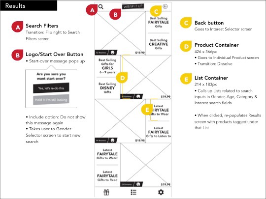
High Fidelity Wireframes


If you'd like to play around with the
Wrap It Up prototype, check it out here


