t.A.T.u.
— THE RETROSPECTIVE —
It was 2003 and thanks to my friend Slava I was highly influenced by David Carson, who was like in superflous opposition to perfect minimal vector shapes of Scandinavian design. The funny thing I was inspired by different photos of skies, concrete and industrial constuctions, pseudo-technical vector trash etc. I tried not to look at David Carson's works so I couldn't steal an element. I looked through 'The End of Print', closed it and never opened again until the project was finished.
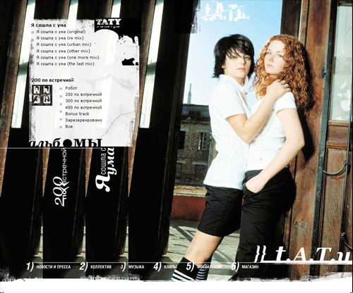
I listened to t.A.T.u. but found out they don't help much, so I started to listen the songs reversed (yes, backwards, so 'Friend or Foe' was like 'Foe or Friend') and that helped to graze the corners and lines.
I used like thousands of grunje brushes, most of them made by myself. I studied tens of techniques to deteriorate the photos. I combined default fonts as text with decorated text saved as images. Don't forget that was 2003 and coding wasn't like nowadays. It was more like puzzle, where you don't have PNG with alpha-channel, advanced CSS or normal JavaScript. I kept that in mind while drawing every element of the design.
Today I found this lo-res picture of the design and no signs of the sources. I messaged my friends I worked with back then in hope they were more responsible than I was and had backups. It seems to me they don't, but while writing this post I remembered about one DVD at parents home that may help me.
Anyway, the worse it looks the more David Carson it is.


Check the full project on my site:


