Assignment:
Choose an existing form of packaging and re-purpose it to contain something else while also being functional. The form should be something we often see in our everyday lives such as an egg carton or a soda can.
Solution:
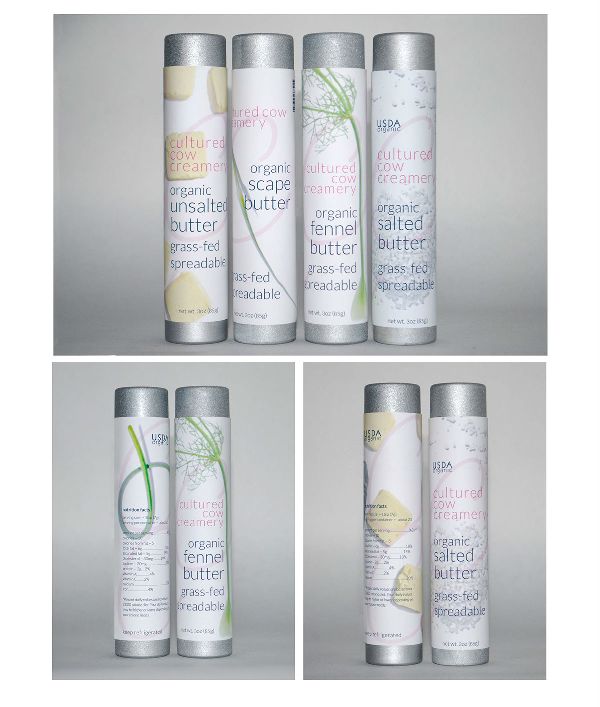
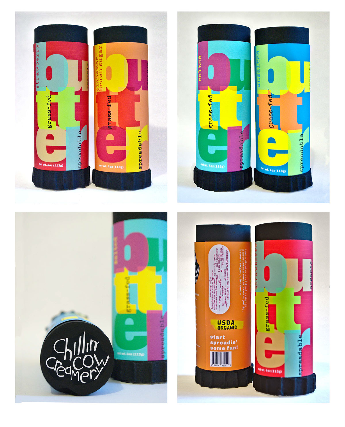
A glue stick container re-imagined to contain butter! No knife needed to butter your bread. This product would also be great for baking! No more mess when greasing a baking sheet or cake pan.
After this solution was presented, along with various label designs, the instructor challenged me to choose 2-3 target audiences and design separate series of labels that would appeal to each of them. Separate series of flavors were also chosen that would appeal to each crowd. A lot of research was done before designing these labels. I found it very helpful to create mood boards for each target audience. Pulling inspiration from found photography helped me to pinpoint aesthetic sensibilities for each audience. This part of the process is something I really enjoy doing. Feel free to follow me on Pinterest if you’d like to see these mood boards.
For The Farm to Table Cook (thyme, rosemary, salted, unsalted)
This product would be for the crafty type of foodie; one who shops at farmers markets, and prefers small batch, artisanal foods.
This product would be for the crafty type of foodie; one who shops at farmers markets, and prefers small batch, artisanal foods.

For The Posh Palette (fennel,scape, salted, unsalted)
This product would be for the urban professional who is very style conscious. One who lives a luxurious lifestyle and always up on the latest design trends in fashion and in home goods. For the foodie who shops in a more high-end and specialty food store. Someone who often throws dinner parties and would have something sleek and innovative on there table. My solution to this was a sleek kind of look but not too stark or cold. So, I photographed some of the ingredients to help the type have something to play off of.
For The Dorm Room Dweller (strawberry, cinnamon-brown sugar, salted, unsalted)
This product would be for the young college student living in a small dorm room. A student may not have the space for a lot of utensils and dinnerware. This would be a good fit for a fast-paced college dorm type of lifestyle. My design goal was to create something bold, colorful and energetic.
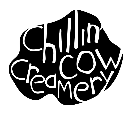
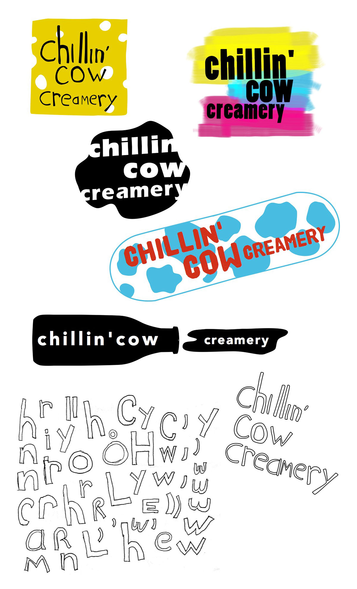
Logos:
Here are the logo designs for each group.
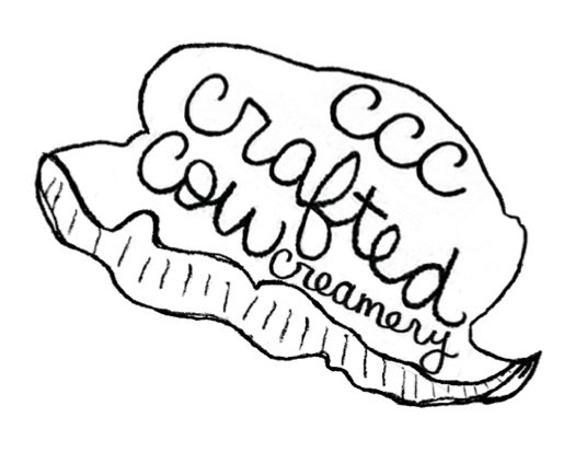
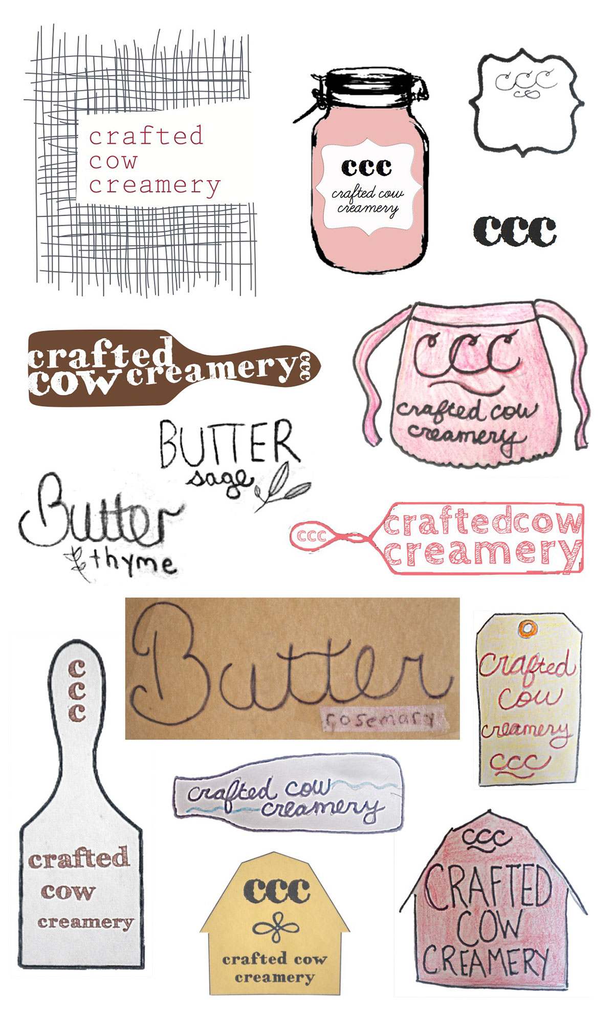
For The Farm to Table Cook
In keeping with the crafty theme, this logo uses handwriting. Preliminary sketches are included below.
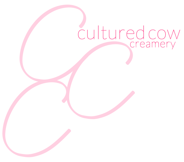
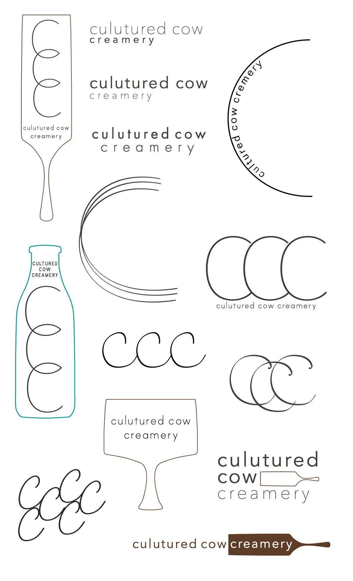
For The Posh Palette
This logo is meant to be adjustable. On the label design, the 3 c’s are enlarged to help provide a little more flowiness between the type and photo. Preliminary sketches are included below.
For The Dorm Room Dweller
For this logo, I was aiming for something like a student’s doodling or scratched in letters on a notebook. Preliminary sketches are included below.