BACKGROUND
We first met Gaby Bayona, owner of Truvelle Bridal after a mutual friend had connected us. Soon after a few quick introductory emails, we scheduled our first meeting together. Despite being under the weather that day, Gaby came by with tons of energy and a large pickle jar full of some type of recovery juice. Being just twenty two at the time, Gaby had already established an impressive first season for Truvelle—pioneering a new approach and perspective to wedding dresses all by herself. Gaby was looking to refine her brand and website as she planned the next chapter of Truvelle.
DISCOVERY
Working on Truvelle was a unique experience for us as Gaby had expressed her desire for Truvelle to be the right balance of not being overtly feminine. The women that Truvelle personifies are independent, confident and simply comfortable in their own skin. Upon studying the current position of Truvelle, we realized that the main task was to create a stronger brand direction around the brand. We began with our discovery process in establishing the core values and goals for Truvelle moving forward.
DESIGN
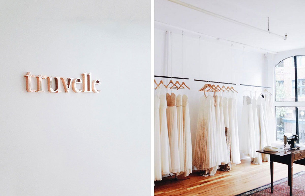
When we first came on board the project, we had always felt that the Truvelle wordmark was not far off but simply needed some adjustments. With the original wordmark set in Garamond, the tall ascenders and tight kerning caused the characters to appear unstable and delicate. We proceeded to lower the ascenders of the original letters and increased the kerning to improve legibility and provide more breathing room between the letters. These slight adjustments allowed the wordmark to appear more grounded and confident as a whole. In addition to the wordmark, it was vital to establish a new direction for photography. Together with Gaby, we agreed on the use of white backgrounds and natural lighting to help brighten up and simplify the imagery while still capturing warmth in the photos. These elements greatly helped the refreshing efforts of the brand and translated effectively to the website.
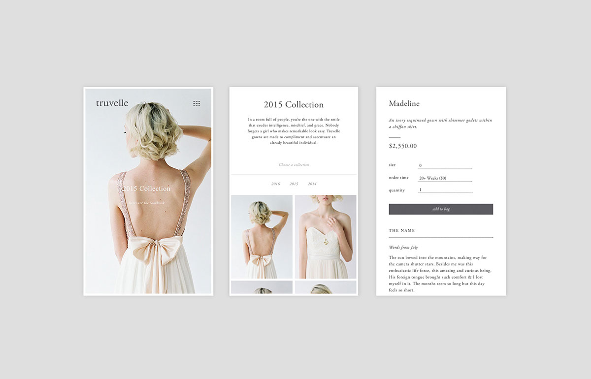
WEBSITE
As we approached the website design, we aimed to include an ample amount of negative space to allow the content to appear with purposeful placement and enough “breathing room”. A white border was included around the edge of the website to reference white-bordered photographs and also reflect the same treatment used for the Truvelle linesheet cards. Garamond was used for the website to continue a consistent tone of voice for the brand throughout all touch points.