Movie Yard
Student Project / University of Waikato / 2014
Movie yard is an android app, which provides movie collection and sharing service to 20-35 people who loves movie and could evaluate movies sensibly.
The name movie yard implies that the app has a lot of movie’ information for our users to read.
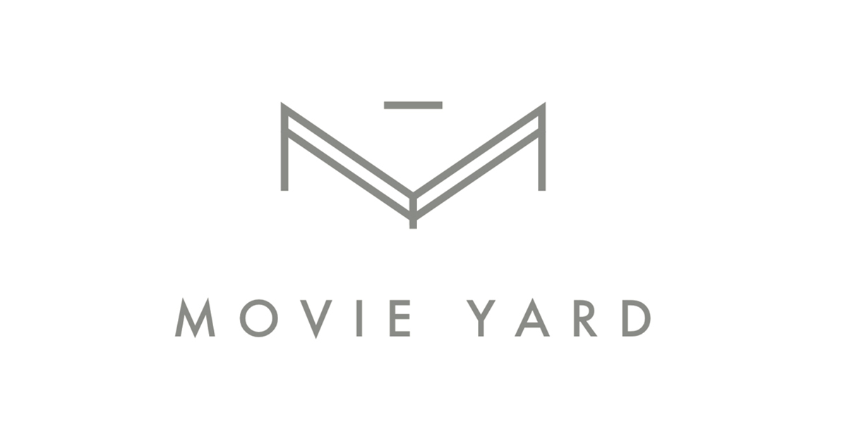
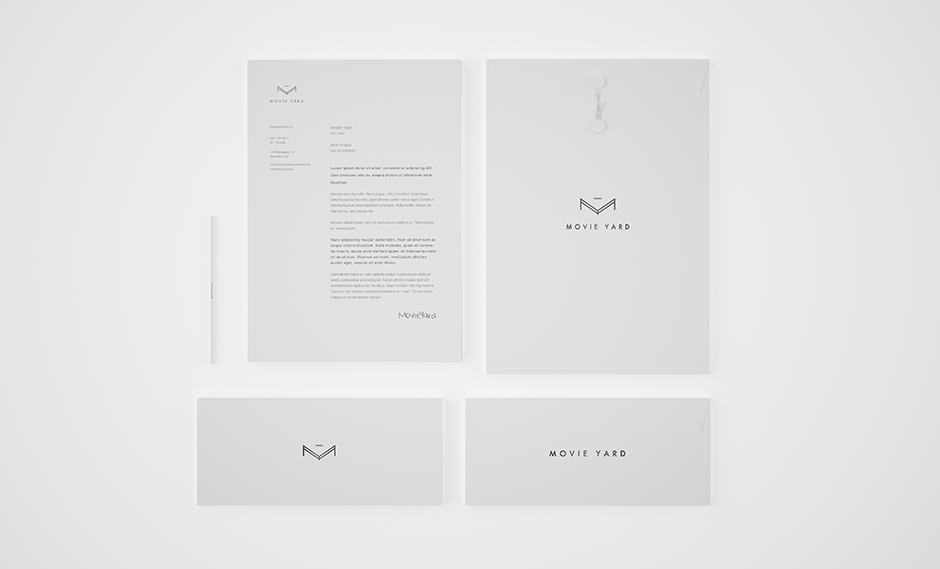
The idea behind the logo is that it should combine both the movie and yard. For the movie part, I decided to use a triangle play button to represent it. I used a 3D fense to represent the yard. Meanwhile, the captial letter ‘M’ and ‘Y’ could be seen in this logo at first sight.
The logo consists a capital letter M with double outline, which looks like a fence in three dimensions, and a line at top to balance the logo. There is a protuberant straight line at bottom, which is to combine the capital letter Y with the whole logo. Excepet the ingenious combination of the two captial letters into the shape, the fence implies yard, which represents that there are a lot of movies in the app, and users could feel free and see a totally di erent world in this app. The whole app looks a bit like two eyes or glasses, which also meets the purpose and overall style of the app.
The font I chosen is pretty sharp and formal, which is to t the whole style of the logo. The whole style is sharp and straight, which ful ls target audience, and to imply Movie Yard requires sensible, responsible and credible reviews, rate for movies, and the app itself o ers same ethos to its target audience.
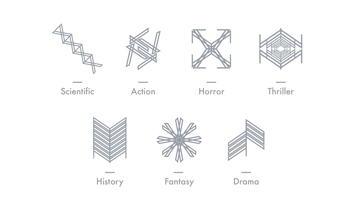
Multiple symbols to represent varieties of movie categories. The animation below shows the personbaility of each symbol and emphasis the category it belongs.
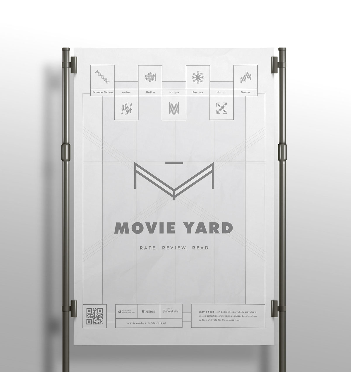
The poster uses monochromatic color, particually grey and white as the color. Overall, the layout is quite simple and straightarwd, which has a decorate header at top, big logo with typle and slogan at center, and contact details, information of app at bottom. The poster is ouline style, which uses a couple of oulines, which keeps the style consistency with the logo design. There are some straight lines at back, which extends from Movie Yard logo to edge of poster, which implies rational and in nite.
The seven symbols at top represent di erent types of movie, such as science ction, action, thriller, history, fantasy, horror and drama movies. Each of these symbols is created by breaking and transforming Movie Yard logo. As a result, the design style is quite consistency and unify.
The seven symbols at top represent di erent types of movie, such as science ction, action, thriller, history, fantasy, horror and drama movies. Each of these symbols is created by breaking and transforming Movie Yard logo. As a result, the design style is quite consistency and unify.
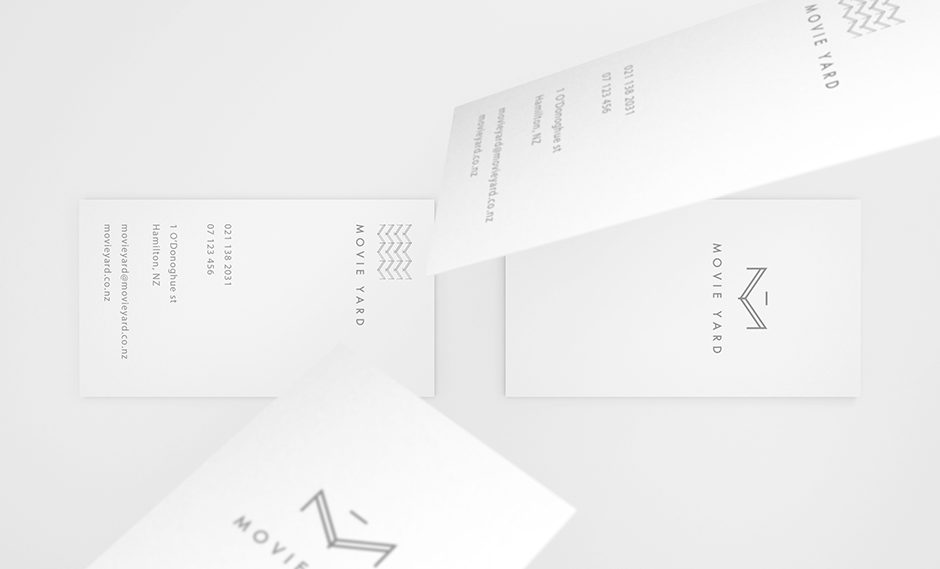
The business card is standard size. Its dimensions are:
Width: 55cm Height: 90cm
The Business Card design is double sided.
Front side includes all the important contact information and the Movie Yard identity. The identify is consist of pattern of the logo to make it looks a bit young and entertaining.
The reverse side is pretty simple, which shows Movie Yard logo and title, and the placement is a bit higher than center, which aims to create a fresh feeling.
The letterhead is standard size. Its dimensions are:
Width: 210cm Height: 297cm
The letterhead continues the same vertical formatting of the logo and supporting contact information.
All the text is aligned on a basline grid. The body text for the letter content aligns with the line movieyard.co.nz, and uses 10pt Helvetica Neue on a line-height of 16 pt.

Movies could be filterd by type (category), location and publish year by clicking the filter icon at top right, just beside the sort icon. Data would be refreshed automitically at background without distrubing.
Thanks for watching!