Brief from Dynamo:
A small Irish family brewery in Cork has created a really successful recipe for Irish Whiskey Beer. They are currently selling very well in farmers’ markets but the brewery wants to expand their business into the mainstream Irish and UK supermarkets and hopefully start exporting to the USA within 24 months.
The supermarkets are very positive about the product but are reluctant to take it on due to its current look and feel. They feel the brand and packaging don’t marry with the quality and taste
of the product. The supermarkets have advised the brewery to work with a design agency to tackle these issues.
The target market is young professional males aged 25-40. The product is more expensive than regular beer but due to the superior taste and whiskey content young professionals are
happy to pay extra.
The brewery needs a new name and identity brand marque with great shelf stand-out, as it’s competing in a tough market. The packaging needs to communicate clearly the product’s unique selling points: Irish, Artisan & Whiskey Beer.
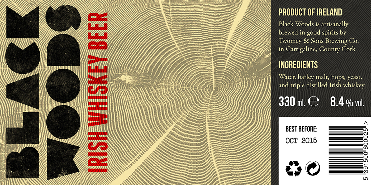
Black Woods has been chosen as a name. It is evocative, it relates to a place (even if fictitious), and it is associated with whiskey through the reference to wood (and, more literally, by the blackening of walls and trees around distilleries).
The type is deliberately unrefined, as if made of wood cuts; the visual language of the brand includes further allusions to wood.

Since the more unique characteristic of the product is its whiskey content, the brand identity has been based on a contemporary take on the aesthetics of whiskey bottles.
Dark amber has been chosen as the bottle colour. This can also relate to the colours of whiskey, where a darker tone signals a more mature, superior product.

The bottle shape has been inspired from a whiskey bottle, editing its shape to result in a smaller and narrower figure with higher shoulders and a greater curvature on the neck.
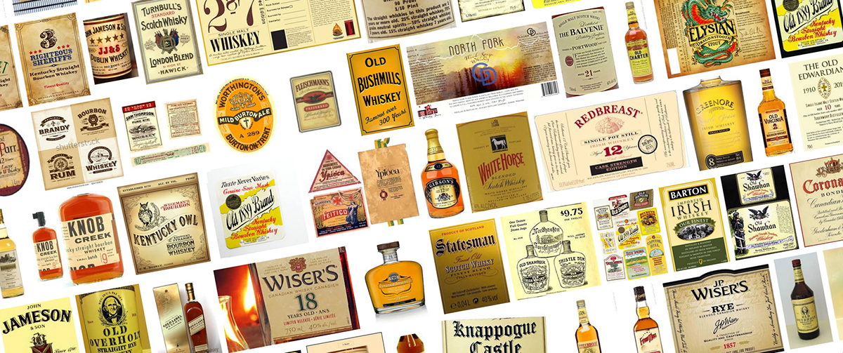
The colours for the label design have also been derived from traditional whiskey labels, which often feature creamy textured backgrounds with black text and red accents.

A second version has been produced using white and gold on black, a colour combination usually associated with premium whiskey brands. This should help the beer stand out when sitting among other beers.


Development work:


