Introduction
I started working on the PACC of BOBS branding late May 2014 and finished in June. The client, who was also a friend, wanted a logo, uniform and style guide for his cycling team.
About PACC of BOBS
PACC of BOBs is the third incarnation of the cycling team created by Rob W and Robert C. They ride for Port Adelaide Cycling Club and encourage new riders to experience riding as part of a team—for fun and teambuilding skills.

Physical Representation
The main version of the logo has a dark grey foreground with a light grey background. It is in a vertical format with the words breaking onto two lines. The emphasis is on 'PACC' and 'BOBS' with 'of' made smaller in comparison. As 'PACC' is an acronym, capital letters were used. 'BOBS' is also capitalised so the letters are more consistent and align better with their block shapes (lower case letters have less of a block shape with more negative space between them which would have led to a less balanced whole). The PACC of Bobs logo has both horizontal and vertical formats for different applications. It also comes in varying colour combinations which can be inversed, as shown below.
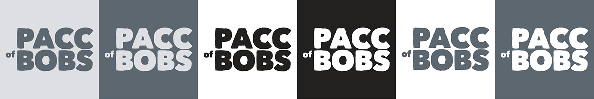

The letters were also kerned and aligned to a grid to have a more pleasing visual aesthetic.
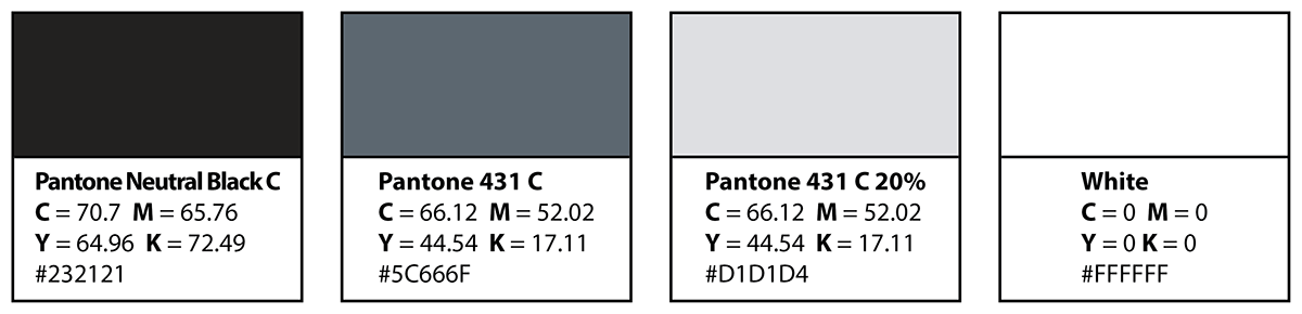
Colour Palette
The heritage of the club suggested grey was a good colour choice for the team logo. The dark grey colour is Pantone 431 C (found in the Pantone+ Solid Coated Swatch Library in Adobe CC applications). The lighter grey is a 20% fill.
Logo Meaning
The PACC of Bobs logo is a simple wordmark using the Matiz font. The typeface has a solid weight to aid with visibility and readability when viewed at different sizes and distances. Considered 'decorative', it has a rough edge which appears almost hand-drawn, lending to it being more personable, playful and fun—values the team embodies.
The team also encourage new riders from all different skill levels and stages of life, knowing they're a bit rough around the edges and that the journey itself is sometimes bumpy. However, they still have fun and persist together as one whole, with the typeface appearing to be a bit fun and cheeky (which their name also implies).
The typeface also looks like blocks that have been chipped away to create the shapes. As they promote an active healthy lifestyle through exercising, team members are being chiseled and refined as they participate together, meeting goals to become more fit.
Font Usage
The logo uses a display font called Matiz created in 2009 by Turkish type designer Beycan Çetin. Devroye describes it as a "slightly eroded black sketchy face", while Softpedia calls it a "rough font style" that gives a "black, bold and heavy effect". It is generally categorised as fancy, eroded or decorative. The font is offered on Font Squirrel 100% free for commercial use. Download it here.
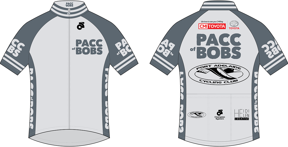
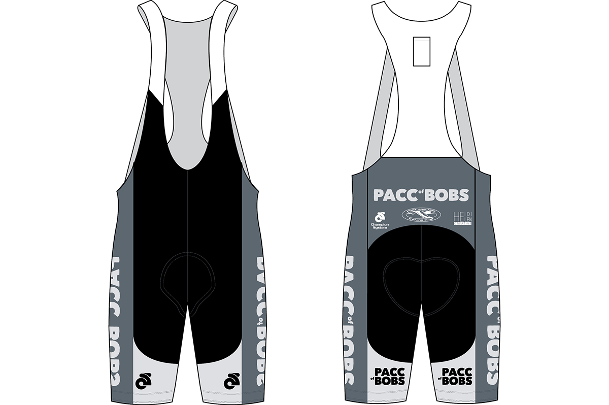
Uniform
The uniform includes a raglan short sleeve jersey and bib shorts. Logos from sponsors / associates are present on the uniform including CMI Toyota, Heidi Helen Creative, Port Adelaide Cycling Club (PACC) and Champion System Australia. The design uses a monochromatic grey colour scheme as well as red from the CMI Toyota logo.
*Note - the client updated the uniform to include red stripes after my work on the project was completed, but that is not shown below in the mock-up. If I can get those files I may include it later.
Additional logos belong to their respective copyright owners.
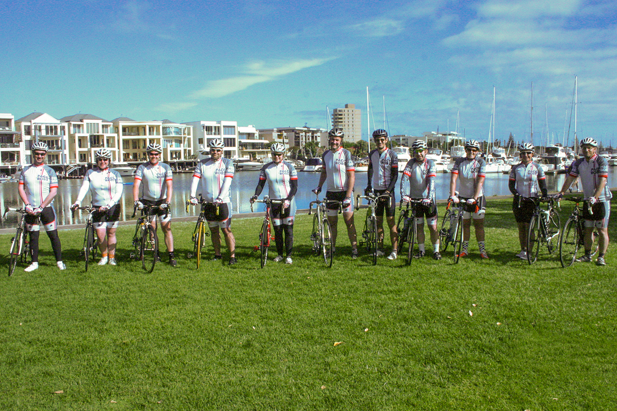
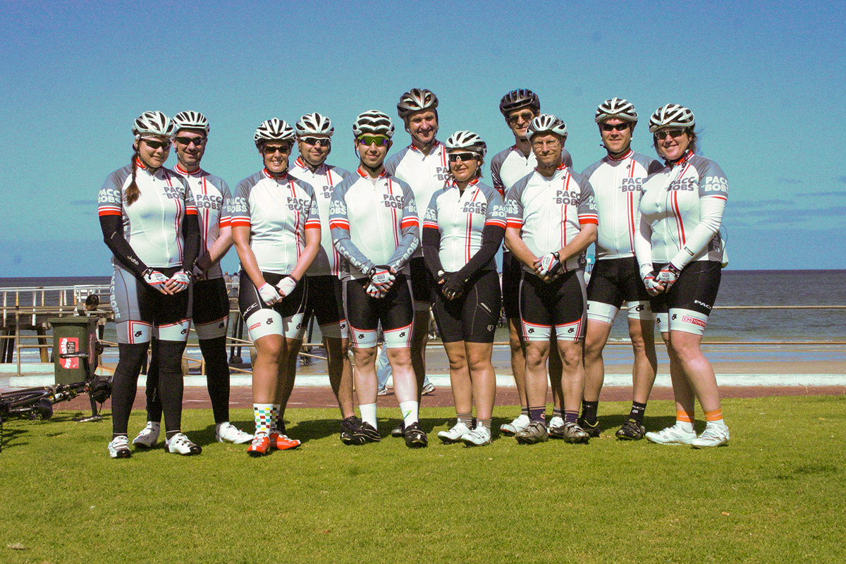
Photos of Completed Uniform
Below are some photos of the completed uniform sent to me by my client. I was pretty stoked to see these! This is the first uniform I've designed. The uniform was finalised by my client and Champion Systems Australia.