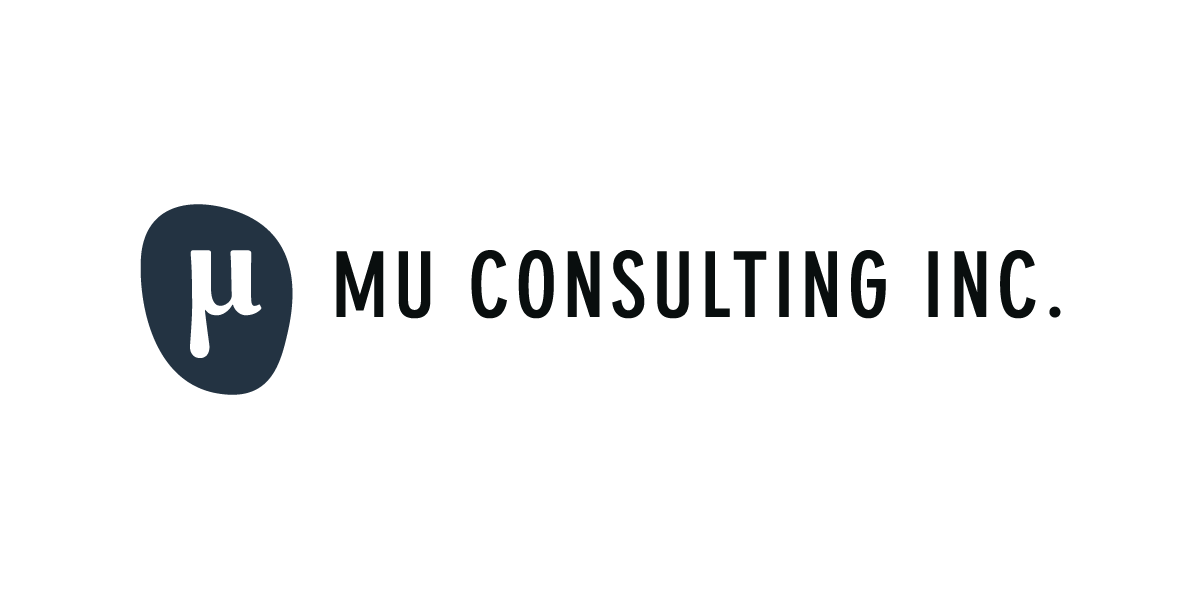
We developed branding for Aaron Nakama, a tech-industry based recruiter and consultant. The organic shape, reminiscent of water-polished stones, reflects friendliness, approachability, and engagement. The “mu” symbol is strong and bold to reflect measurable success. The typography chosen for “Mu Consulting Inc.” is a very technical, geometrically-based typeface – almost architectural – to reinforce the theme of measurement.
We customized a responsive Wordpress theme to reflect the Mu Consulting colour palette. All brand materials are designed to feel clean and professional, without appearing stuffy or old-fashioned.


