Voortman
Baked goods
Voortman is a cookie and baked goods distributor that's been around for at least 50 or 60 years.
The Image of the red girl does feel outdated, but it's developed such a strong relationship with the voortman brand that removing her entirely would result in a failed redesign, so i removed her ugly feet and made her look more friendly

Voortman wordmark uses Edmond Sans
Old logo (below)

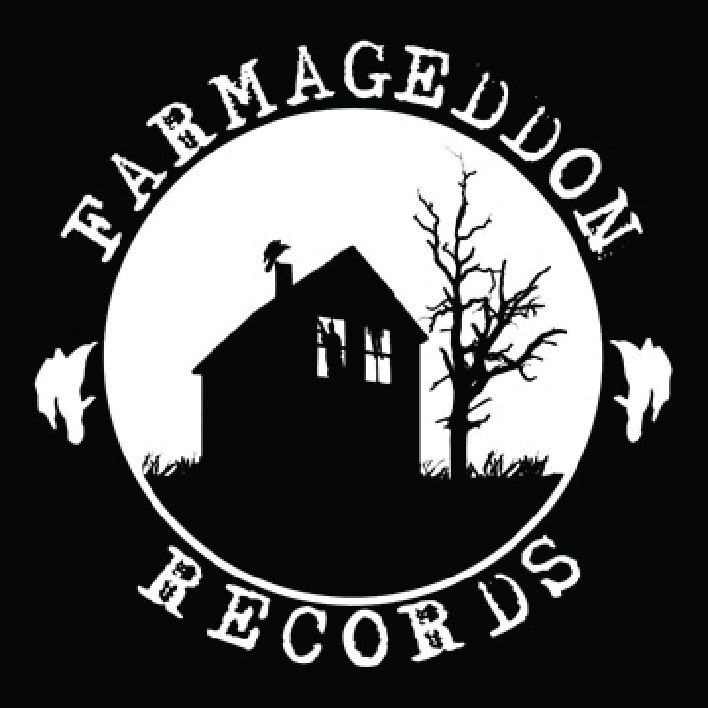
Farmageddon
Records
Records
Farmageddon Records is a smaller American Record label that signs a lot of alt-country/americana-genre bands and musicians.
For the redesign, I kept the image of the house and the scrawny tree, but also removed a lot of other imagery, such as the men in the window, the detail of the grass and the vultures on either side of the logo. Font used for the redesign is Im Fell (via fontsquirrel)

below is the Im Fell font before it was edited and baseline-shifted to what it looks like in the final logo. The s felt slightly thinner than everything else, so it went up in size a lot.

old logo (below)
Jif
peanut butter
Jif peanut butter is best known for their peanut butter, but also offers a few other products. Theyve been around for about 50 years and have a huge gallery of their past logo designs on their website, which is pretty cool.
This logo redesign is entirely handdrawn in illustrator, made of rounded corners to feel smooth and "buttery", while retaining a fun atmosphere.
I kept the original colours from the old logo just to follow the guidelines for a better redesign. The biggest issue with Jif was their intimidating and overly impactful font choice, but the green blue & red "flag" behind the font seemed appropriate to keep.

old logo (below)


