μαnα is a family company that produces organic products in their own farms. The project is a collaboration between, DesignClub & theosdesign.
THE LOGO
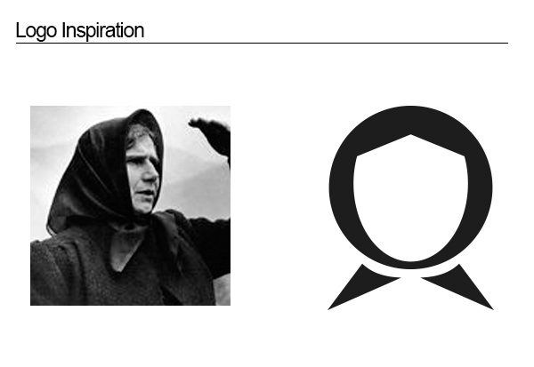
For the brand marque we used the image of a mother from a village in Greece between 1950-1970. We simplify the image and create a marque easy to identify using mainly the headscarf and not other women characteristics. Women in 50s and 60s were always wearing a headscarf as a protection from cold and to protect the food and other goodies they were preparing from falling hair.
For the wordmark we used Katsoulidis font from Cannibal fonts. That font gives Greek aesthetic to the logo. Further more is a great example of Greek typography and reminds that period were those women lived (50s-60s). We used only one english letter in the typography ’n’. ‘a’ is the greek lower case but nowadays used also in English fonts. ‘μ’ is the Greek ‘m’ but recognizable to the west countries also. As a result we gave an international flair to a Greek word.
THE LOGO
For the brand marque we used the image of a mother from a village in Greece between 1950-1970. We simplify the image and create a marque easy to identify using mainly the headscarf and not other women characteristics. Women in 50s and 60s were always wearing a headscarf as a protection from cold and to protect the food and other goodies they were preparing from falling hair.
For the wordmark we used Katsoulidis font from Cannibal fonts. That font gives Greek aesthetic to the logo. Further more is a great example of Greek typography and reminds that period were those women lived (50s-60s). We used only one english letter in the typography ’n’. ‘a’ is the greek lower case but nowadays used also in English fonts. ‘μ’ is the Greek ‘m’ but recognizable to the west countries also. As a result we gave an international flair to a Greek word.

ILLUSTRATIONS
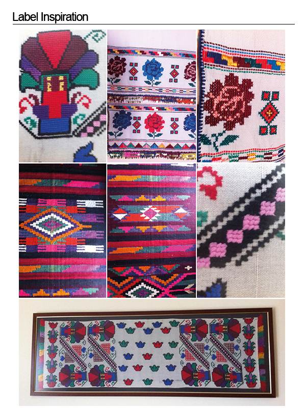
Reaching the problem of designing the labels for the products that Mana will produce we decided to go also with something from 50s and 60s tradition. And what is better than the Greek textiles those women were producing knitting on the loom. From rags to blankets those knitted textiles is traditional treasure.
The concept was to illustrate all the labels with that technique but digitally. We gather references from most of the raw materials of the products and we started giving them a knitted aesthetic. We also made different patterns with this technique based on old rags we found from our grannies.

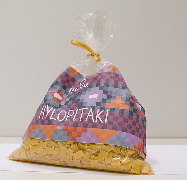
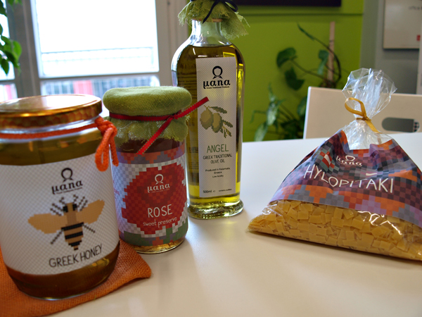
LABELS
The last stage of this project was to create the labels of the products. We had to match the illustration with the typography and what we had to write on the labels.
We used two fonts on the labels. One for naming the product and a secondary font for all the additional information.
The font for the names is a handmade font. It has only Uppercase and lowercase and is still on going. With this font we gave a continuity to the knitting aesthetic of the illustrations and we reckon we succeeded.
As a secondary font we used Din, a sans serif font that provides seriousness and prestige to the product. The use is only for the additional information of the products, such nutrition facts and ingredients.


- Thank you for watching! -


