
NBC Universal VoD Applications
UX design of NBC Universal's "Video on Demand" applications for Windows 8, Windows Phone, and Xbox One.
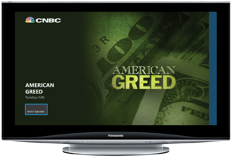
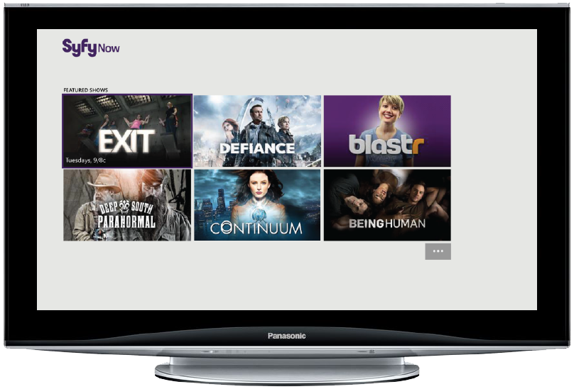
The core challenge of this project was to make a single set of applications that, with a few palette swaps and branding tweaks, could accommodate ALL of NBC Universal's entertainment brands. That includes brands as dramatically opposite as CNBC and SyFy, as well as a diverse selection of brands like USA, Telemundo, Sprout, and Bravo. It required extensive research into featured content philosophies, catalog sizes, and existing apps, and involved steady communication with a large number of shareholders.
With a grand total of 36 applications initially slated for launch, we kept to the basics: creating the smoothest possible video playing experience, with a focus on beautiful imagery and getting users to their preferred content in a minimum of clicks.
Windows 8
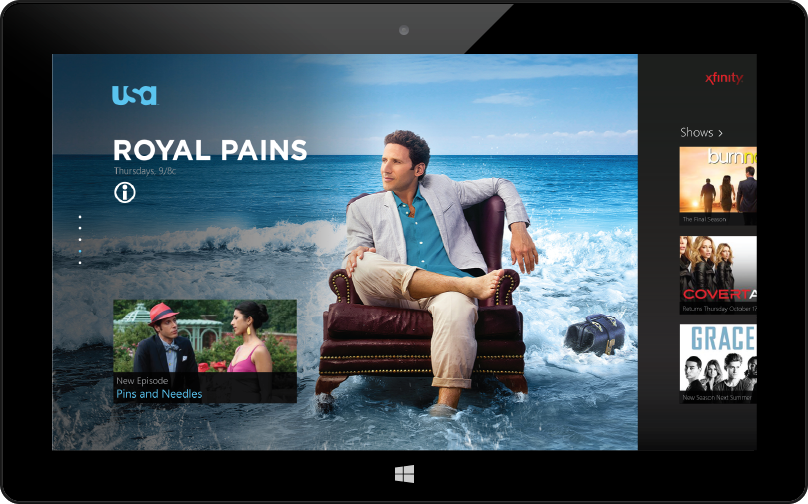
A series of beautiful corner-to-corner art in our featured carousel makes a big impact on the user and helps the individual brands to establish unique identities via unique show imagery.

The full hub offers users direct routes to featured content, showcases the most relevant schedule items, and allows users the option to dive right into the brands' most popular shows or see their full selection.

Having a dedicated Shows page allowed us to accommodate brands with any number of shows. Though USA only has around a dozen shows available to stream, other brands had significantly more, and woud have crowded out the schedule on the home page.

The #1 most sought content for a given show is the latest episode, so we put it front and center and displayed enough metadata that a user could be sure it was reallly what (s)he was looking for at a glance.

The shortcuts in the navigation bar at the top are available on every screen, allowing the user to jump into any of the app's main categories without having to backtrack to the home screen. The bottom app bar changes for each page; on the player, the shortcuts allow a user to peruse through the current series easily and directly.

We had no imagery to use for schedule items, so we focused on a clean presentation of key metadata for the entries and a simple, clear interface for changing the date.
Xbox One

On the Xbox, we had to design for the "10 foot experience" - users are much farther away from their TVs, on average, than they are from their tablets or PC monitors. Full screen imagery becomes even more important.

Another key distinction for the Xbox is that the user is most likely to be using a controller, not a mouse or touch screen, to navigate. This means we have to be very careful and judicious with the placement of buttons and other clickable content; but it also means that moving the screen large distances quickly is less onerous than repeated swiping required elsewhere.
We based the Featured layout on the fact that many of the NBCU brands' large artwork had safe zones or even preexisting gradients on the left side.
The last page of the hub, Featured Shows, offers the user a mixup of shows and the path to the dedicated shows page which holds the brand's full library.

The Shows page is accessible from the Featured Shows pivot as well as from any screen via the app menu.

The fact that Xbox navigation involves controlling a focus (instead of pointing and clicking) presented difficulties, but also unique opportunities. Here, we leveraged it to allow the maximum use of screen real estate by only showing the description of the currently selected item.

Even though the controller is the primary method of navigating around the Xbox app, we always had to be sure to consider voice and gesture controls as well; every button needed an easily recognizable voice command and a sufficiently large touch area.
Windows Phone
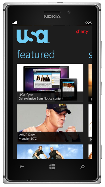
On the Windows Phone, using pivots allowed us to put a large quantity of material on the hub while keeping it organized and usable. The pivots are featured, shows, schedule, search, and settings.

We used the About page as the landing page for an individual show as it provides good branding due to its use of show art, and because starting on episodes or clips would be risky when it wasn't clear whether a given show would have that type of content.

Pivots are also useful in order to have parallel lists - for example, episodes and clips - without worrying that users will have to scroll to the end of a long list to get to the start of the next one. Tapping a thumbnail starts video, while tapping an episode title (blue to indicate tappability) leads users to the episode detail.
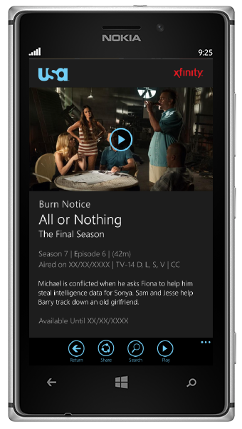
Rather than cram descriptions onto the episode list, we opted to give each piece of content its own page with all metadata and a large thumbnail. That way, users could be sure of which episode they were about to watch before sitting through its ads, and the episode list could remain streamlined.


With the limited screen real estate of the phone, we opted for a collapsible schedule. The date picker uses a modified pivot control.


