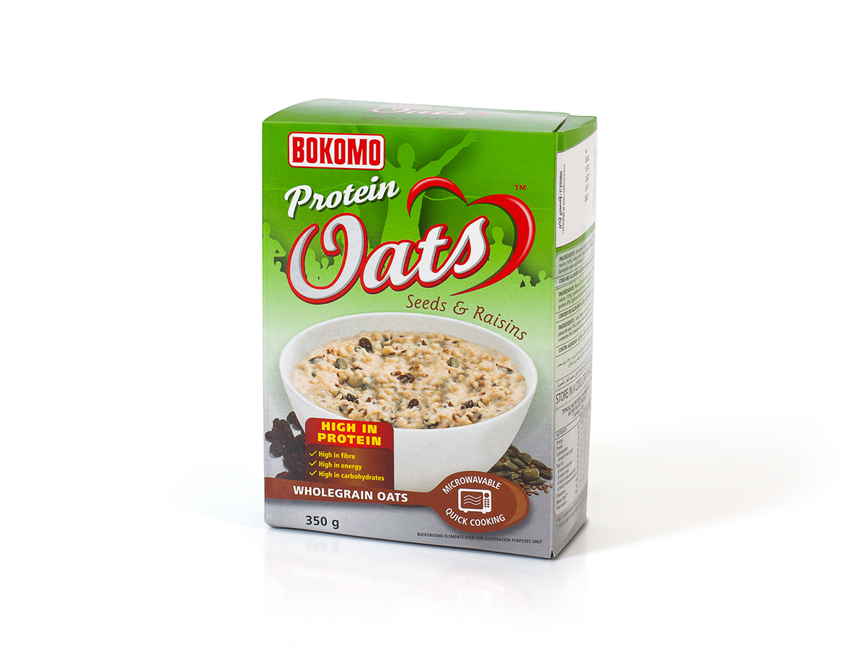
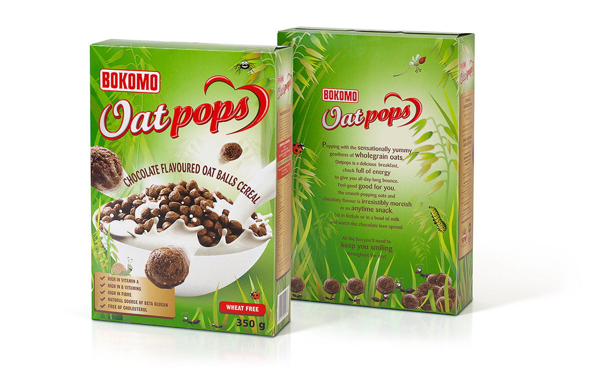
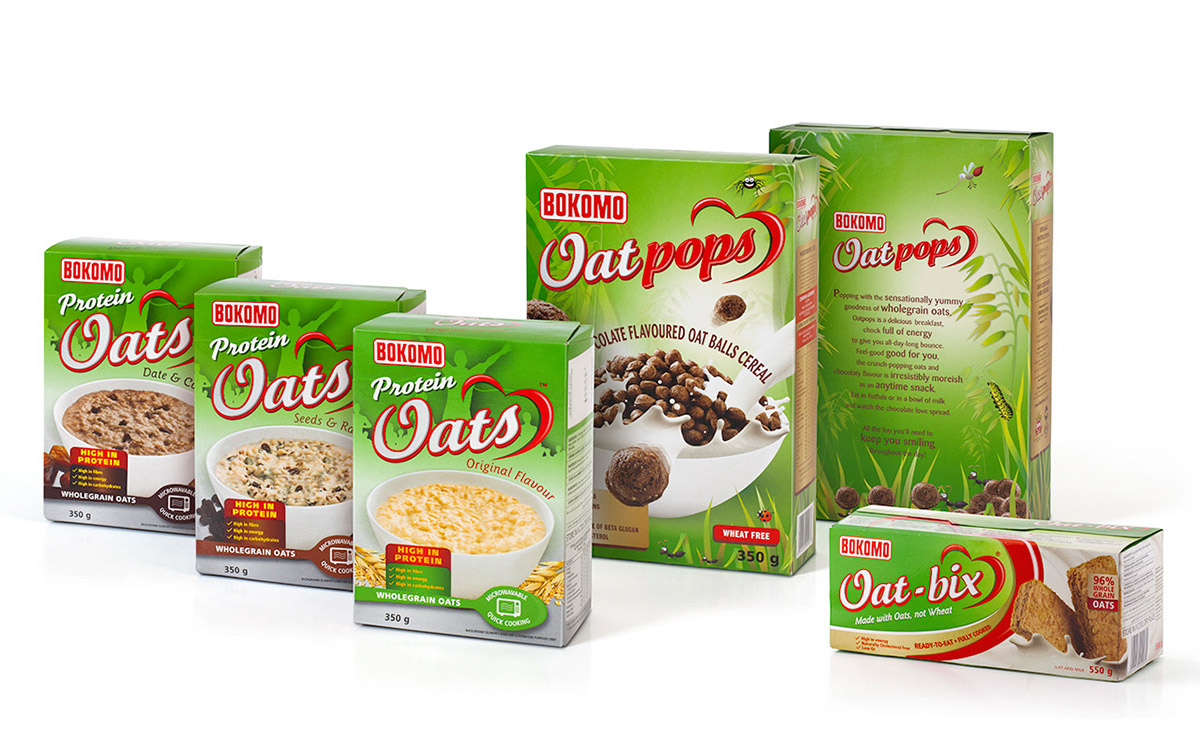
The oats market in South Africa can be a real jungle and, until recently, Bokomo Oats had lost its direction. Without an overarching design architecture, the different offerings had become fractured and disconnected.
A complete upgrade included re-packaging the existing products, in addition to all-new packaging for innovative product lines – Oatpops and Oat-bix – whilst ensuring that all the variants form one cohesive family.
Another objective was to tap into the global health trend. The new architecture punches through the clutter
with a dynamic, modern and wholly ownable green. A health heart was incorporated into the Oats logo and underpinned by the trusted Bokomo brand, making the various products easier to identify and navigate and giving the brand more shelf presence. The result is the perfect balance of product differentiation and brand consistency. With its unique visual identity, Bokomo Oats turns over a whole new leaf.