
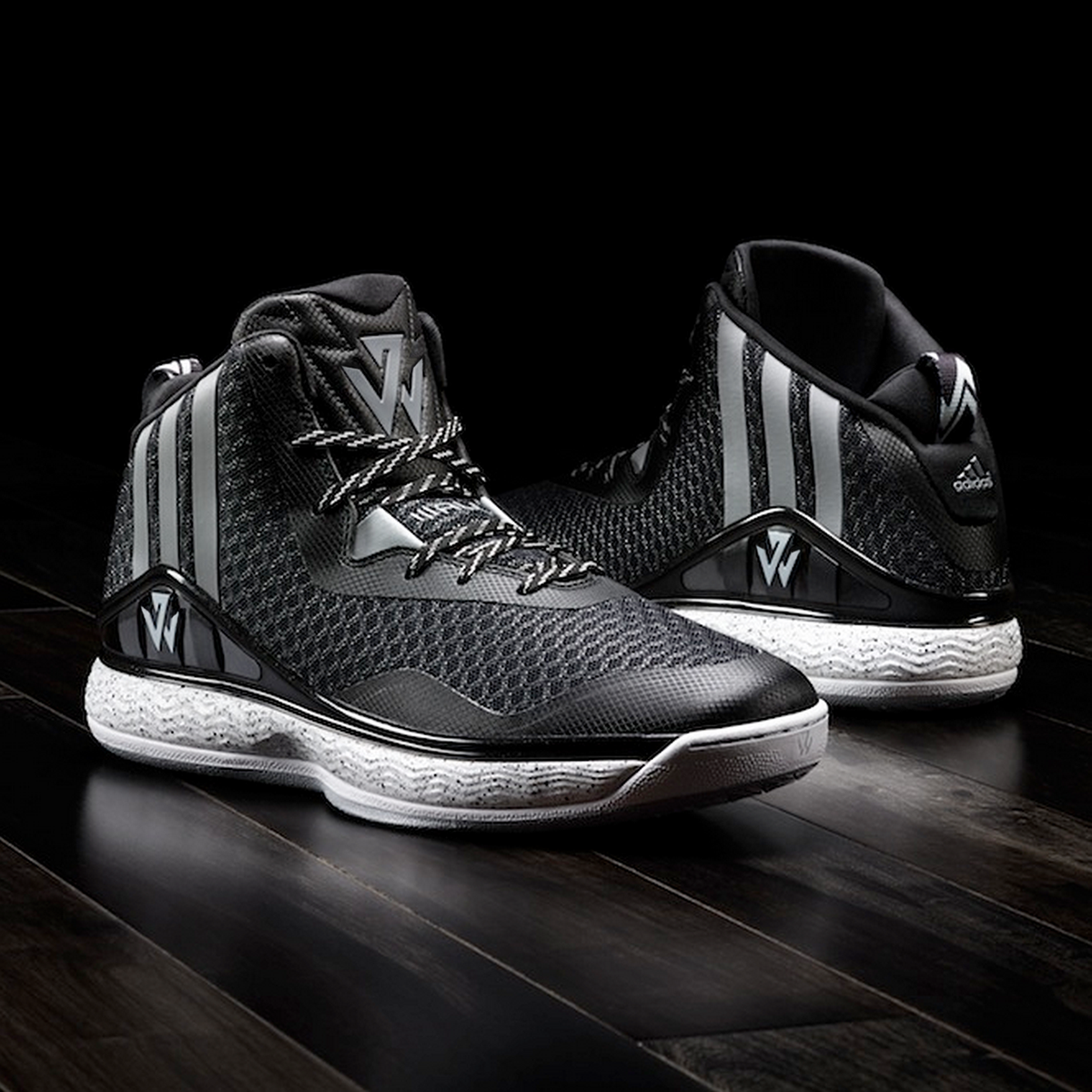
JOHN WALL ID
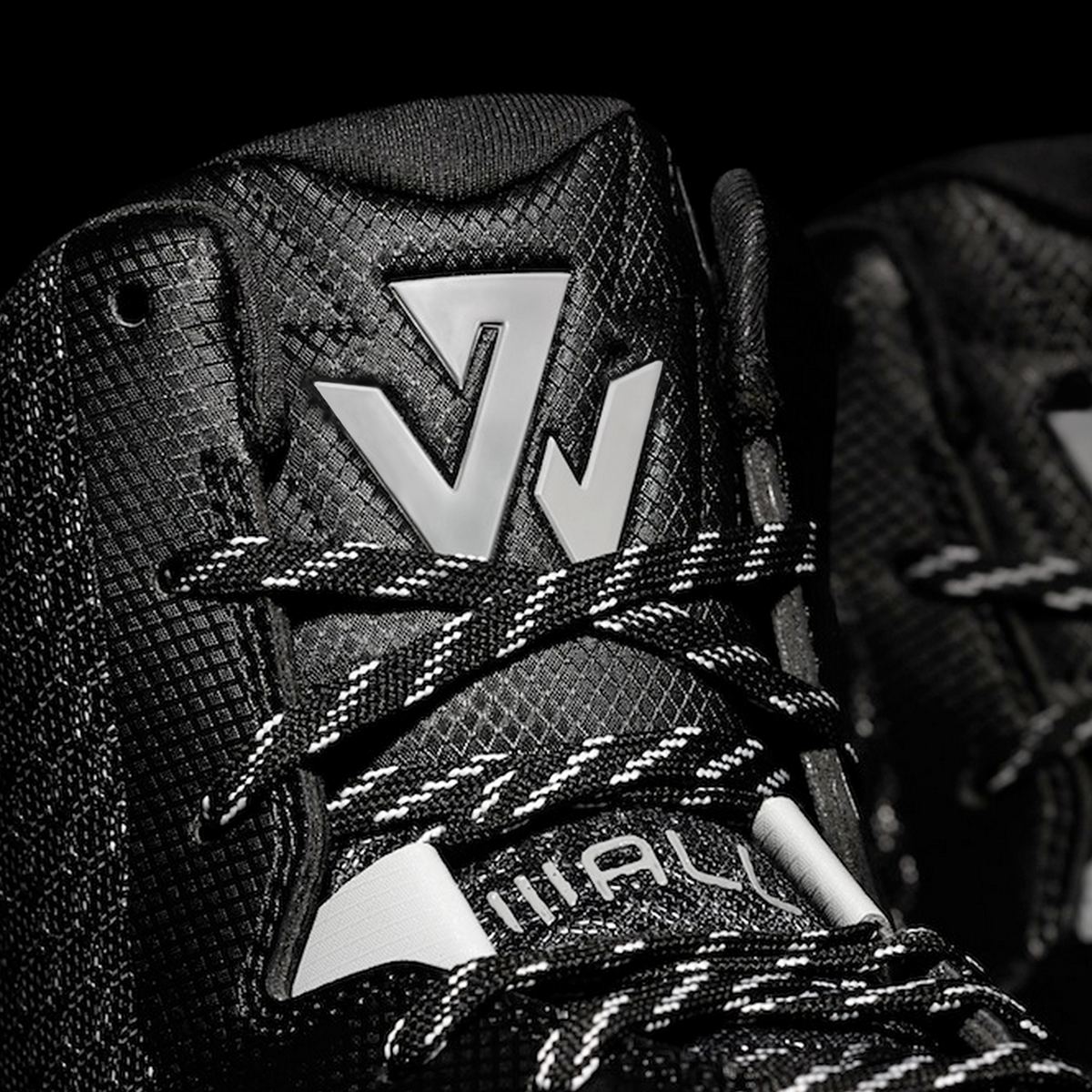
When John Wall switched from Reebok to Adidas he needed a new logo that represented this change and his new identity as a fashion forward player. The brand wanted to create a new identity that aligned with John’s position as a style-driven person but also as an incredibly quick player with a deadly crossover. The logo needed to be timeless as well as speak into John’s dynamic playing style.
The sharp lines that make up the mark represent John’s cutting edge style as a person. John keeps up with current trends and enjoys setting his own. The logo’s lines quickly change direction like John and his crossover. These two aspects make up John on and off the court. The logo brings together these two parts. Additionally, the two separate parts of the logo are made up of a J and a W.
Ultimately, Adidas Portland did a great job refining this logo and evolving it into the final mark. I've mocked-up my version using photography courtesy of Adidas and the Washington Post.


Thanks for viewing!


