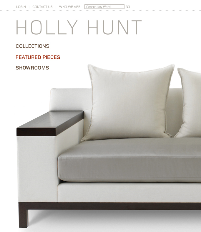
Holly Hunt
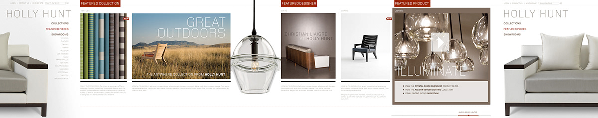
Website Proof-of-concept
Website Proof-of-concept
The 'big idea' was to create a design that only scrolled horizontally in a continuous loop. As content was added or changed, modules would just get swapped out with what was new. The look and feel was to be similar to a high-end catalog, but with rich media and interaction in each section. The design also utilizes principals of 'Responsive Web Design,' and would fit and fill the entire screen of a device.

A persistent navigation follows along with the horizontal scrolling if the user wants to jump to a specific section

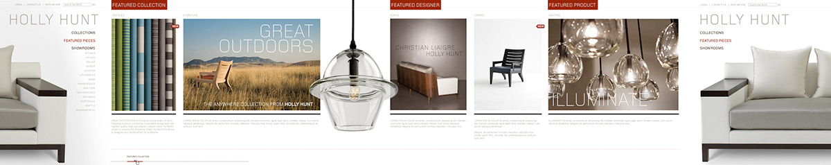
This design also needed to include a to ability to localize to a specific Showroom to allow each location to have a customized experience based on collections and designer's products available at those locations.

Rollover in a section would highlight and reveal any additional content available.

Selecting 'View Samples' reveals the product catalog for the collection, hovering over the image reveals the specifications and options available for the product being viewed

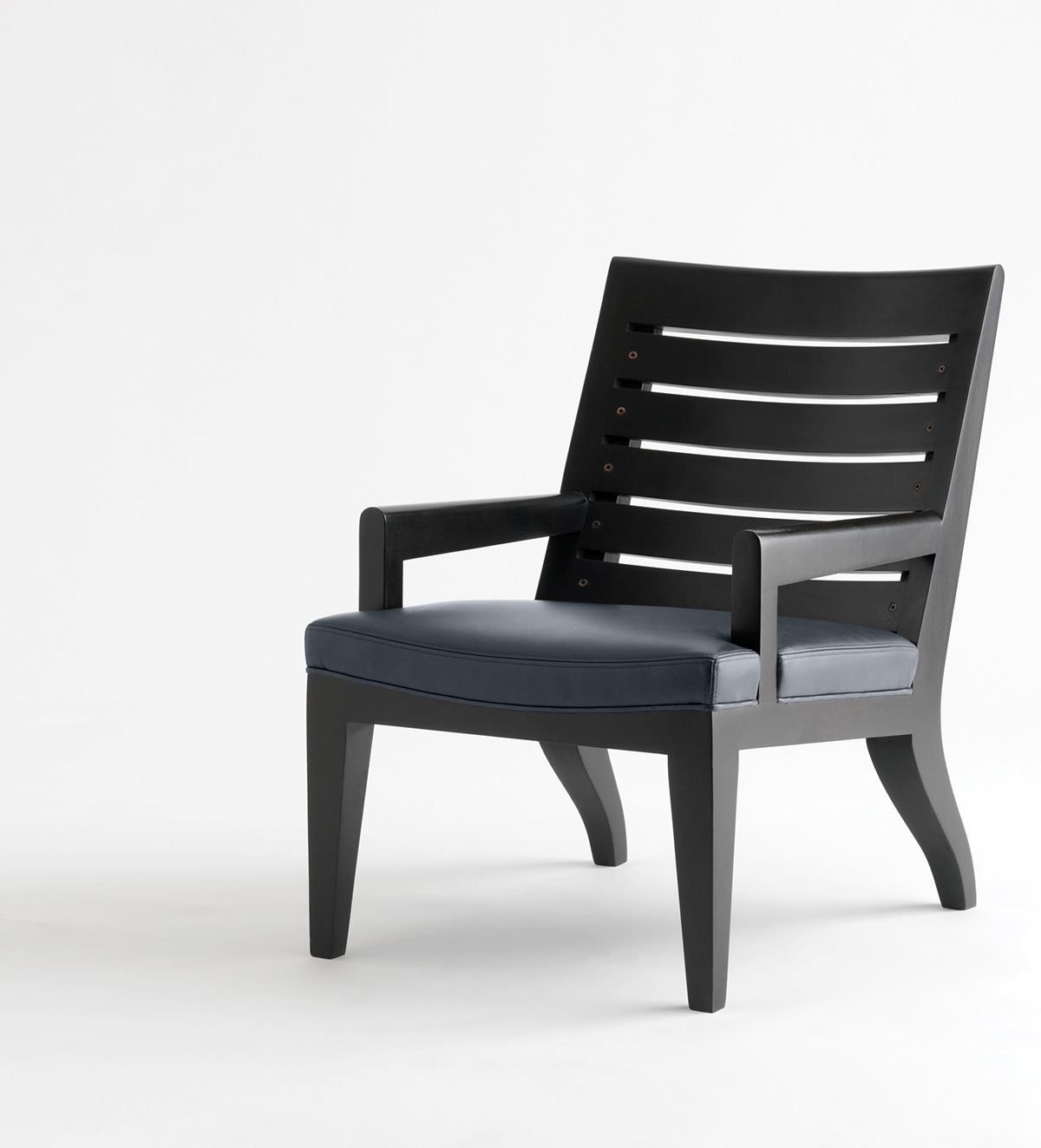
Zoom feature to show products as a large beauty shot was important.

Video content could be added to a section as an option.