


Hung Rui Chen, BI + Package Design
Mar.2018
Client : Hung Rui Chen
Design : Alissa Hwang
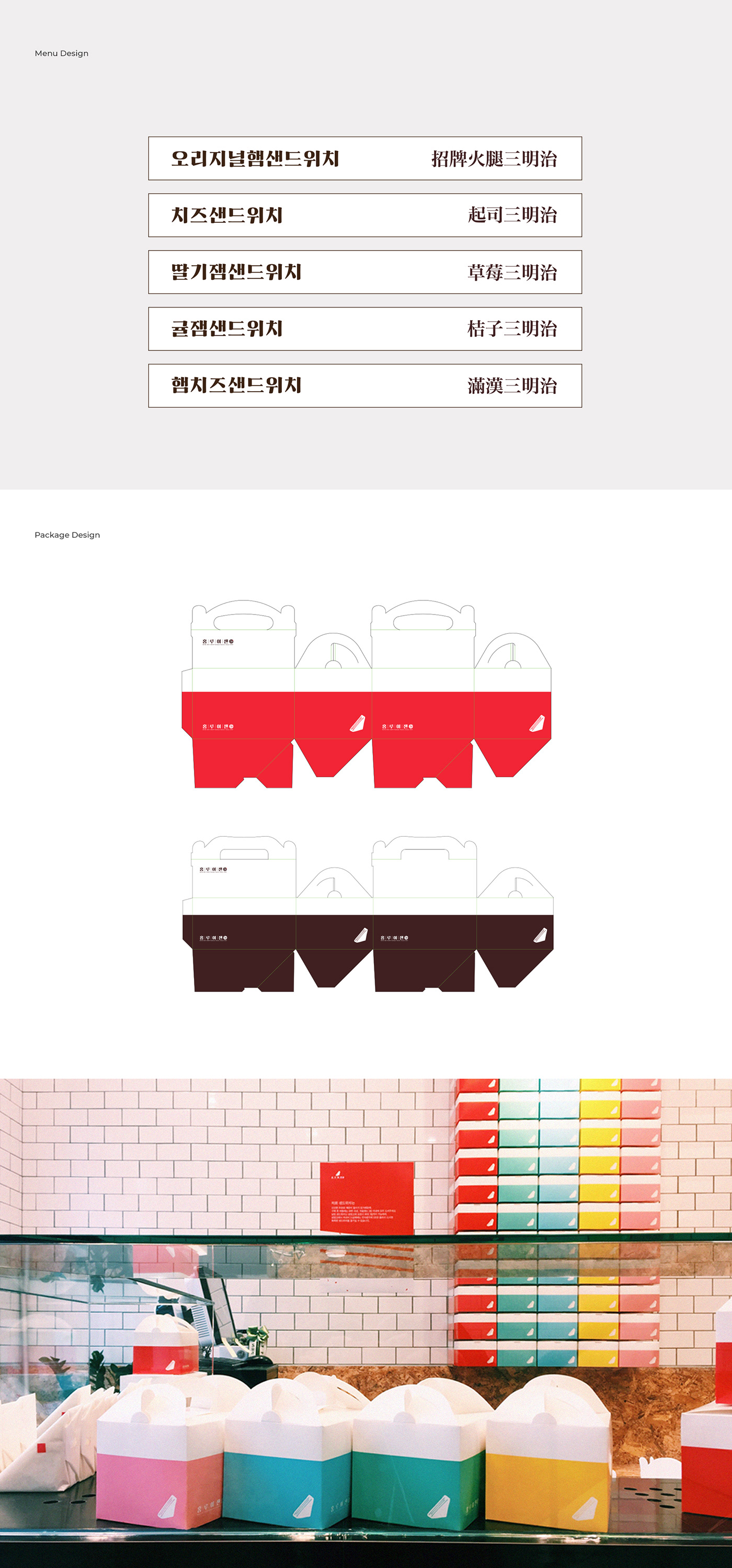
Hung Rui Chen is a Taiwanese national sandwich brand with a 70-year history, boasting a simple yet optimal ingredient combination. However, to enter the Korean market, there was a need for a redesign of the brand image, which was a mix of various logos and fonts. Especially, the existing image composed entirely in Chinese characters needed to be reconstructed to suit the Korean franchise market.
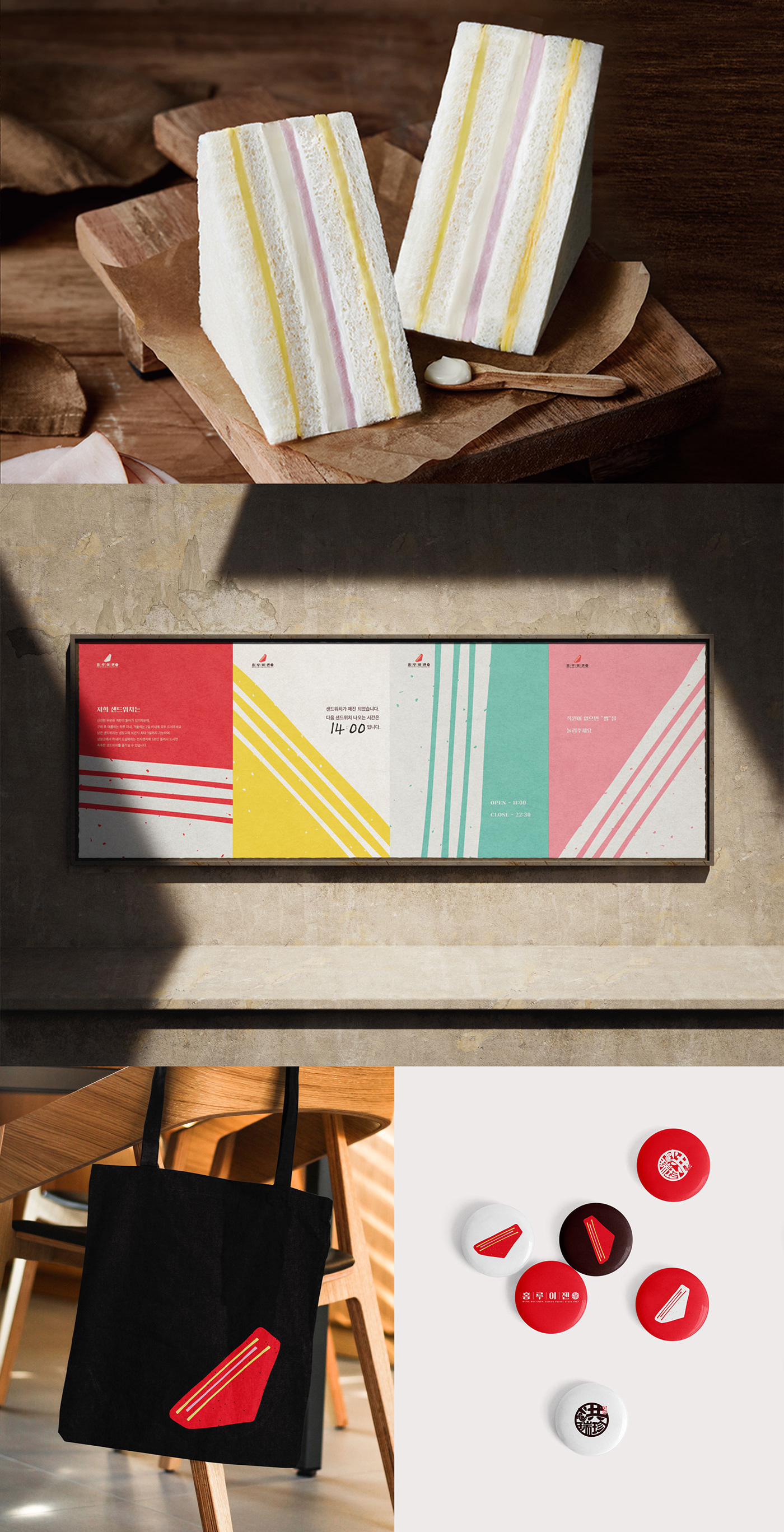
As a result, we designed a symbol representing the essence of the flagship menu item, the soft sandwich. The symbol, depicted in red, consists of lines symbolizing the ingredients of the soft sandwich, emphasizing the tradition of the original recipe dating back to 1947. Additionally, we designed a wordmark incorporating a classic feel with a font and lines that complement the Chinese character seal symbol.
We applied the main color, red, and pastel tones inspired by the ingredients as sub-colors to the package. In the package design, we aimed for minimalistic interiors with color schemes, similar to brand's simple ingredients, to serve as the focal point.


Thank you for watching!
Enquiry : alissahwang3236@gmail.com
Instagram : tripledesignspace
tripledesignspace.com
Copyright © TripleDesignSpace. All rights reserved.


