Spherotek is an innovative web platform designed for professionals in the field of information technology. It serves as an online resource and social network where IT industry specialists can exchange experiences, stay updated on the latest news in the field, and showcase their portfolios. Additionally, it functions as an educational platform where those interested in working in IT can find courses to kickstart their careers, while experienced professionals can select training programs to enhance their qualifications, recommended by artificial intelligence based on their portfolio and resume.
Target Audience:
The target audience for Spherotek includes professionals in the field of information technology, as well as those aspiring to start a career in IT. The age range of this audience spans a wide spectrum, ranging from young individuals just embarking on their professional journey in the industry to experienced professionals looking to further expand their knowledge and skills.
Segmentation of the Target Audience:
"IT Novices": Individuals interested in information technology and looking to start a career in this field.
"Experienced Professionals": Specialists who already have experience working in the IT industry and are seeking opportunities for further development.
"Technology Enthusiasts": People passionate about the latest technological trends and innovations.

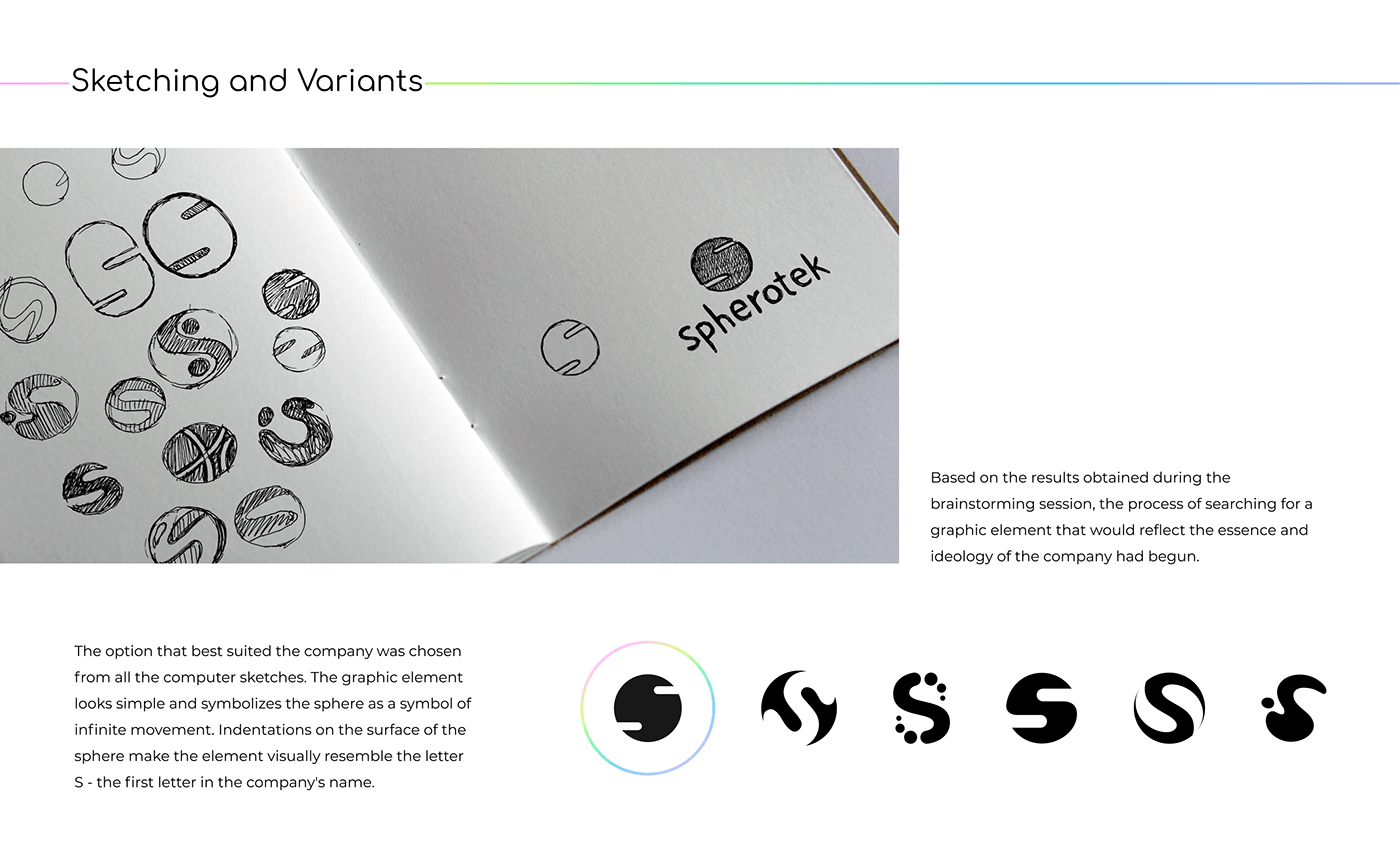
To design a distinctive and powerful identity for Spherotek, an intensive brainstorming session was initiated with our creative team. The goal of this session was to form an associative cloud of words, laying the foundation
for the subsequent development of the brand's visual aspects. Two primary words highlighted by the team - "Spectrum" and "Sphere" - became the axes around which the visual identity would revolve.
Spectrum:
• Symbol of diversity and multiplicity.
• Reflection of a wide spectrum of ideas and innovations.
• Color palette expressing a creative range.
• Reflection of a wide spectrum of ideas and innovations.
• Color palette expressing a creative range.
Sphere:
• Circular form as a symbol of endless movement and development.
• Global nature and all-encompassing energy of the creative process.
• The word "sphere" in the sense of "sphere of activity" as a homonym to the word "sphere" as a geometric figure.
Based on these key associations, we curated a mood board that served as a source of inspiration for developing the brand's visual elements.