

Smile Africa
Client
Onomo Hotels
Industry
Hospitality
Project
Brand update
Services
Brand discovery
Tone of voice
Messaging
Messaging
Visual identity design
Brand guidelines
Brand launch and roll out
Wayfinding and signage
Brand launch and roll out
Wayfinding and signage
Background
Anchored in a rapidly developing Africa.


Challenge
Modernise, simplify and reposition – celebrating African art and culture.
Onomo Hotels felt that partnering with an agency from Africa would be beneficial to avoid portraying any stereotypes in their branding. They considered various design agencies and ultimately decided to work with Kandi to update their visual identity and positioning. The objective was to modernise and simplify their existing identity while still keeping its African roots intact, to appeal to global travellers. It was crucial to showcase the African essence of the brand in a contemporary and vibrant manner, celebrating its lifestyle in a way that would resonate with a modern audience.

Discovery
A deep dive into the brand identity.
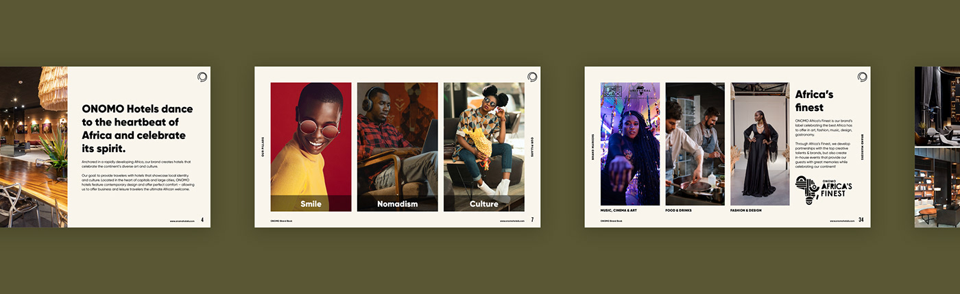
The project kicked off with a discovery session. The team worked through worksheets and we actioned a review of the current identity. The brand identity was established as approachable, modern, urban and energetic – celebrating African identity, art and culture.
When updating the visual identity, we focused on highlighting the brand pillars; Smile, Nomadism and Culture. A brand book was created to summarise the brand character and markers.


Identity
Simplifying the visual identity – anchored in Africa.
The visual identity was simplified, focusing on the use of a revised African colour palette, typography and image usage.
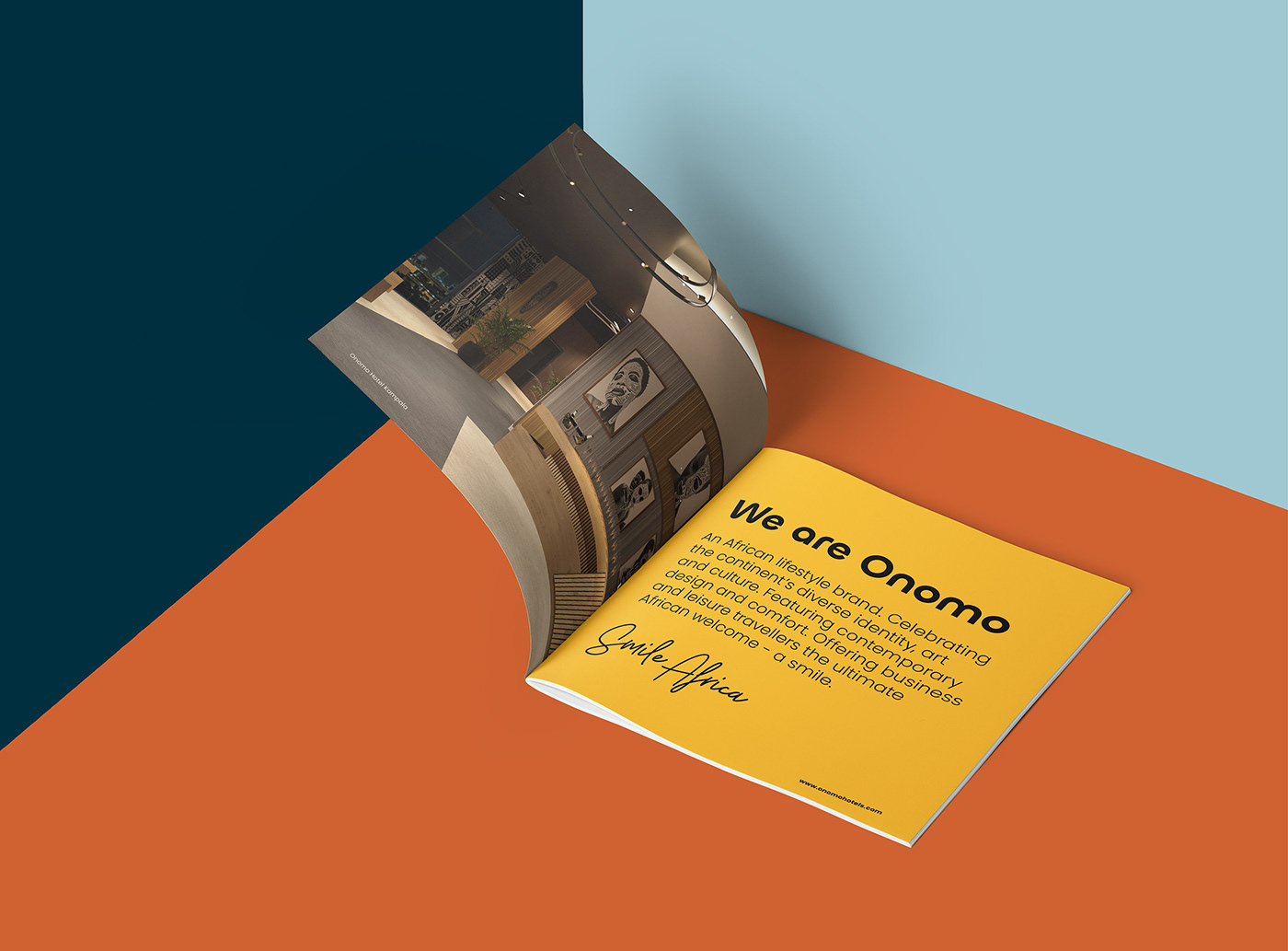
The new visual identity represents Onomo’s brand values, personality and positioning. We developed extensive brand guidelines and templates to assist in implementing the design language across head office as well as all hotels across the continent. The guidelines were developed to provide an understanding of how to visually express the Onomo brand, tone of voice and messaging guidelines, along with instructions on how to use the core brand elements.

Details
Revising the identity.
The colour palette was revised to work in harmony with good accessibility and legibility in different colour combinations. An ivory colour was introduced to work in combination with the earthy palette and as a replacement for white.
The imagery was updated with a focus on diverse African people who are engaging, have energy and that are representative of the modern nomadic traveller.
We introduced a unique, memorable display font for headings, and a signature style font for particular instances where accompanying taglines are needed.
A set of icons were developed along with instructions on how to create the iconography with consistent line weights and visual style.
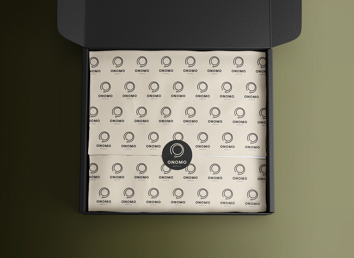
The logo was updated and tweaked to work in different sizes.


In-hotel applications
A unified visual identity for in-hotel applications.
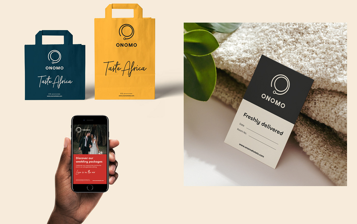
A set of in-hotel applications were created along with templates, featuring the new colour palette and font usage. This included front desk and head office stationery, in-room applications such as door hangers, welcome book, in-room dining menu, notepads, laundry list, laundry bag and bathroom amenities.


Restaurants
Food and beverages applications.
For Onomo’s restaurants and bars that are not stand-alone branded concepts (such as Klok and Kokoma), we developed a set of applications based on the new identity. These included menus, bill folders, coasters, placemats, napkins, tent cards, take-away boxes, bags, and coffee cups.


Shopping
Promoting the best the continent has to offer.
One of Onomo’s key brand markers is to offer travellers a modern African experience through social hubs. Apart from offering flexible workspaces, these social hubs are also turned into art galleries and pop-up stores where guests can get inspired through art from local artists but also find design, fashion and retail goods made by local brands and designers. A set of key applications were developed for the pop-up stores such as bags and packaging.


Digital
Implementing the branding across all digital touchpoints.
All social media profiles were updated with the new identity. Campaigns and templates were developed, along with email signatures, newsletter templates, website audit and homepage design. Kandi has continued to assist with social media posts and story visuals on an ongoing basis for head office and regional hotels.

Signage and wayfinding
A key extension of the brand experience.
Signage and wayfinding are an important part of the overall hotel experience. Guidelines for how to implement the new visual identity, using the new typography and iconography in signage were established. This included totem signage, wall signage, room numbers, directional and identification signage.


Print
The new identity seen in print.
Various printed touch points were updated with the new look and feel, including billboard advertising, posters, flyers, property brochures, sales brochures, fact sheets, press releases, and shuttle buses.


