Munu
Bring the future to the table
__
Munu is a Norwegian technology company dedicated to crafting software solutions for restaurants and bars. In a fast-paced industry, where customer satisfaction, productivity and short wait times are crucial to success, Munu empowers their users and lets them focus on what’s important; the guest.
The visual identity articulates this need for speed through rhythm, flow and movement – all while promoting clear communication and a welcoming vibe.
Credits:
Moxey, Grensesnitt
Year:
2023
Deliverables:
Brand strategy, Visual identity, Art Direction, Web Design


Munu was founded by people with industry knowledge, driven by a passion for both food and technology.


To echo the brand identity's core design values of rhythm, flow, and movement, we used the PP Pangram Sans Compressed typeface, distinguished by its expressive italics and slanting versions.
Serving as a visual representation of dynamic movement and seamless flow, the bold usage of slanted typography and expressive motion principles were designed to communicate quickly and effectively. Combined with Selecta as a the functional and legible workhorse, the pair supports a forward looking brand, optimized for a digital future.
Rounded corners and pillow shapes imbues the brand with a distinct, honest and friendly aesthetic.
The colours are harmonious, chosen for their luminous quality in the digital world.

Different shapes serve as a visual gateway to the various modules on Munus platform, presenting complex ideas in a simple and captivating manner.


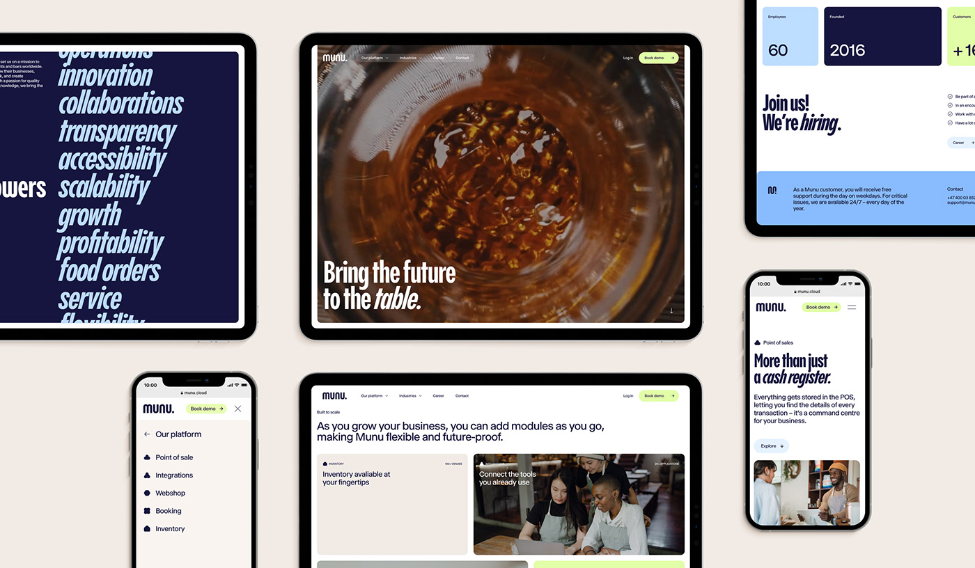
We reimagined Munus digital presence to cater to the needs of today, and tomorrow.