


en.
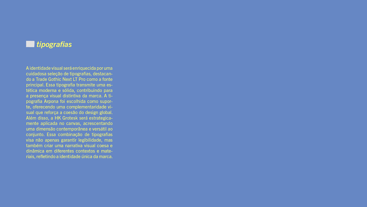
The creation of a visual identity that harmonizes the classic and the modern is an exercise in balancing tradition and innovation. In this context, the Trade Gothic typography takes on the role of anchoring the brand in the past, evoking the solidity and reliability of 20th-century typographic design. Its presence provides a solid foundation for a contemporary gaze.
For the logo's tagline, we incorporated the Arpona typography, a choice that adds a unique and distinctive dimension to the visual identity. Arpona is a font with small wedge serifs, giving it a strong and elegant character. The use of italicized letters in the logo complements this style, giving it a visual dynamic that highlights modernity.
However, the true highlight of this visual identity lies in the accompanying graphics. Handcrafted and inspired by the shapes of human bodies, they are marked by an "imperfection" that carries its own beauty. This artistic approach celebrates uniqueness and diversity, reminding us that each individual is unique in their characteristics.
Most notably, when these graphics are combined and modified, they gain incredible versatility. They have the ability to form images that can evoke a wide variety of meanings. It's as if they transform into a blank canvas, waiting to come to life through imagination and creativity. This adaptability makes the visual identity more than just a logo; it becomes a platform for storytelling and conveying personalized messages.


