Diker Bau
Branding
Client
Diker is a Group of Construction and Architecture+Planning companies based in Berlin, Germany.
Project goals
Develop a Brand Identity, which would indicate the company services along with the specific area the company serves in a modern and edge cutting way.
Creative solution
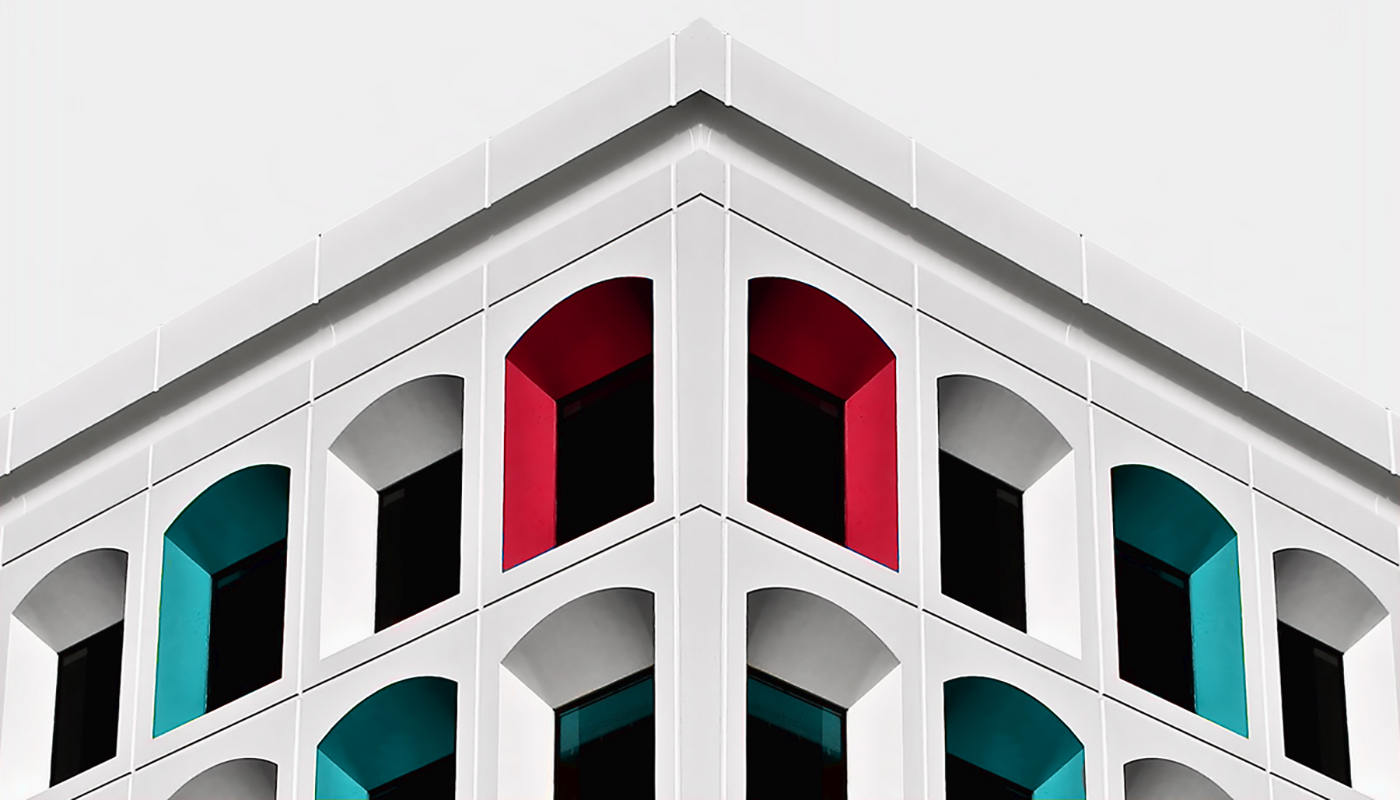
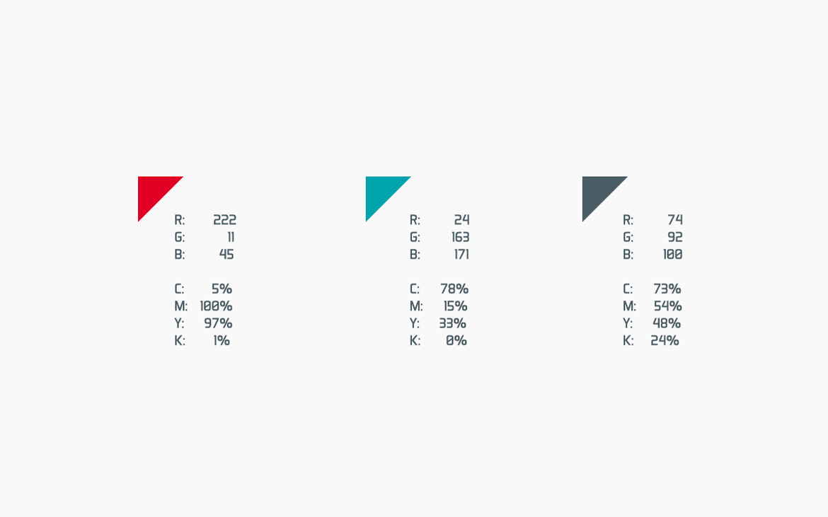
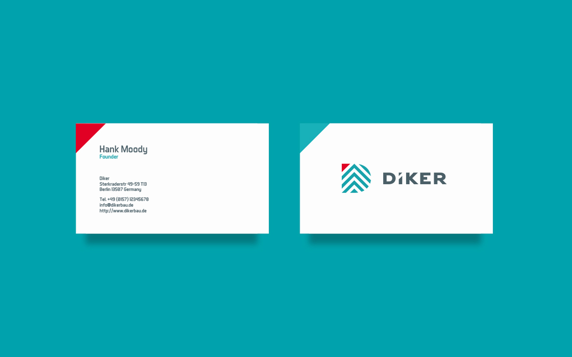
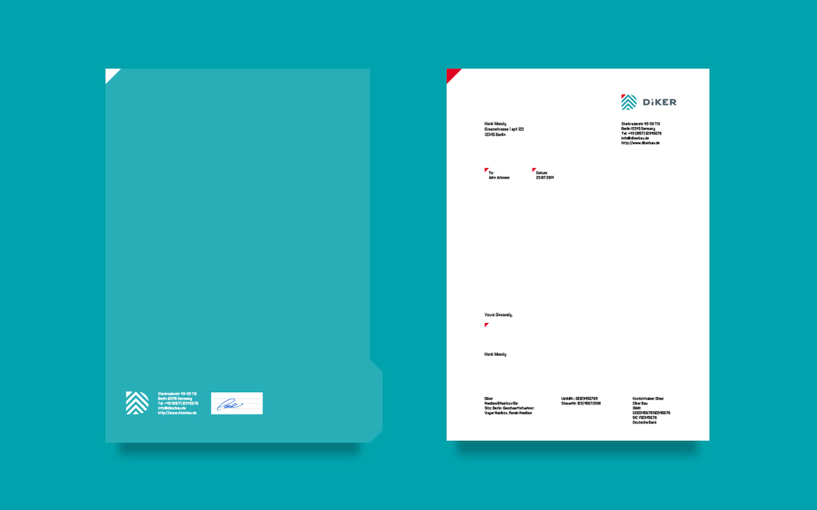
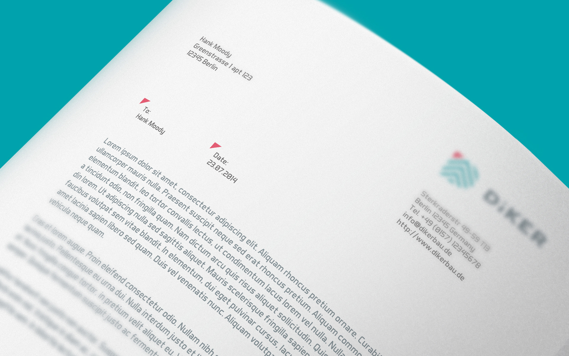
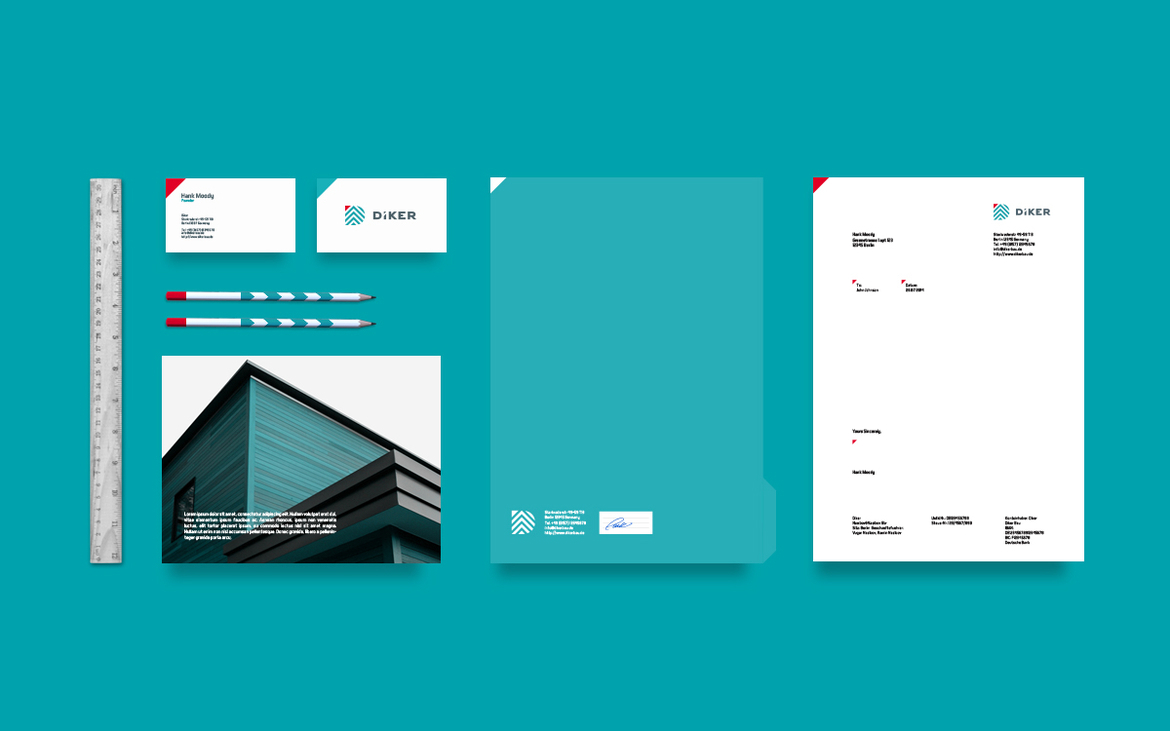
The Big Idea was to target the Construction Industry identity from modern perspective, taking into account the current trends and company's future specialization goals. From the start of the project we decided to use multiple slides of roof symbolizing the direction to high goals "Higher and Higher" . Thanks to the creative integration of the Big Idea into the logo mark it can also be used apart from the Logotype part to identify the brand. The Teal Blue color choice posistions the the direction to the Sky, whereas the Red touch gives the brand the feel of warmth and heat from the sun. The Typeface part harmonically coresponds with the logo mark curves and helps to reach the balance in the whole Logo.
Branding
Client
Diker is a Group of Construction and Architecture+Planning companies based in Berlin, Germany.
Project goals
Develop a Brand Identity, which would indicate the company services along with the specific area the company serves in a modern and edge cutting way.
Creative solution
The Big Idea was to target the Construction Industry identity from modern perspective, taking into account the current trends and company's future specialization goals. From the start of the project we decided to use multiple slides of roof symbolizing the direction to high goals "Higher and Higher" . Thanks to the creative integration of the Big Idea into the logo mark it can also be used apart from the Logotype part to identify the brand. The Teal Blue color choice posistions the the direction to the Sky, whereas the Red touch gives the brand the feel of warmth and heat from the sun. The Typeface part harmonically coresponds with the logo mark curves and helps to reach the balance in the whole Logo.


Thanks for watching and your appreciation!
Visit Me: www.nasibov.me Contact Me: ramin@nasibov.me Follow Me: Facebook


