

Lummi
Mineral Sunscreen with peach fragrance
Personal project, 2023
This project is my submission to the brief challenge made by @briefclub back in August. My concept has been redesigned since.
So who is Lummi?
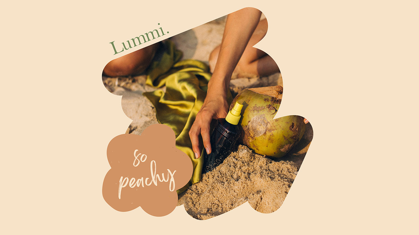
Lummi is a natural sunscreen brand that offers a vegan formula that protects you from damaging UV rays while still nourishing your skin. The mineral-based formula stands as a testament to their commitment to holistic well-being, ensuring robust protection without compromising on skin health.

Our playful yet sophisticated imagery, an artful dance that
invites you into a sunlit world of vitality.
The choice of playful elements in our visual language is akin to a spirited dance—a lively expression that mirrors the joy inherent in a sun-soaked day. From the graceful curves of our logo to the lively patterns that adorn our packaging, every swirl and twirl invites you to join the playful rhythm of nature.
It's a design that doesn't take itself too seriously, inviting a sense of lightness and fun into the often minimalist & serious world of skincare.

Our design palette draws inspiration from the serene beauty of the beach landscape—the lush greenery, golden sands, and the warmth of the sun.
These colours harmonise with our belief in the healing power of nature, creating a visual identity that resonates with our audience's longing for both protection and a pampering experience in itself.


The soothing typography chosen for Lummi whispers a gentle reminder of tranquility, mirroring the calming embrace of a day by the seaside. It's not just letters; it's a visual sigh of relief, an invitation to pause and indulge in self-care.

The development of the branding
In its primal stage, Lummi embraced the beauty of simplicity—clean lines, subtle tones, and a minimalist approach that resonated with purity and clarity. The early design echoed the essence of clean beauty, mirroring the straightforward promise of effective sun protection with a natural touch. This initial simplicity was deliberate, creating a canvas upon which the brand could unfold its visual narrative.
Introducing the brand's symbol, the abstract flower, marked a turning point—a blossoming of creativity and a burst of energy. This emblem, with its playful contours and vibrant hues, injected a new life force into the brand.
The groovy aesthetic that emerged seamlessly integrated with the minimalist roots, creating a captivating harmony of opposites.


