

A B O U T G R A V I T Y T E A M
The crypto natives
Gravity Team is a quantitative cryptocurrency trading company, which entered the crypto scene in 2017, providing trading opportunities, exchanges as well as liquidity. With the rapid growth of blockchain-based technology, Gravity Team started to look for improving their internet presence, wishing to tell the world about their innovative business idea.

H O M E P A G E
Say hello to innovation
Dark tones, a sliding bar with current exchange rates, and a gridded, virtual floor, making a connection to a stock exchange’s trading floor with its animated “ups and downs” – Gravity Team’s homepage sure is unique. Given the fact that it’s a crypto company, our aim was to create a very on-brand welcoming screen, mixing dark colors, which are typical for this industry, with modern gradients and animations. The first of two services offered by Gravity Team to cryptocurrency owners are their growth-oriented market-making opportunities. We went with a 3D-like, animated Hero, an animated chart depicting crypto startup lifecycle, and a highlighted partner showcase.


T I M E L I N E
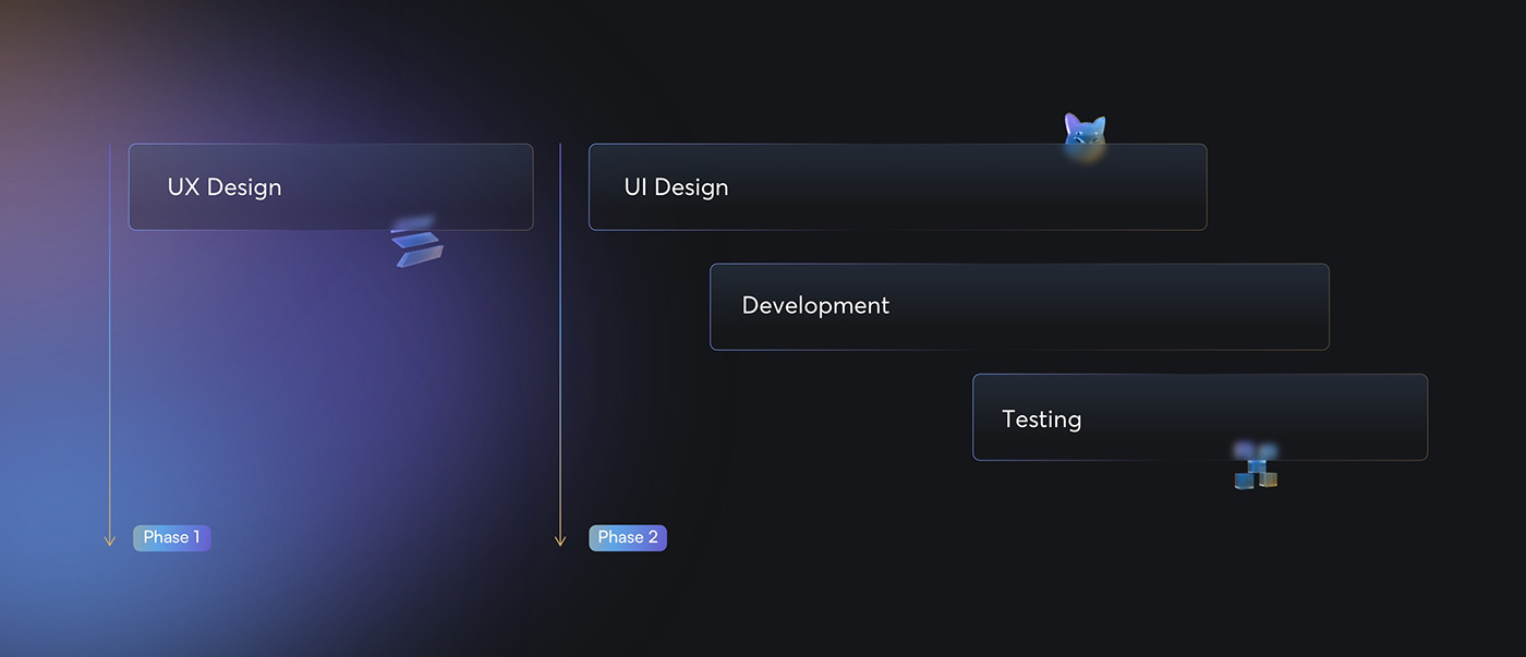
Our way forward
We sat down to create a very no-nonsense plan, which included UX and UI design work, making sure there was space for cooperation between designers and developers coordinating their tasks to save time. Naturally, before Gravity Team could start using their website, we ran several quality-oriented tests to ensure the launch would go smoothly.
C R Y P T O P R O J E C T S
Liquid, virtual gold
Another, entirely different service page. This time, it’s about liquidity for cryptocurrency exchanges. Apart from service descriptions, this page received another great-looking hero animation, as well as a partner testimonials section.


A B O U T U S &. S E R V I C E S P A G E S
More pages, more fun
The Services page is a hub-type of subpage, which showcase Gravity Team’s offer and presents their services on one, easy-to-use page. It was also a great idea in terms of Search Engine Optimization (SEO), the aim of which was to elevate the company’s discoverability. Visible on the right is the About page, on which the most noticeable thing is the frequent use of the on-brand gradients and blurs, which are a part of the brand identity we designed.


B R A N D I N G
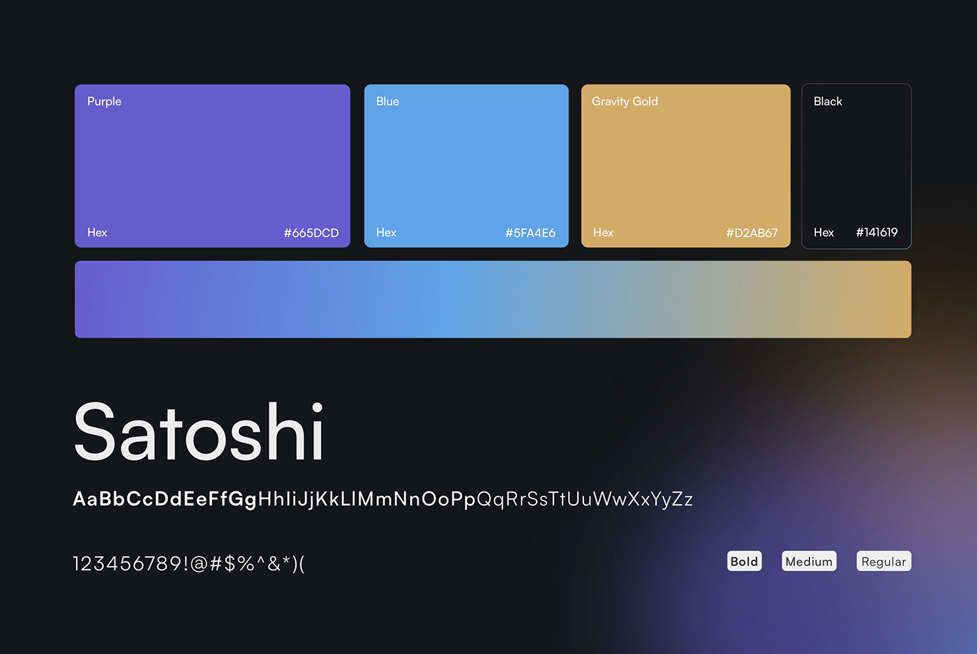
The crypto theme
The generally dark ambiance of the site is nicely balanced thanks to blue and gold gradients and blurs. These are a feature of many modern and innovative websites, which is very on-brand with the general perception of what can be called the “crypto theme”. It’s a real heaven for fans of dark mode, by the way!
Nicely befitting a website about cryptocurrency markets, the font used here is Satoshi, a perfectly straightforward, nearly-geometrical sans serif typeface that fits well with just about any modern and innovative subject.
T E A M
The superheroes behind it all
Modern, responsive websites come out best (and on time) when there’s cooperation. And one couldn’t dream of a team more competent and cooperative than these fine minds below.

Thanks for watching!
Adchitects is a leading product & web design agency based in Europe.
Let’s shape & build your next digital product together:
Message us at hello@adchitects.co or visit our website
Copyright (C) 2023 Adchitects

