
Echo
Conference Graphics
THE CHALLENGE
When I was told the theme of this conference, ECHO, I knew it would be a challenging but exciting project to tackle. The main obstacle instantly became clear: how do I visually represent a concept of sound? The conference directors also shared that a conference motif would be the idea of a message moving from here out into the rest of the world. The logo mark would have to communicate a lot of big ideas.
On top of that, the logo would have to be easily applied to many different mediums (posters, banners, screens, t-shirts, schedules, social media, etc.), so it had to be contained and recognizable.
THE SOLUTION
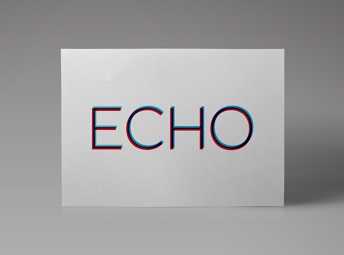
I began experimenting optical illusions to trick the eye into seeing movement in a static image. It can be difficult create effective optical illusions in a small, contained space, though, so I tested different patterns of simple shapes to contain the movement of the logo mark.


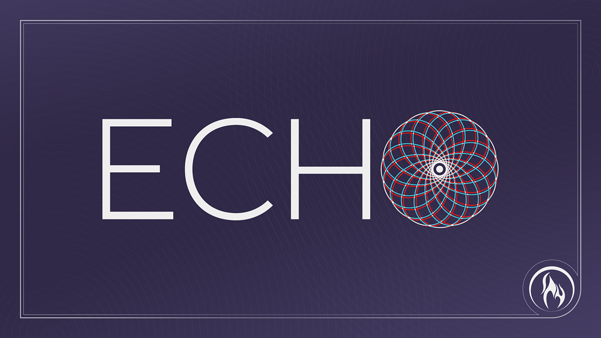
THE LOGO
Anaglyph colors are utilized to create the illusion of movement while the repeated oval pattern draws they eye outward from a the focal point.

THE COLOR SCHEME
The anaglyph colors allowed the use of three distinct and strong colors throughout the conference while not straying from a cohesive color concept. A potential limitation of the logo mark was the fact that it was most effective when applied against a dark purple background, so modifications were necessary to work against white when necessary.

TYPOGRAPHY


Inspiration Everywhere
jeremy.t.hamann@gmail.com


