


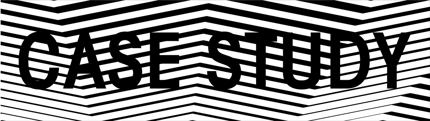
Case Study: One And The Same visualizer
I was commissioned by I-CUE of Ingenious Music, to create a captivating visualizer and thumbnail image for a project called One And The Same. The song was produced for a "beat flip" contest with a "90s sitcom" theme.
This is the case study.
Scroll past the full video for full creative break down.
Let's get into the process!
I-CUE decided to use Twin Peaks as his 90s TV Show "sample flip" subject.
Twin Peaks was a show created by David Lynch & Mark Frost,
and featured a musical score by Angelo Badalamenti.
When I considered the aesthetic for the visualizer,
I was aware that Twin Peaks had a very distinct visual language comprised of elements from dream sequences, local businesses, and the woodsy, logging, mountain region in which the show was based.
Most visually striking, in my opinion,
was a recurring Red Room within The Black Lodge.
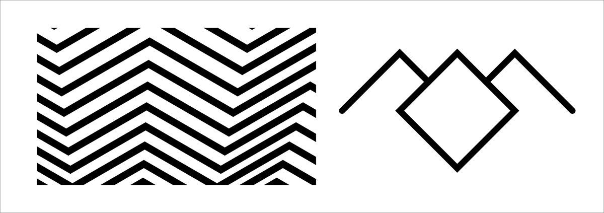
Using text to vector in Adobe Illustrator,
I created a number of images and patterns based on the Twin Peaks aesthetic and settled on these as a style reference for the visualizer.


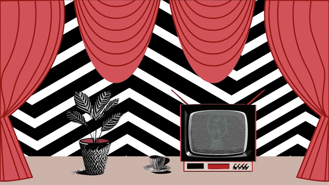
RED ROOM deep dive!
Definitely needed red curtains and a clean zig zag pattern.
In Adobe Illustrator, I used the pen tool, some simple shapes, and applied the zig zag effect and pathfinder palette options.
The curtains were also made with pen tool,
using very basic lines, curves, and copy/pastes.

Also in Adobe Illustrator, I used text to vector
and described (separately) a tv, plant, and coffee cup.

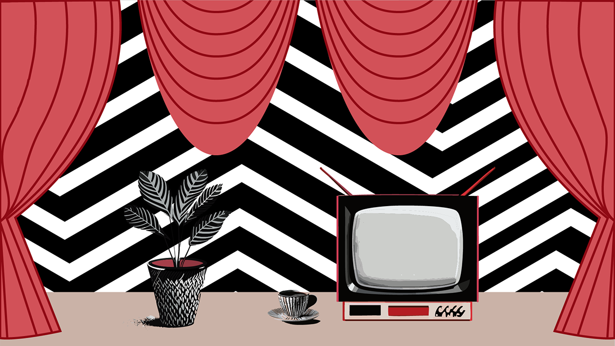
This will be the image for the majority of the visualizer and the TV screen was used to mask in video clips, graphics and static noise.
For typography, I checked some popular fan sites and found
ITC Avant Garde Gothic Demi Condensed.
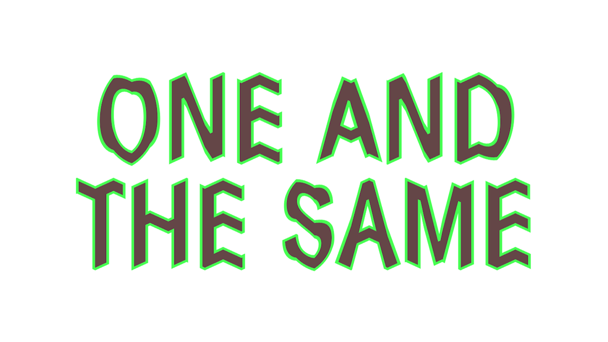
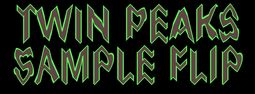
Since i knew i wanted the text to have some animation, I typed out the title in Adobe After Effects.

And of course added a brown fill and lime green stroke, recreating the Twin Peaks character style treatment.
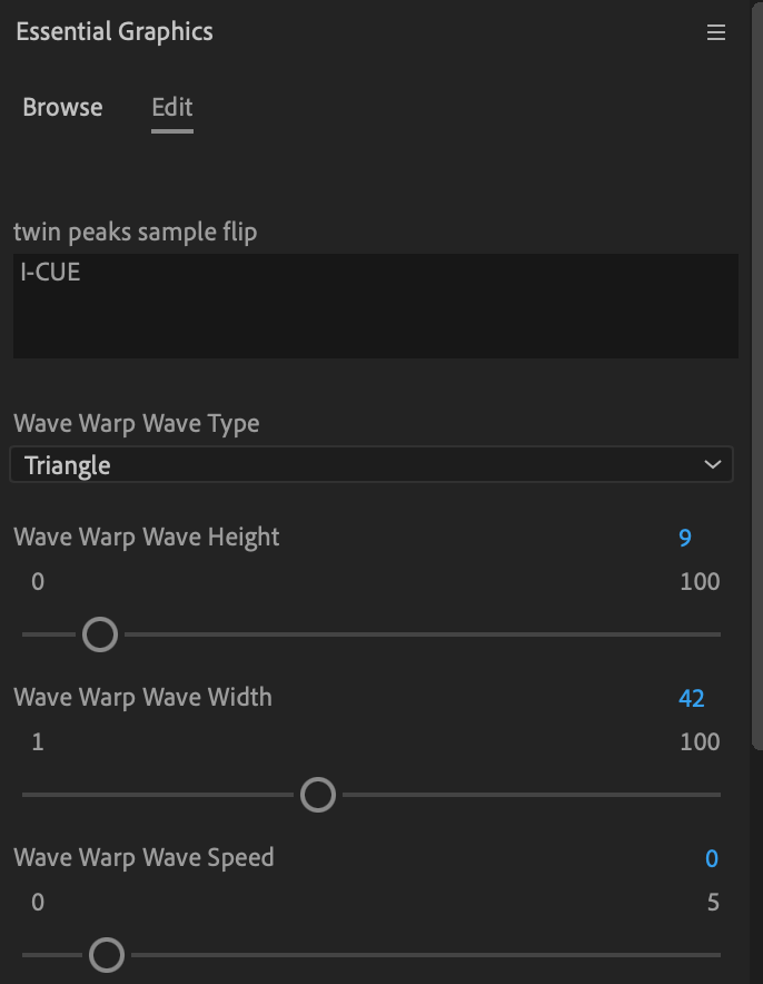
These titles were then Wave Warped in After Effects for a zig zag shape appearance.
I saved this warped text treatment as a MOGRT (motion graphics template), and used it in Adobe Premiere Pro when I assembled the final video.
That MOGRT was applied to all titles in an Adobe Premiere Pro sequence, with these settings:
Once all these separate assets were created, I captured screen recordings of
Twin Peaks clips on YouTube and masked them on to the tv screen in the red room scene.
I chose some key moments to splice in and slowed most of the footage down for a dreamy retrospective vibe.

The Ingenious Music logo was also masked on to the screen as "the man from another place" repeats the word coffee, over and over again.
I added warp effects to heavily distort the logo over time,
applied a noise filter, and overlayed a white noise video from Adobe Stock.
The clips that followed were synced up with samples taken for use in the music.

These were used at regular speed and give the feeling of being in the "now".
As the last of the vocals fade, the familiar title treatment is used on 3 successive screens and on beat, emphasizing the final bars of the music.
Once the video was edited, I created versions of the thumbnail images in 1x1 and 16x9 ratios.


And that's what Twin Peakers call, "wrapped in plastic!"
One And The Same by I-Cue
For more of my work please visit http://sergemilstein.com


