Background
According to McKinsey research, about 20% of the company’s profits can come from loyalty programs alone. This is in-line with MW’s goal of increasing customer loyalty, so customers will shop more and stay engaged with the products.
Because of this, we need to make sure that this loyalty program is usable and therefore delivers a delightful experience.
A delightful experience can be best achieved with streamlined workflows and reduced pain points. It simply means designing a product that works as expected (or better), and meets user needs at the right time and place (Source: A Theory of User Delight - NNGroup).
However, there are currently several problems regarding loyalty program in the existing MachtWatch's website that I will cover in next section.
Problems
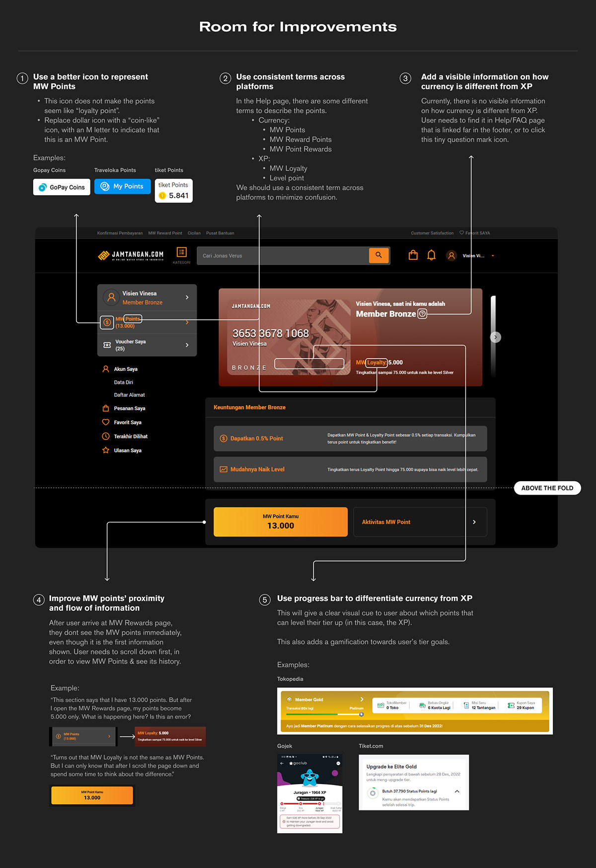
▪ Majority of users don’t know the difference between MW Points and level points
▪ User has false information on how to increase member tier (they thought it’s by increasing currency points (MW Points)).
▪ Because they have false information, they have no idea how to add up level points versus MW points.
Objectives
Design a solution where members can:
▪ Differentiate between MW Poins vs Level Points
▪ Track tier status and goals
▪ See Level points earned
▪ See MW points earned
▪ Increase member tier
▪ Redeem rewards
▪ Track tier status and goals
▪ See Level points earned
▪ See MW points earned
▪ Increase member tier
▪ Redeem rewards
From now on, I will use the term "currency" to refer to MW Points, since MW Points act as a currency and is able to be exchanged with goods, and "XP" or "experience" to refer to MW Loyalty/Level Points since Level points act as an experience points to level up member's tier level.
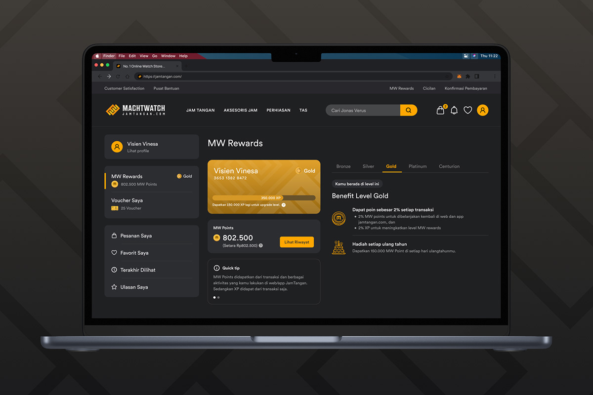
Evaluating Existing Designs
Before I start redesigning, I first evaluate what is already done on the website and see where to improve.
I base these arguments by using secondary research on platforms that are mostly used by Indonesian people regardless of socioeconomic status, which are: Gojek, Grab, Traveloka, Tiket, and Tokopedia, and some from my own design rationale.
Wireframes
Based on the above evaluation, I designed wireframes as a solution to the problems. Using wireframe, I could arrange the flow of information and do explorations quickly.
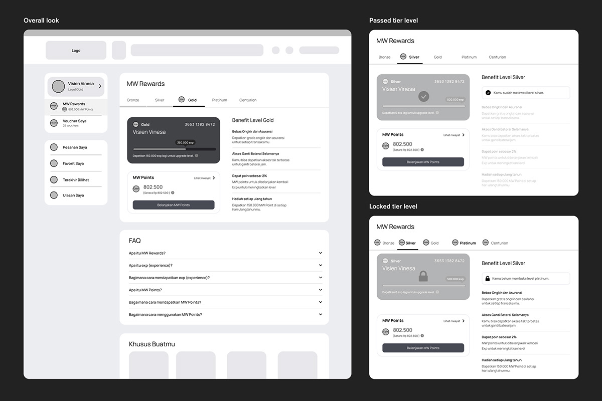
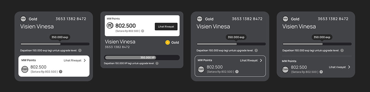
Exploration on the tier cards' flow of information.
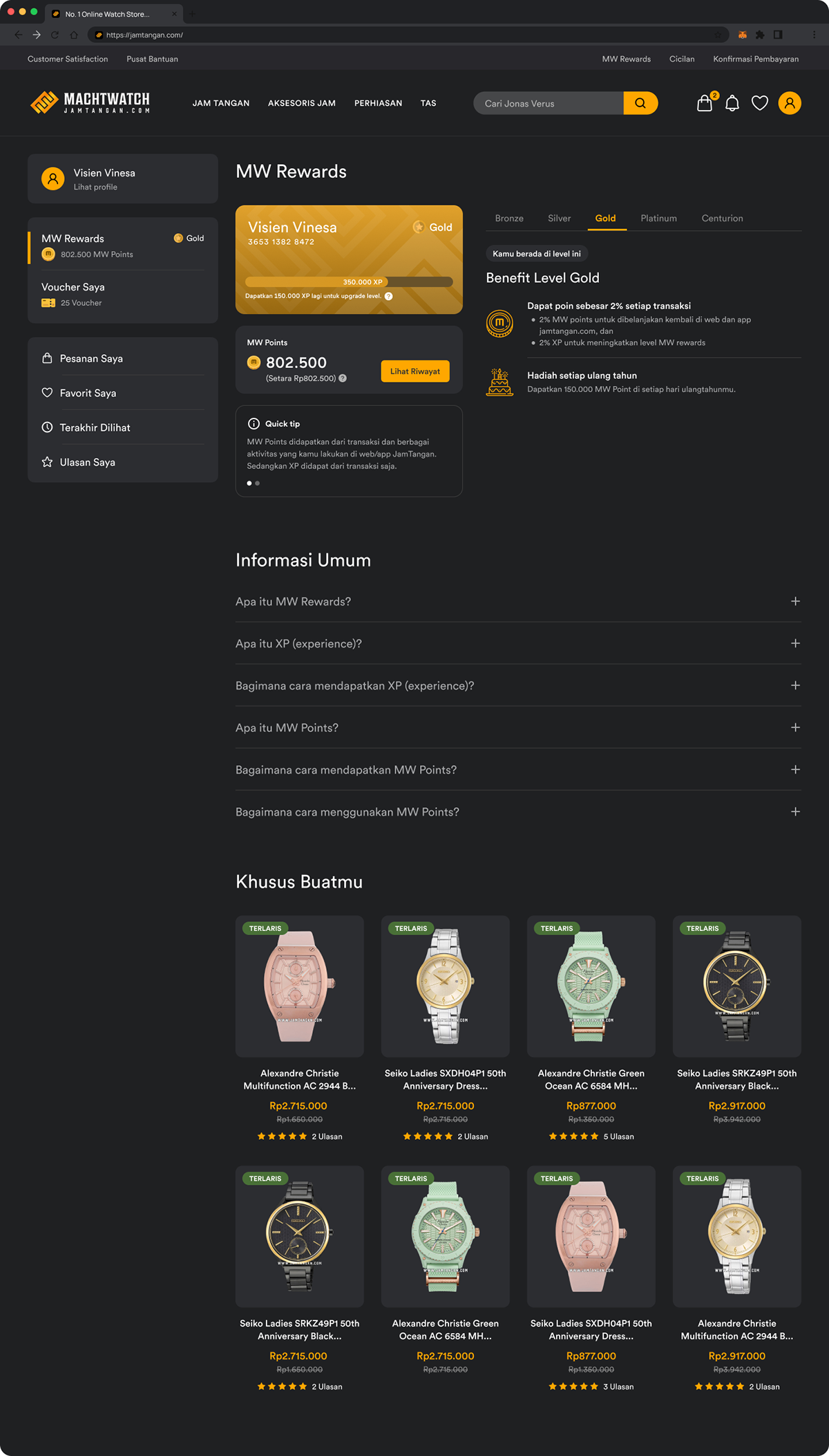
Final Design
After I finished the wireframes, I began to create the high-fidelity designs, together with prototypes.
Improvements
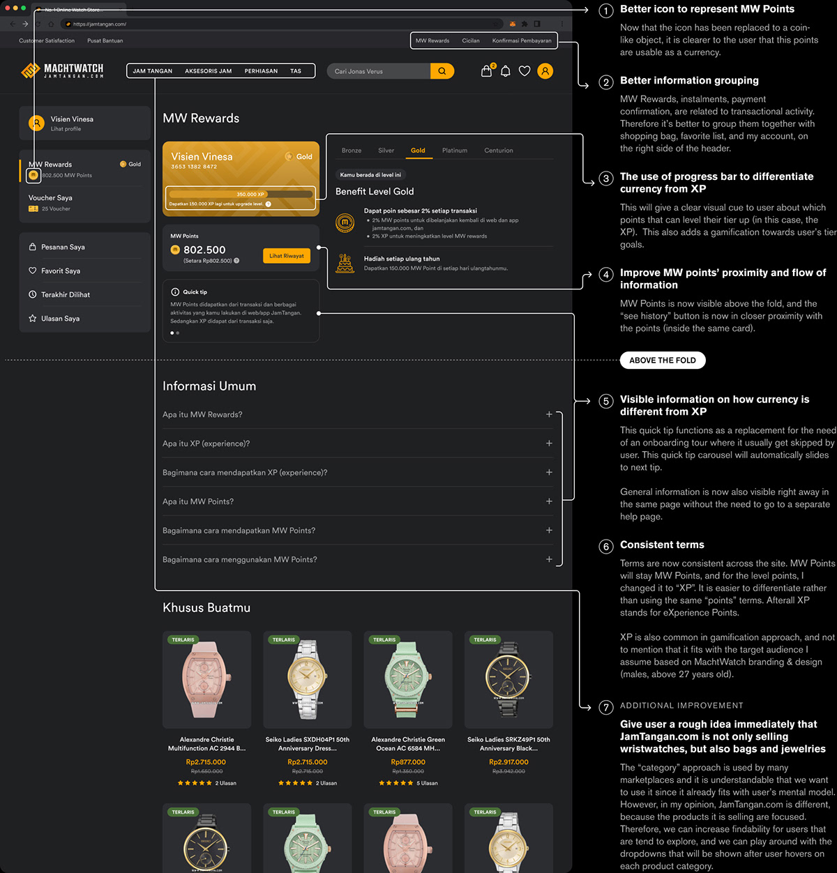
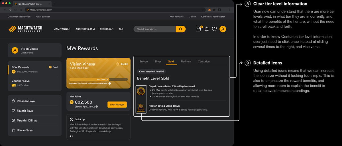
Different Tier States
Click to enlarge and view the design in detail.


Prototype
End Note
Working on this design challenge was an interesting one since I rarely design an interface that has dark predominant colors. Also, looking at those wristwatches makes me want one too!
If this challenge was a real case, the next steps would be to conduct a usability testing and make improvements based on the result. Then, we can roll the changes out by using A/B testing to gather some insights on whether this approach solves users' problems.
Hopefully, this challenge result will demonstrate my abilities in solving UX problems, as well as in articulating my design decisions. Thank you for your time and attention.
