Information Architecture-
Process and Procedure Project
Process and Procedure Project
Layout Design

Above, these mock layouts created in Figma served as guides for structuring my Process and Procedures document. It describes a clear hierarchy and a simplistic page that shouldn't have too much text. This makes it easier for the user to scan the document for what they're looking for.
First Renditions


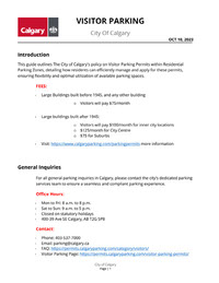
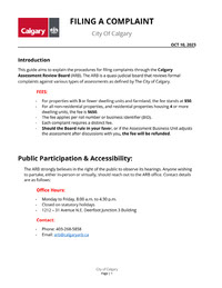
In my first rendition for my process document, I incorporated essential Gestalt principles. I grouped pertinent details through proximity, and the white background with contrasting content, occasionally highlighted by the Calgary logo, embodies the figure-ground relationship. The document's systematic structure is a testament to the principles of symmetry and order, promoting ease of comprehension for readers.


For my first rendition of my procedure document, I aimed to make intricate parking rules both user-friendly and efficient. I established a clear visual hierarchy using varied font sizes and weights, ensuring intuitive navigation. I refined the core content for clarity and brevity. The information was organized into distinct sections: Introduction, Policy Guidelines, Online Visitor Permits, and FAQs for easy access. I integrated the City of Calgary's emblem for authenticity and employed visual cues to enhance trust. A user-centric approach guided my inclusion of clear instructions for tasks like account setup and permit management. A cohesive color palette aligned with the City's branding was chosen to reduce distractions and heighten focus. Accessibility was a priority; hence the document uses jargon-free language and readable fonts. Additionally, an "FAQs and Troubleshooting" section addresses potential queries and provides a feedback mechanism. In essence, this project reflects my dedication to human-centered design and my belief in design's ability to clarify and streamline information for all.
User Testing


During the user testing of my portfolio, participants highlighted the need for improved alignment between text and visual elements. It was suggested to simplify the language even further for better accessibility and to avoid dense text blocks. The presentation of "Visitor Parking" and "MyParking" sections required further clarity, calling for a clearer hierarchy throughout the content. Additionally, feedback pointed towards refining the use of bullet points, reducing image clutter, and considering the potential for a more intuitive content structure.
Final Design


