Cardinal Heifer is a small, quaint pub that sports the palpable age and atmosphere of the Edwardian era in the heart of London’s West End that was in need of a new brand identity.
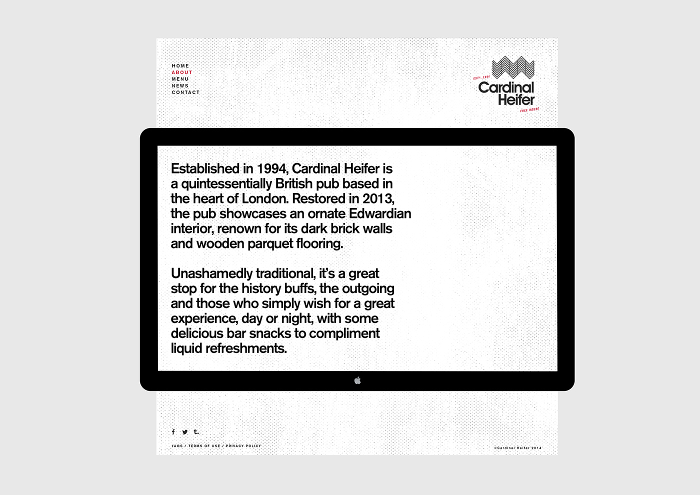
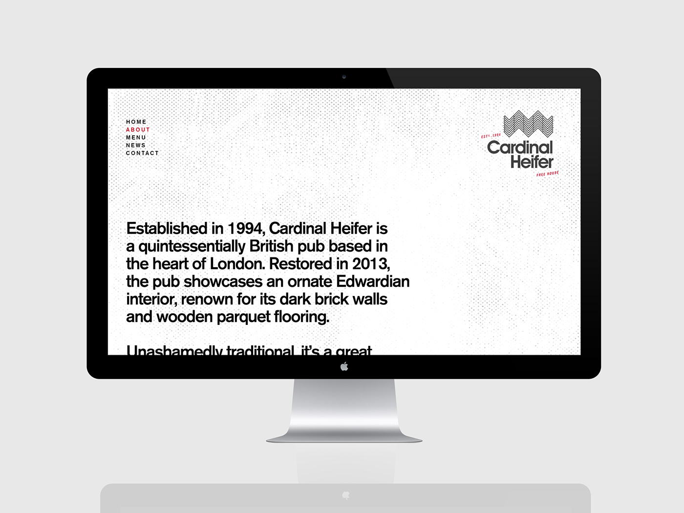
Cardinal Heifer is an Edwardian terrace, which was converted into a pub in 1994, oozing history and boasting decor pertinent to its era; with a cozy warren of hidden rooms, tight corridors, dark brick walls and wooden parquet flooring. Although a slight facelift in 2013, the pub still holds much of its “ye olde” authentic feel and character, twinned with modern standards, that is still beautifully maintained after the builders moved in to refurbish.
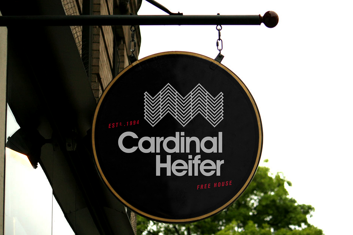
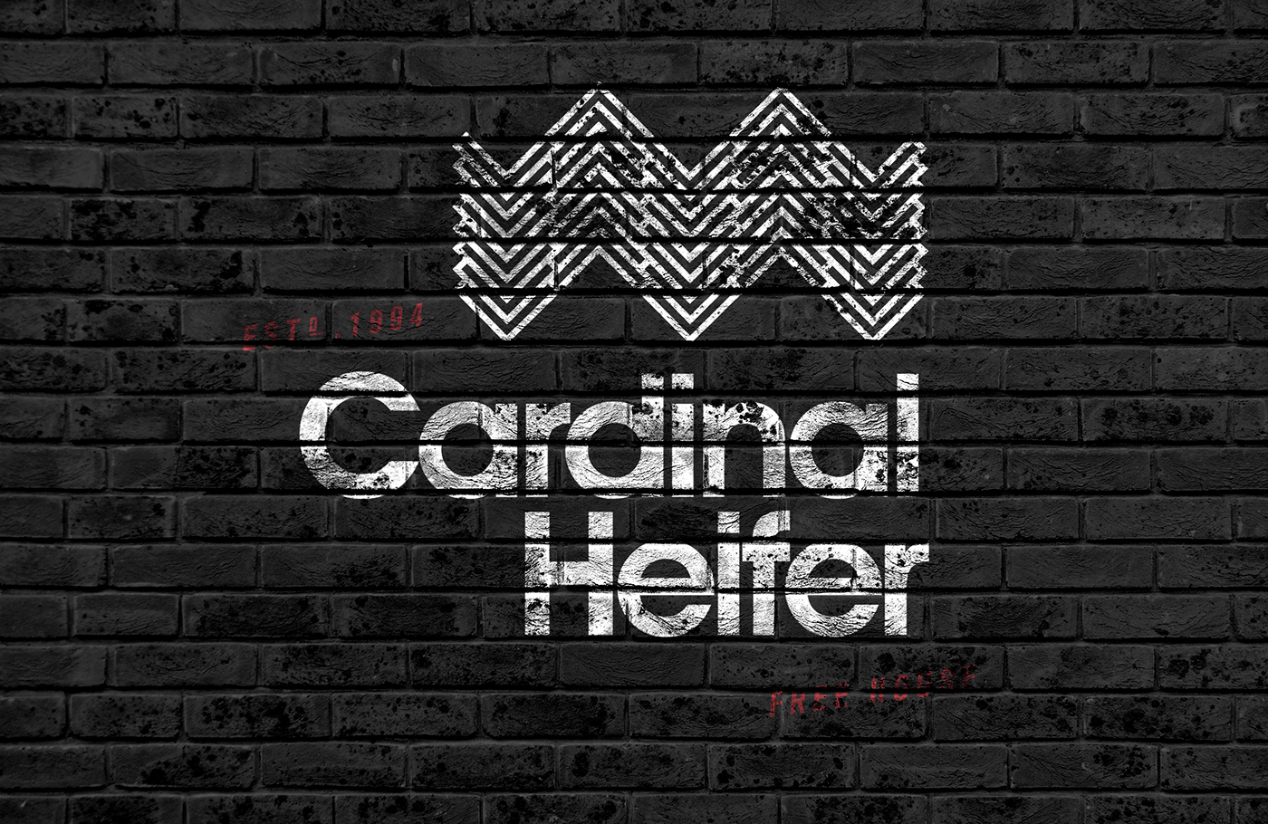

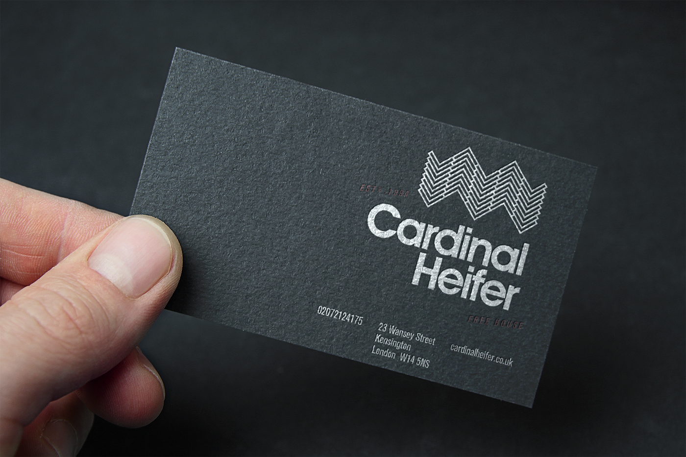

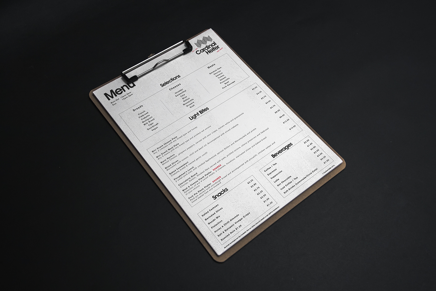
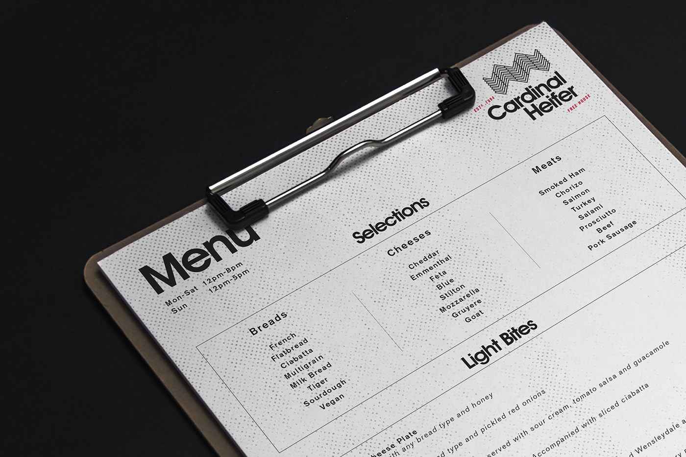
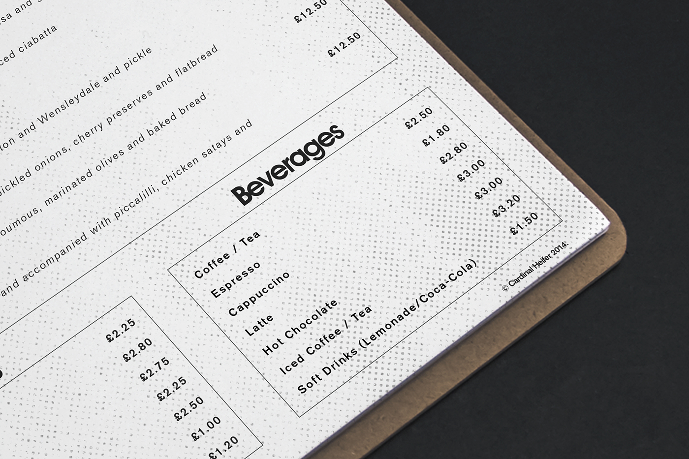
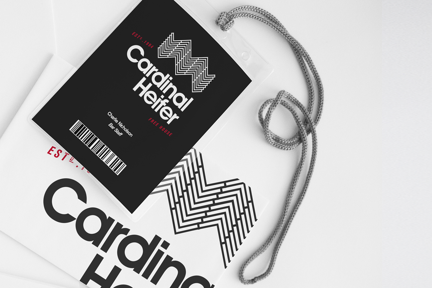
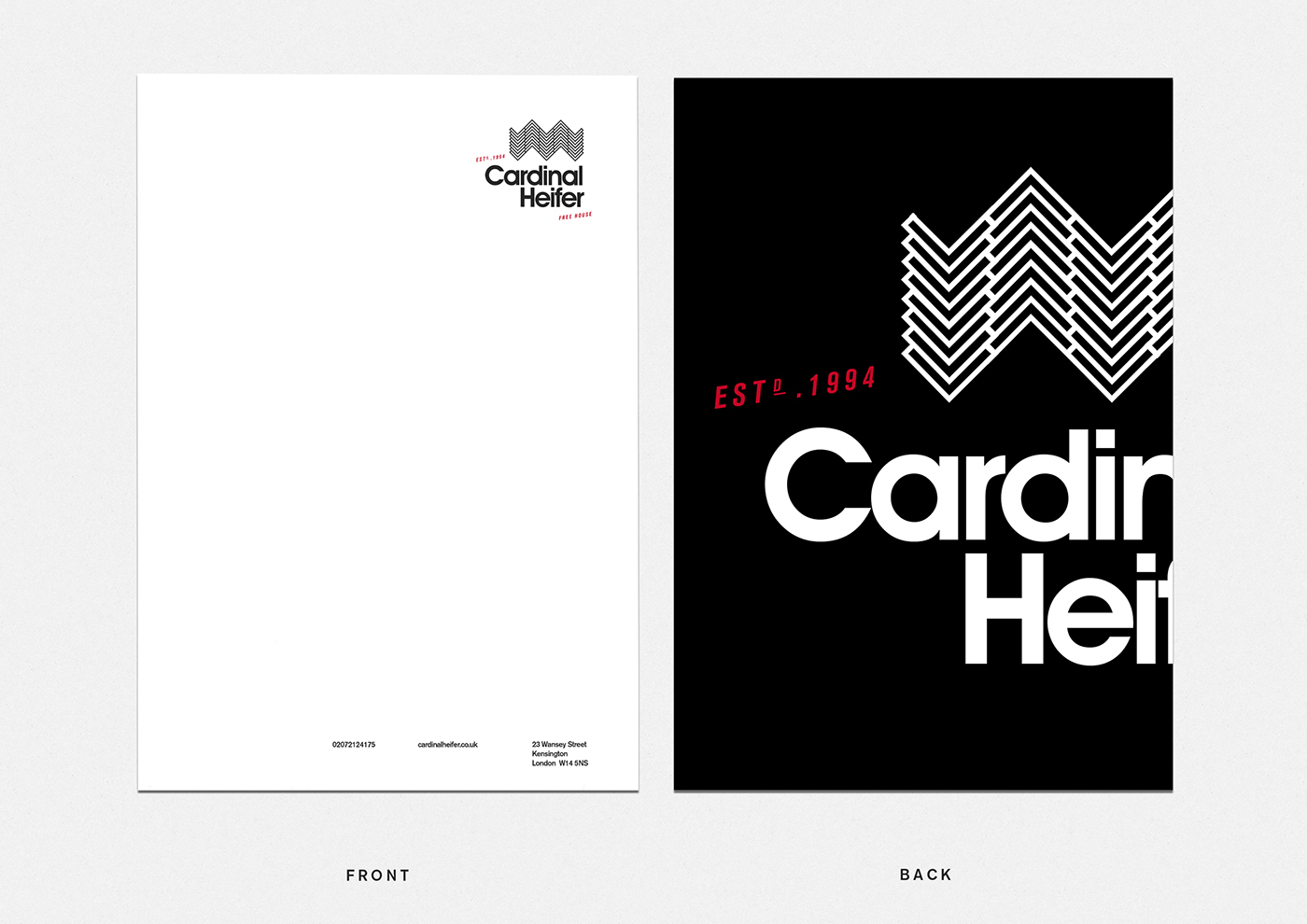
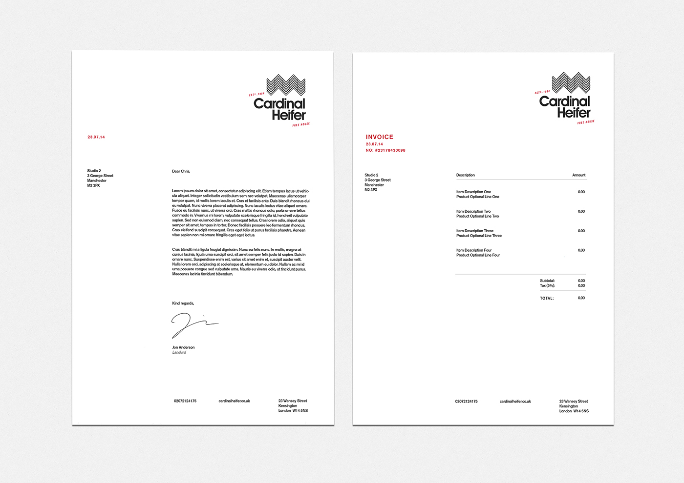
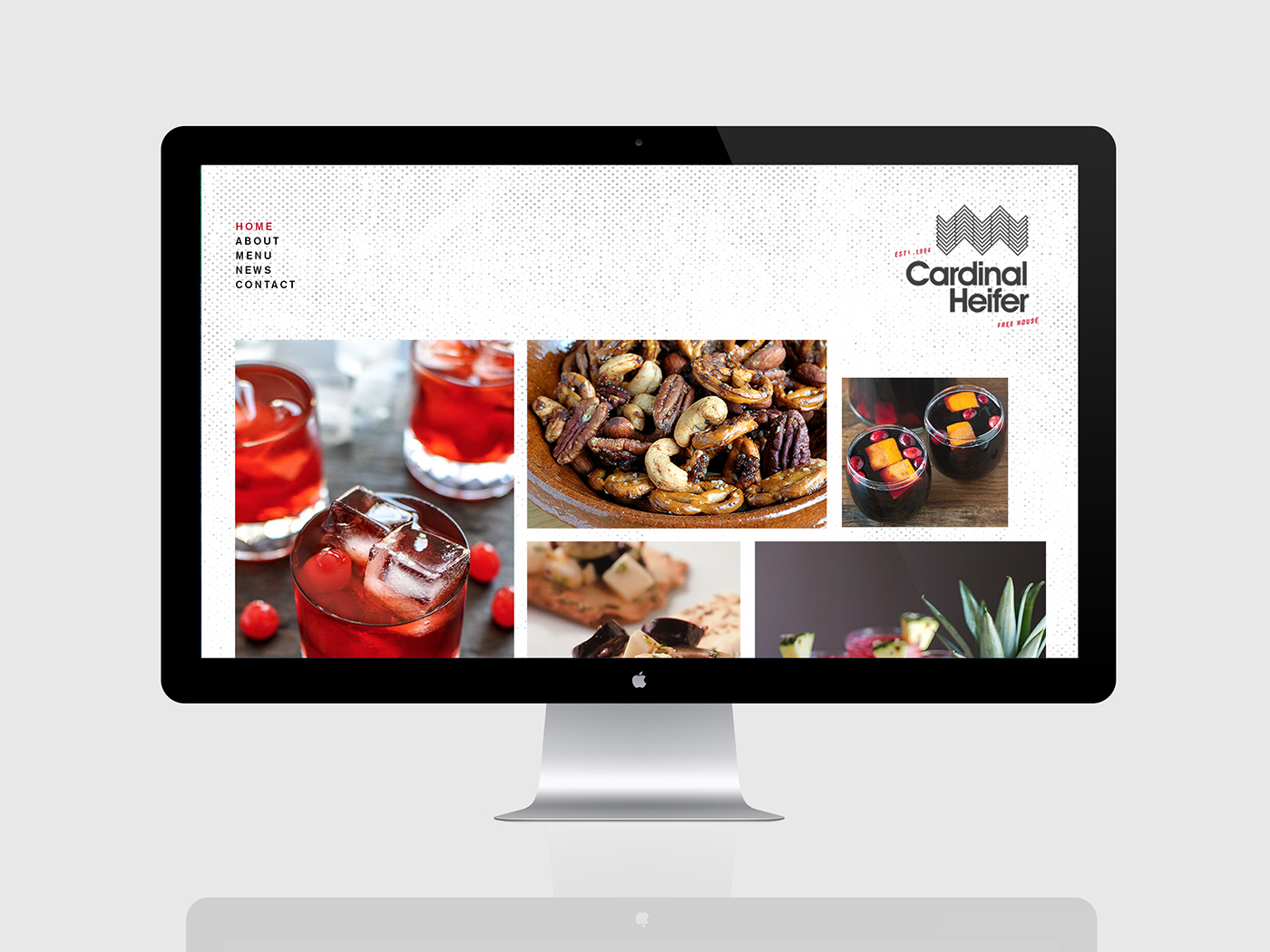
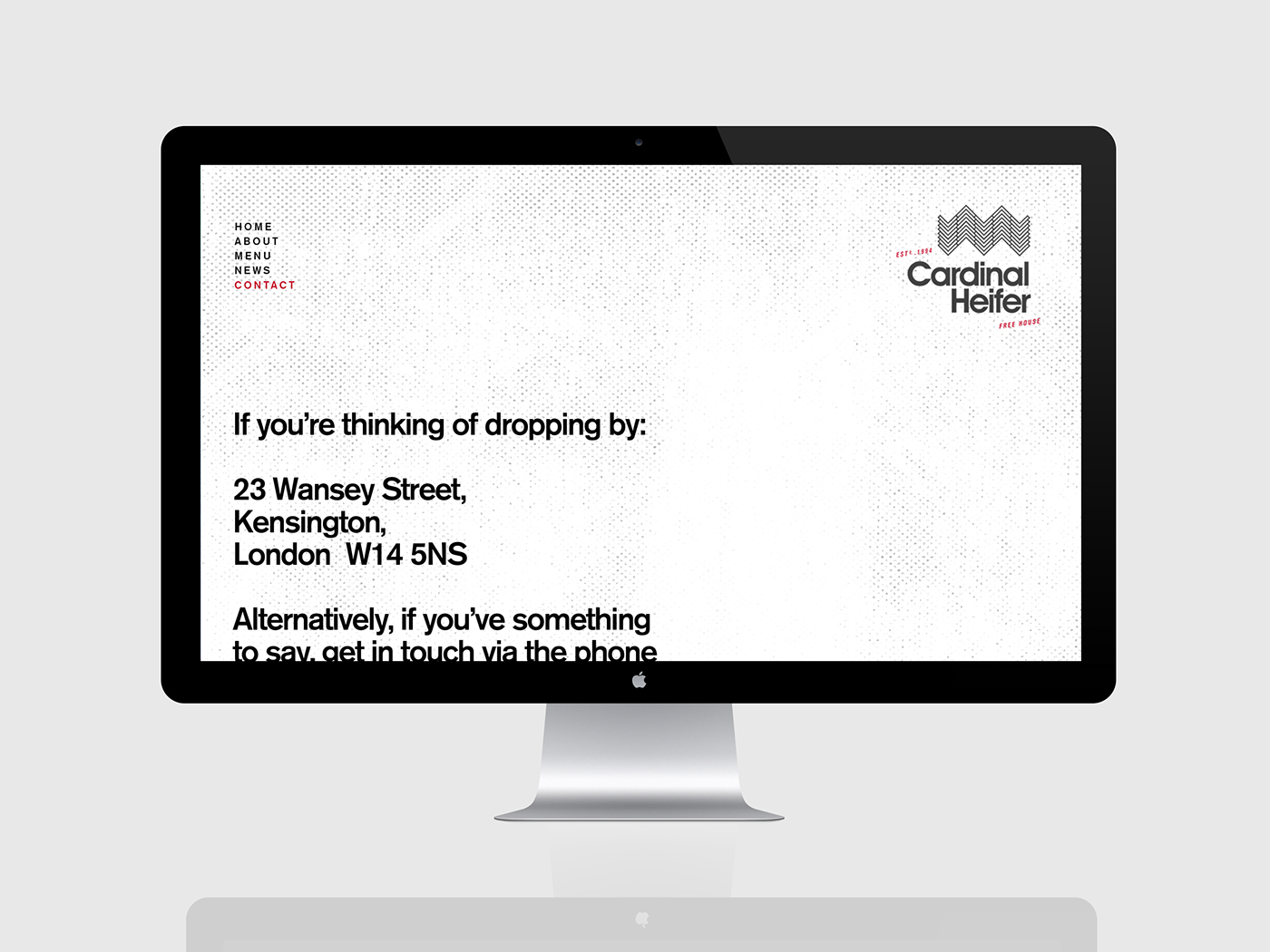
Aiming to reflect the pub’s unique blend of historical and modern charm, the logo mark incorporates a parquet floor style as well as a formation of terraced rooftops - an identity that is sympathetic to its building, with an element of a Cardinal red in homage to the pub’s given name. This brand identity is extended from menus to signage to website design.