


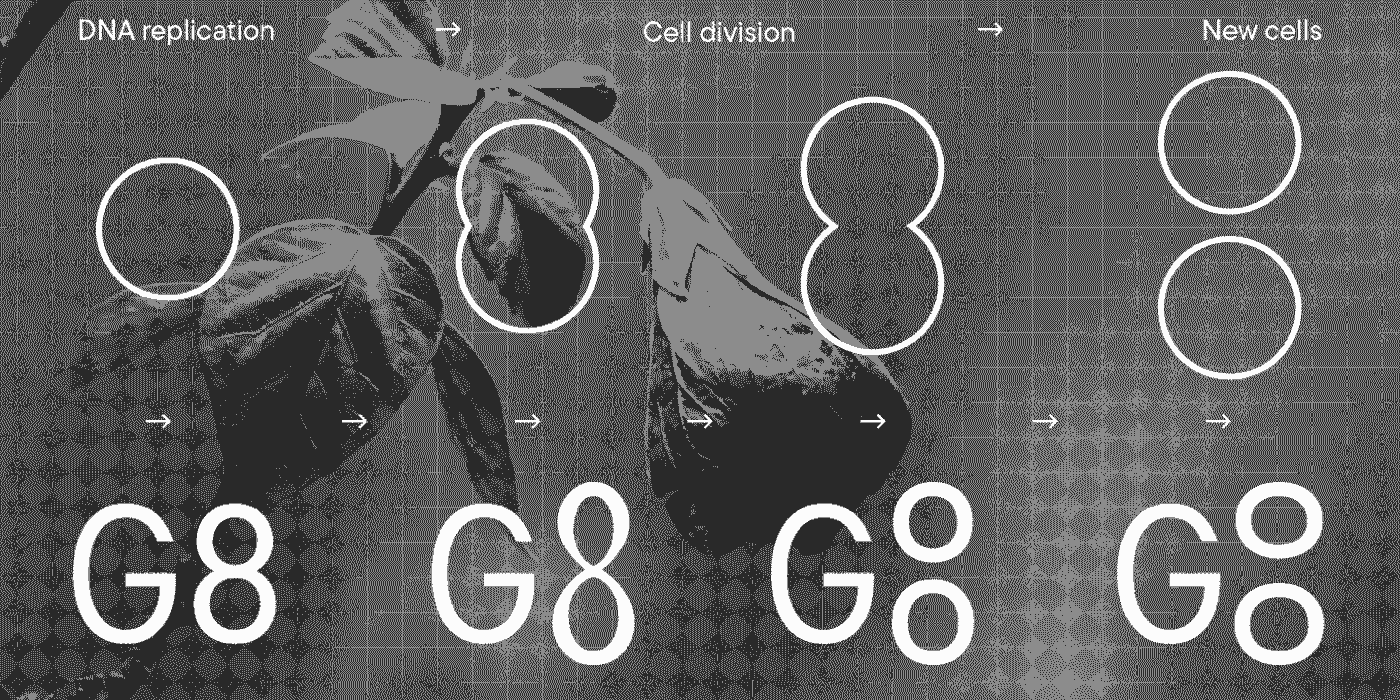
Creative industries Festival G8 has presented its 2022 visual identity. The associations that immediately come to mind are the unity of nature and people, cell division, and organics.
The «grow and divide» principle was guiding the creation of the corporate visual identity created by a large team. The font design studio TypeType is one of the participants in the creative process of making the font and logo.
As noted by the organizers of G8, the «grow and divide» principle guiding the visual identics is also reflected in the new logo. It will change for the whole duration of the festival, growing, dividing, and becoming one whole entity again.
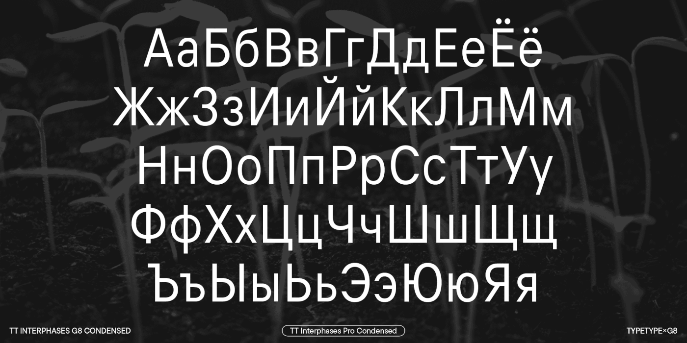
The team shared the idea to design all festival communications as experimental notes taken by scientists. We wanted to sustain this thought in typography. Selecting a font, we tried conveying an image of scientists describing the results of their experiments. We wanted to choose a font that would transmit the idea without attracting too much attention to itself. We were looking for a reasonably neutral font that would not be too ostentatious.
We were inspired by the fonts Cyrillized in the 80s and 90s with their «strange» Cyrillics that a modern onlooker is unfamiliar with. The studio’s TT Interphases was chosen as the basic font, and we selectively changed some of the glyphs so that the set would gain its slightly messy, quirky flair, bringing about the right associations.
Taking part in the G8 creative process was a great experience and thousands of participants and viewers can evaluate the results. We were happy to support the project on a not for profit basis.
Participants:
G8 festival organizer—Vitaly Bykov
Project art director—Denis Bashev
Head project designers—Easy Digital Agency
Corporate font and logo provider—TypeType


