


Typeface design
Abbiamo progettato il carattere tipografico rendendolo coerente al nome attraverso forme che danno l’idea di qualcosa di solido, forte, autorevole.
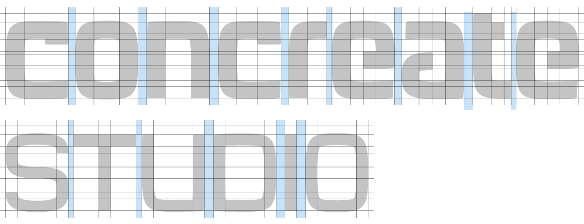
La scelta è stata condizionata anche dalla volontà di renderlo moderno e originale, quindi siamo partiti disegnando un font sans serif (senza grazie) che risultasse “solido”, l’abbiamo reso “grintoso” con accorgimenti come il terminale della “c”, e moderno, creativo e maggiormente distinguibile, attraverso la mancaza delle parti che chiudono la “e” e la “a”. Quest’ultima operazione è servita anche ad alleggerire la parte destra del nome il cui peso risultava altrimenti eccessivo.
La scelta del minuscolo è stata fatta per renderlo più leggibile e più interessante graficamente.
Per la parola “studio” abbiamo creato una versione più “leggera” dello stesso carattere ed abbiamo usato il maiuscolo per dividerla visivamente dalla parola precedente e per darle una diversa importanza.
We designed the typeface in order to make it consistent with the name through forms which give the idea of something solid, strong, authoritative.
The choice has been influenced by the fact that we also wanted to make it modern and original, so we began designing a font sans serif which could prove to be “solid”, we made it “bold” through some devices like the “c” ending, and modern, imaginative and mainly distinguishable through the lack of the parts that close the “e” and the “a”. This last procedure has also been usefull to lighten the part on the right of the name, whose weight could otherwise result excessive.
The choice of the lower case letters was to make it more readable and graphically more interessant.
For the word “studio” we created a “lighter” version of the same typeface and we used the capital letters in order to separate it optically from the preceding word and to give it a different importance.
Symbol design
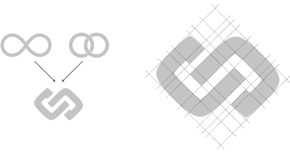
L’ideogramma vuole suggerire dinamicità (attraverso una rotazione), creatività (richiamando il simbolo dell’infinito) e fiducia (che viene suscitata attraverso una scelta simbolica che ricorda una catena o le due fedi del matrimonio).
Per renderlo coerente con il resto del logo è stato creato utilizzando le stesse caratteristiche del testo.
Per renderlo coerente con il resto del logo è stato creato utilizzando le stesse caratteristiche del testo.
The ideograph wants to suggest dynamism (thanks to the rotation), creativity (thanks to the symbol of the infinite) and confidence (conveyed by the choice of a symbol that recalls a chain or the two wedding rings).
In order to make it consistent with the rest of the logo design it has been created using the same characteristics of the text.
In order to make it consistent with the rest of the logo design it has been created using the same characteristics of the text.
Logo design
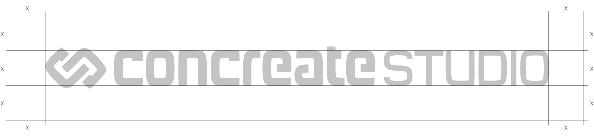
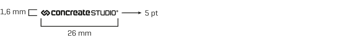
x = distanza minima da mantenere da altri elementi grafici.
x= minimal distance to be kept from other graphic elements.
Colours
Il colore principale è un rosso scuro vicino al bordeaux che nel nostro contesto risulta particolarmente elegante, a cui affianchiamo solo colori neutri che lo valorizzino.
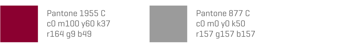
The main color is a dark red, similar to the bordeaux, which results particularly elegant in our context. We then flank only neutral colors, which can value it.
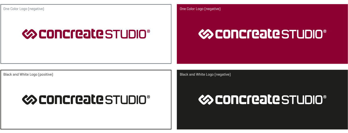
Colour combinatons
Minimal dimension
Font to be used

Branding
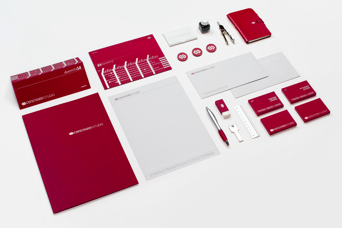

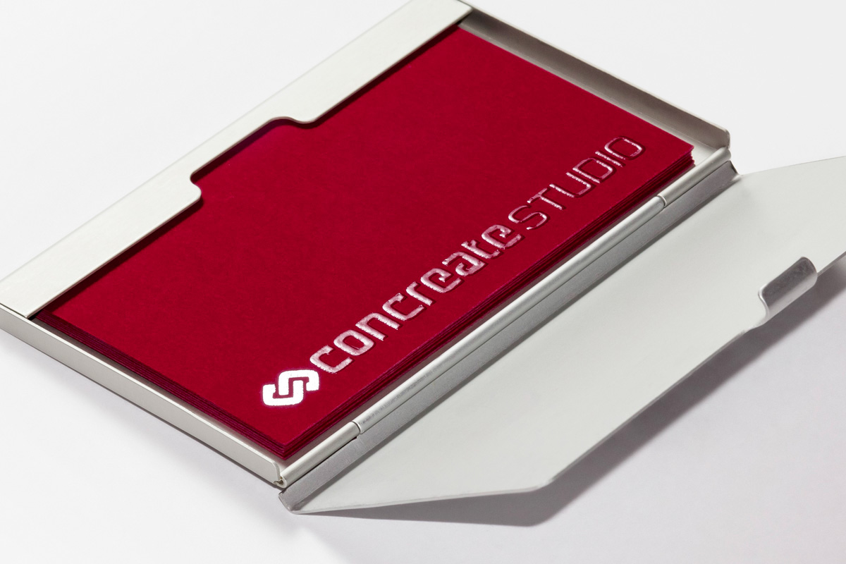
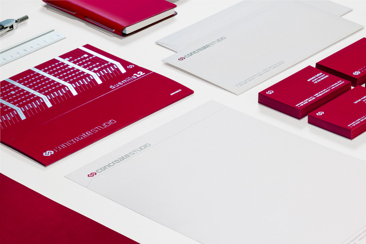
I calendari da tavolo ed i biglietti da visita sono stampati fronte e retro su una carta di un intenso colore bordeaux (Favini The Tube Ketchup, 340 gr.) particolarmente gradevole al tatto. La stampa serigrafica con inchiostro argento effetto specchio e vernice spessorata cre un’interessate gioco di riflessi e contrasti.
Table calendars and business cards has been printed back and front on a bordeaux colored paper (Favini The Tube Ketchup, 340 gr.) particularly pleasant in the touch. A silk-screen print with a silver mirror effect ink and deeper paint create an interesting game of reflections and contrasts.
Our studio


