About brand:
Stretch studio in Japan, Tokyo The stretching studio was founded by a Russian-speaking girl in Tokyo, Japan. The mission of the brand is to help people to be physically active, to make the body more mobile and flexible. The value of the brand is balanced to pierce the muscles and relax them to stretch.
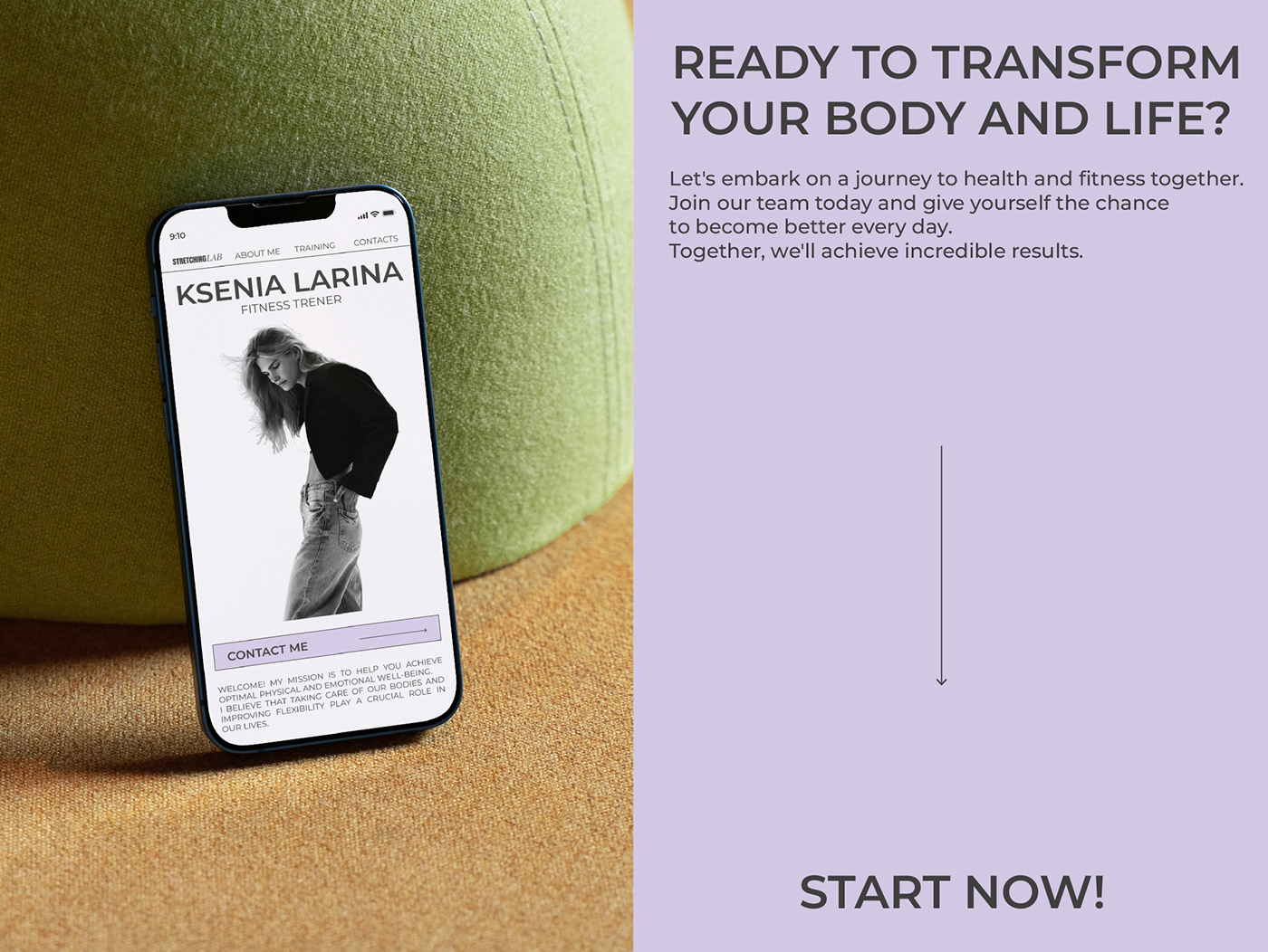
Task:
My task was to create a corporate identity. The choice of colors is ideal for this brand. The combination of delicate purple with black and gray looks harmonious. The niche works with both girls and men.
The logo combines two typefaces: grotesque and antique italic. "STRETCHING" represents male strength, while "LAB" embodies female flexibility. The line at the bottom symbolizes the goal, direction, and the ultimate point that can be achieved with the help of Ksenia Larina.
Color:
Humility and Strength:
Humility (Soft Lavender): Soft lavender symbolizes tranquility, inner peace, and balance. It's a place where people can find harmony and relaxation through stretching. Strength (Black and Gray): Black and gray emphasize elegance and strength. They embody confidence and determination that individuals gain through intensive workouts and stretching.