

Unlocking potential
Client
Avado Learning
Industry
E-learning
Project
Brand update
Services
Brand discovery
Brand workshop
Brand strategy
Visual identity design
Brand guidelines
Background
UK’s most trusted professional skills and careers accelerator.
Avado Learning is an online e-learning company, established in 2011. They employ 250 employees, with their head office in London. Avado offers professional qualifications, for B2B and B2C customers, primarily in human resources and digital marketing. It has a sub-brand called FastFutures, which offers government-funded early careers boot camps and apprenticeships. They have strong collaborative partnerships across industries, one being with Google, where they co-created the first digital marketing online course called ‘Squared Online’.
With a strong reputation in the industry for high-quality online learning, Avado currently holds over 24% of the UK market share of CIPD qualifications.

Challenge
A brand refresh for the future.
The Avado team felt that the brand was not effectively reaching both B2C and B2B target markets. As a result they felt that the visual identity could be more clearly defined. Additionally, they were looking for the brand to be better positioned in response to market changes. The main objective of the refresh was to improve brand recognition and brand loyalty, whilst differentiating the main brand from its sub-brand.

Discovery
A brand workshop focused on personality and positioning.
Kandi conducted an online brand workshop with the Avado key stakeholders, focusing on brand personality and positioning. Various exercises were explored with the team, and the insights and conclusions were extracted and compiled into a brand strategy framework. As a result, the team now have a good foundation for the brand.
The new brand strategy focuses on Avado’s key attributes, and is therefore better aligned with the company’s values and target markets.


Identity
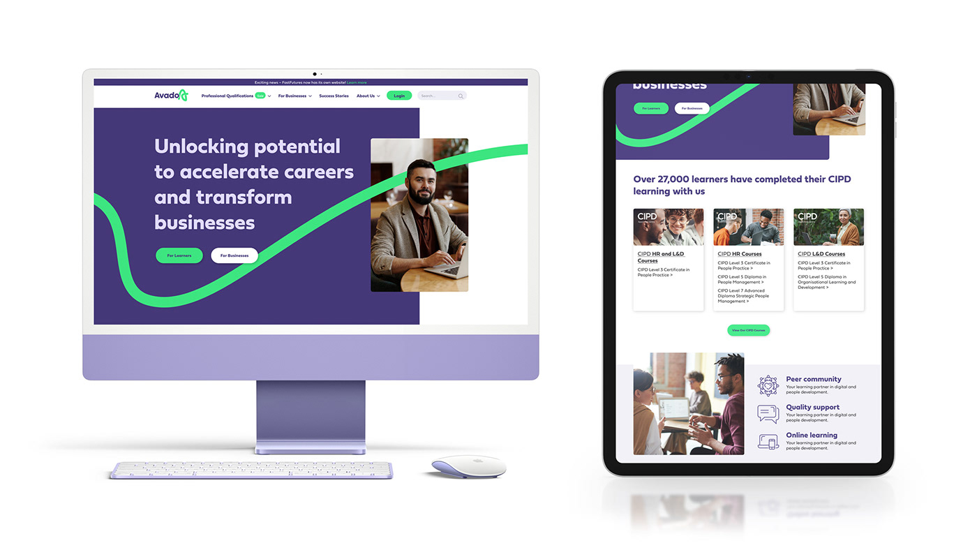
Incremental changes for a bolder, more inclusive identity.
The visual identity was not radically changed, but instead, we made incremental changes to uplift and reposition the Avado brand. The current Avado logo, corporate colours and typography stayed, but with subtle changes and defined usage guidelines.
Key components we looked at to refresh the Avado brand identity included image usage, colour usage and above all, the introduction of a brand element – the pathway. To emphasise the brand’s human-focused values, the photography was updated to be more inclusive and diverse.
The new Avado brand identity is bold, professional, and with an approachable representation of the company’s values. The outcome is a more modern, relevant, and engaging identity, that is effectively reaching both B2C and B2B target markets.


A graphic element
The pathway.
We introduced a key brand element called the pathway, which was inspired by the logo brand mark. The pathway represents a journey and signifies progress without specific starting or ending points. It was designed as a versatile element that can be used to complement photography and text. Consequently, by incorporating the pathway graphic element into the brand, we aim to strengthen brand recognition.


