

Rkeg. Brand identity
2019 – 2022
The Brand
The Brand
Rkeg is a new brand of Europlast, the leader of PET packaging in CIS countries. Rkeg PET kegs are a lightweight alternative to steel kegs and offer significant savings. Made from recyclable materials. They are suitable for beer, wine, cider, cocktails, cold brew coffee, kombucha, etc. Rkeg stands for innovation and sustainable packaging solutions, excellent product quality. With an unwavering commitment to excellence, technologists and engineers work every day to improve Rkeg.
The Challenge
To create branding to reach the international market in Europe, South America and Asia. Crafting a logotype and branding was to distill the brand's essence into a simple yet captivating design.
The Solution
Blends contemporary aesthetics to create a logotype and branding that embody innovation and friendly demeanor. The result: a cohesive, versatile, captivating visual identity sets it apart in the competitive landscape.


logotype
The letters of the logo are a geometric grotesque, in which all shapes are based on geometric figures and all diagonals have an angle of 45 degrees. Such structuredness gives the logo wholeness. In addition, the letters are built with a monoline, which allows the logo to be used in small sizes and technologically complex reproduction methods.
The logo is beautiful. In it you can see the flexibility of PET raw materials, find preforms, round keg volumes and even a beer tap.

The logo has three versions. Each one solves its tasks well and the short slogan is translated into the right language.


Colors
Colors are an important brand identifier, and each color carries a different message. Red is the basic color of uniqueness, energy and activity, passion for innovation, it creates a bright and memorable impression. White balances the bright character of the brand, gives openness and space. Purple is innovation and creativity. Green is about accessibility, safety and sustainability.

Typography
Gilroy font perfectly reflects the character of the brand. Modern, simple, honest, crisp, clear geometric grotesque. Gilroy is a great example of an extremely modern and versatile font.


Illustrations and icons
Positive and friendly illustrations show what Rkeg was created for - modern production, friendly communication, quality and tasty drink.

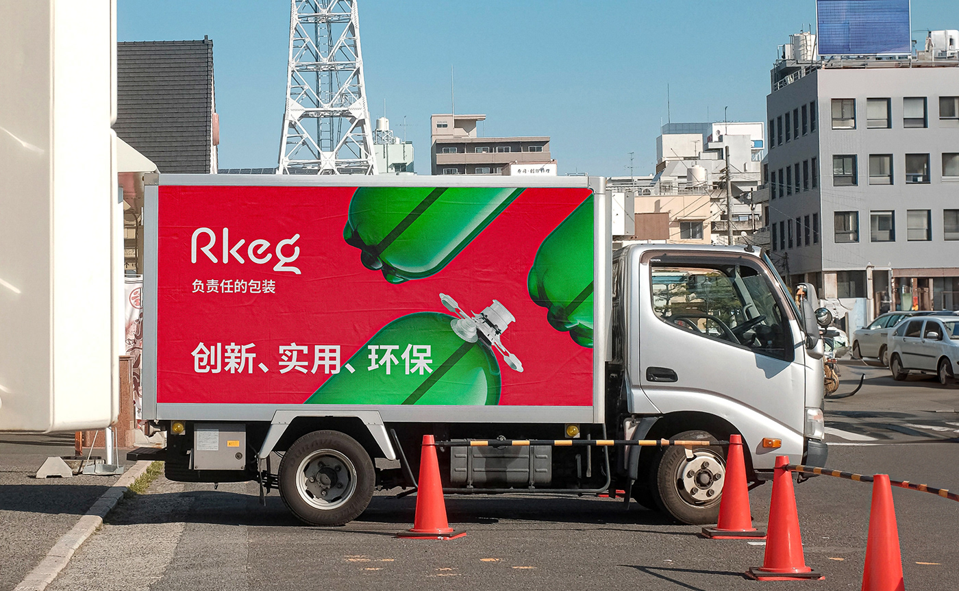
Visual identity
The main focus is on the signature colors and photos. We love Rkeg from all sides, so we show it in the photos in close-up, in detail. So that people can see and love it as much as we do. Also one of the signature elements is the 45 degree angle. It is taken from the logo and makes the layout more dynamic.


Credits
Agency: New Idea Studio
Art Direction and Design: Mikhail Zaittsev
Logo typographer: Oleg Matsuev
Photographer: Filipovic Filip
Manager: Aleksei Stepanishchev
Producer: Elena Sokolskaya


