With a membership of 66,000 (OMG!), this is easily
the most comprehensive rebrand I've worked on.
the most comprehensive rebrand I've worked on.
The Mega Co-op is one of the largest consumer co-ops in the United States and based in Western Wisconsin. And the last thing needed was a superficial, cosmetic fix. It needed to go deeper.
So when I had the opportunity to bring this co-op (established in 1935) into the 21st century, I was thrilled.
For anyone not familiar with a “consumer cooperative,” Wikipedia offers this:
“Consumer cooperatives are enterprises owned by consumers and managed democratically which aim at fulfilling the needs and aspirations of their members. They operate within the market system, independently of the state, as a form of mutual aid, oriented toward service rather than profit. Consumers’ cooperatives often take the form of retail outlets owned and operated by their consumers, such as food co-ops.”
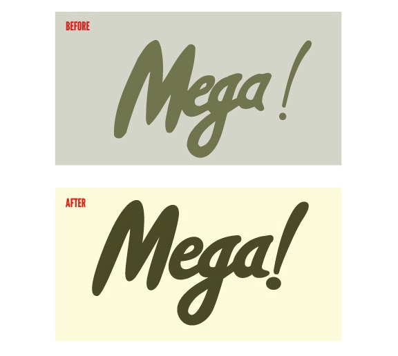
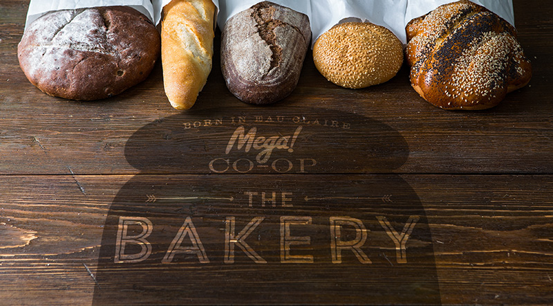
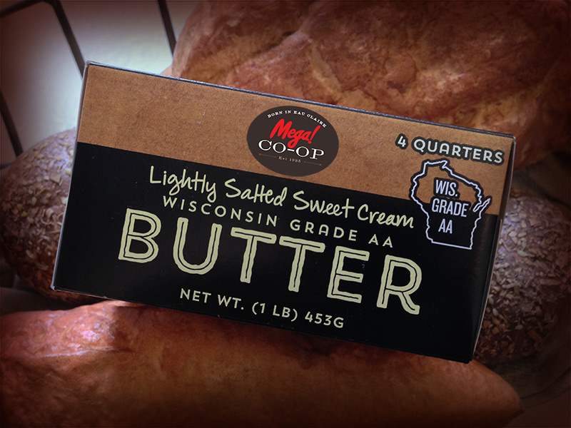
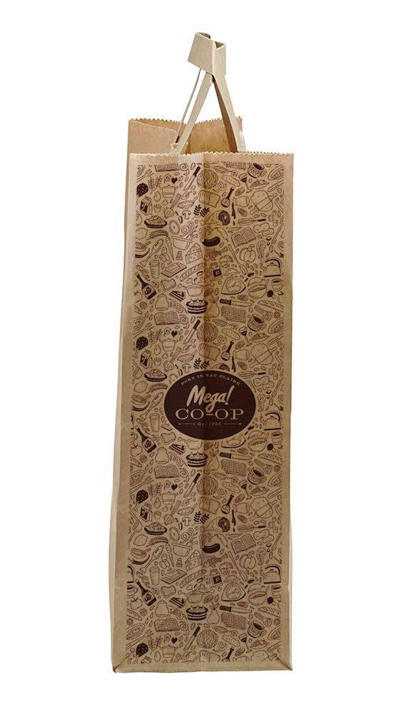
Below are some of the examples of what was done.
Below that are some of the finer details that went into their brand evolution showing where they came from and where they are now.


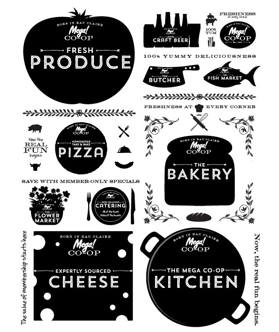
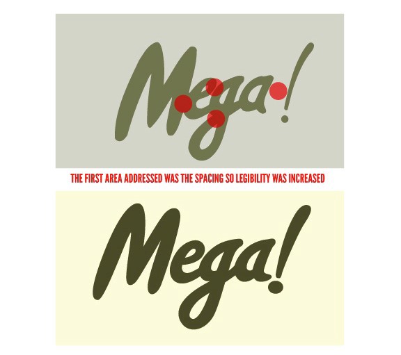
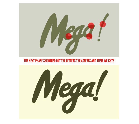
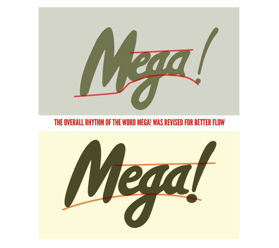
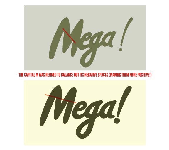
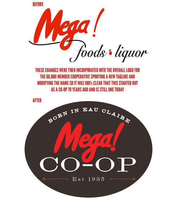
Here are the details that went into some of the refinements of the Mega brand: