


Maomaria — Visual Identity — 2012
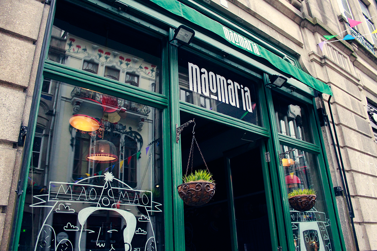
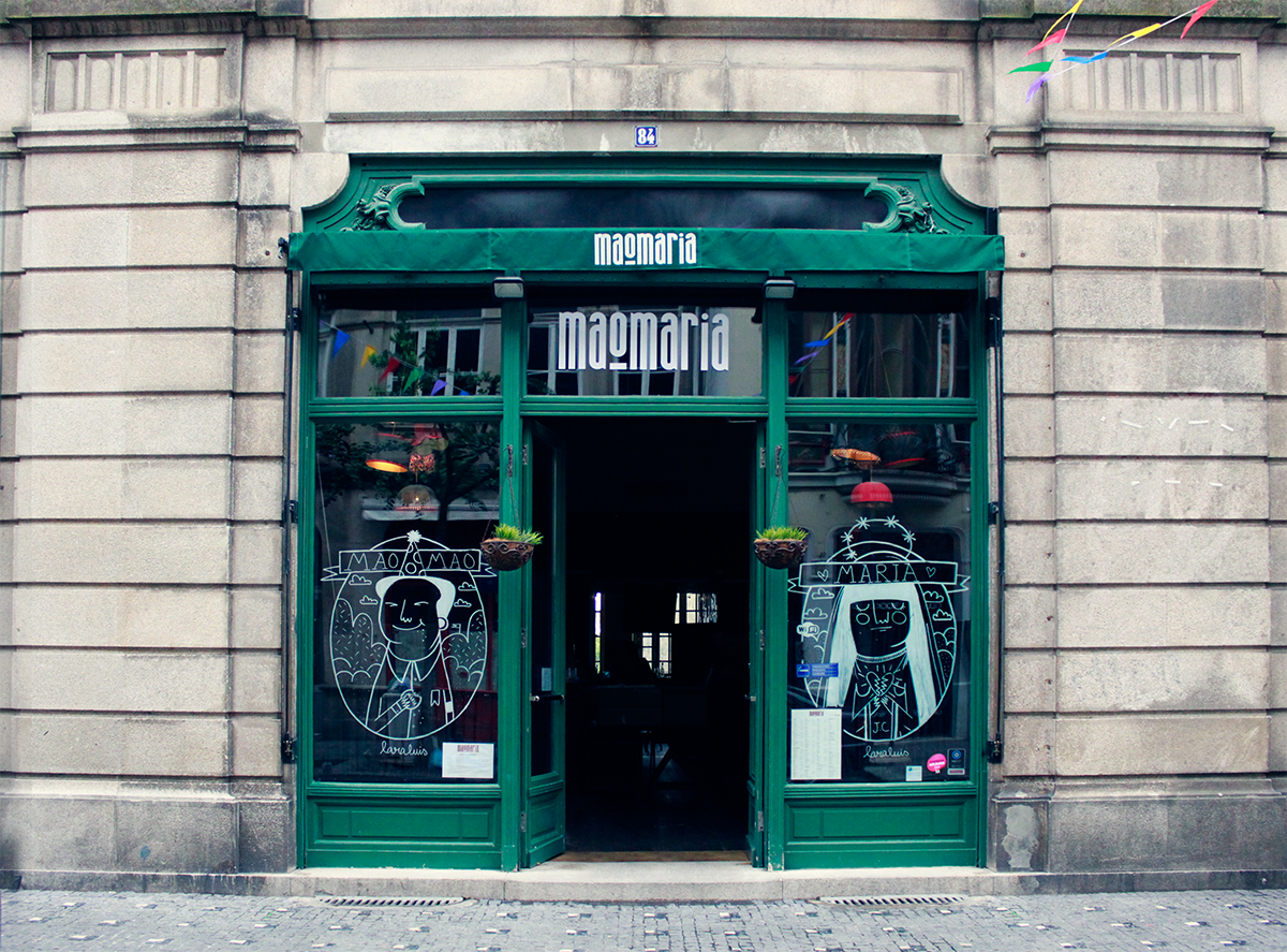
Situated in Porto’s downtown, Maomaria emerges from the common interest in music, social and night lifestyle. The idea of a Mao Tse Tung and a Virgin Mary as mottos for its creation is just casual but enriches its own personality — A bar with no dogmas or beliefs, no prejudices or trends.
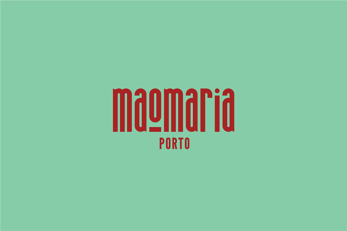
Maomaria's logo plays the core role. The word Maomaria appears as a consolidated typographic stain. Its verticality suggest affirmation and belief — invigorates Porto's culture, ancient city’s typefaces and resembles tall and curvy typefaces used in religion — and its rounded and grotesque shape reinforce the idea of simplicity and functionalism. The brand mark O is designed as a symbol to complement the identity and to be used in specific cases as corporate events/documents (e.g. illustrations, stamps). Its shape works as a celebration of the strength of its lettering and its associated symbolism. It differentiates the meaning of the words MaO and Maria in its literal sense Mau Maria — Mau, Mau Maria! is an Portuguese saying that means literally Bad, bad Mary! used to tell someone off (usually children) when things go wrong — and also separates the two figures — MAO Tse Tung and Virgin MARY. It also resembles the sacred with its aureole shape.
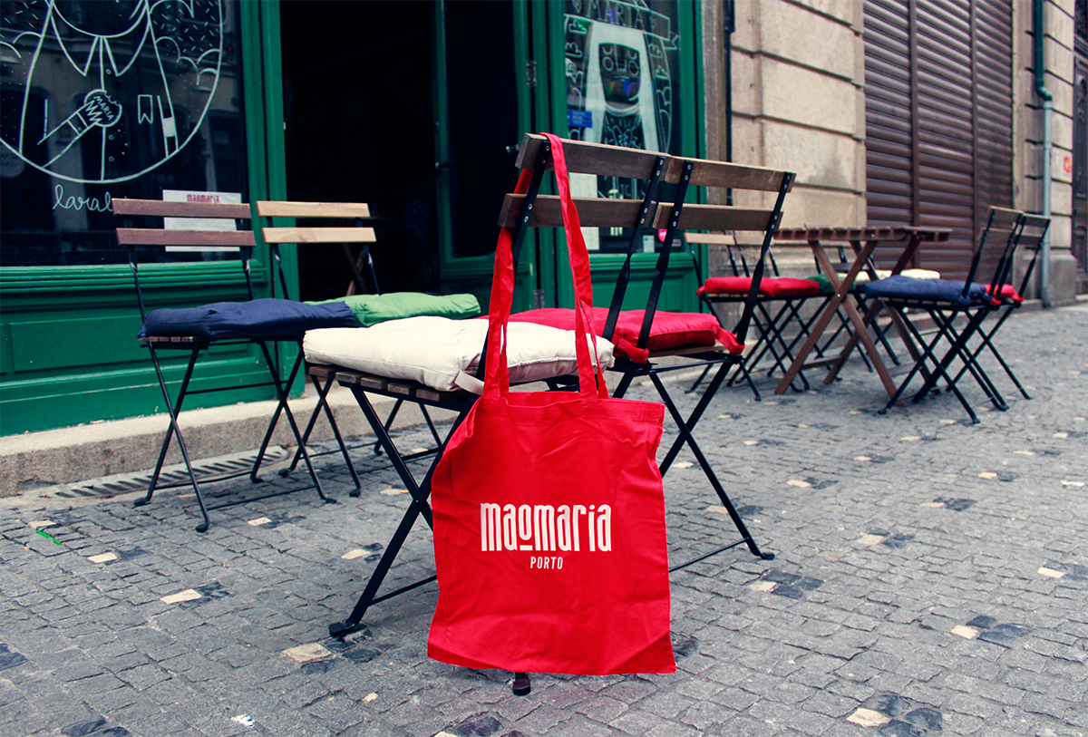
On a last note, Maomaria’s color palette invigorates the atmosphere of the brand, suggesting an analogy with the wine and the grape's color tones. Also representing tones associated with religion — symbol of Jesus’ martyrdom, of blood and Christ’Passion — and with the revolutionary and communist culture of Mao Tse Tung. As warm color tones, it also complement the well-being of its space and environment.


