PAUL SIMON. So Beautiful or So What
Poster Design
Poster Design

About
With one of the most anticipated albums of the year, the release of Paul Simon’s new work ‘So Beautiful or So What’, his eleventh studio album, released in April 2011, was considered by the press as a big promise. Between the media, Rolling Stone Magazine mentioned ‘Best since Graceland’, NPR affirmed ‘So Beautiful or So What balance great poetry and pop’ and First Magazine declared ‘It’s a new masterpiece from the Picasso of music’.
Paul Simon has earned numerous honors and awards, among them, 12 Grammy Awards won -one of them, a Lifetime Achievement Award for his work as half of the duo Simon and Garfunkel-, five Grammy nominations, an Oscar nomination for the song ‘Father and Daughter’, he is on the Rock n' Roll Hall of Fame, was honored by BMI at April 12 2011, celebrating the more than 100 million performances of his songs on radio and TV on the United States, and selected by Time Magazine as one of the ‘100 People Who Shaped the World’.
To promote the worldwide release of the album of this mayor artist, the Official Album Poster was designed. It was a strong requirement that the design complemented the main style of the current album’s artwork while a new content were added.
The Creative Process
In the search of a creative and original proposal, a different kind of inspiration was needed. And trying to follow the steps that Paul did with his new work, the exploration was the main key to a different and attractive result.
The process started listening to his music, which indeed is a big part for the project design, but most of all, trying to capture the true essence of the album in all its shapes. And was not only related with the final album, as well, the method that he used to create, the atmosphere felt, the reviews from the press, and comments left from many people in social media sites, all contributed to the inspiration.
He sees the composing as an ‘art form’. So that was the main theme, Art. And the design was developed as a piece of art.
The Graphic Resolution
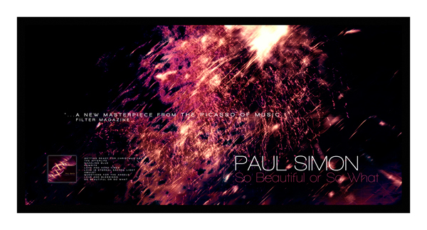
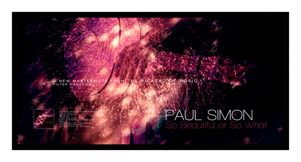
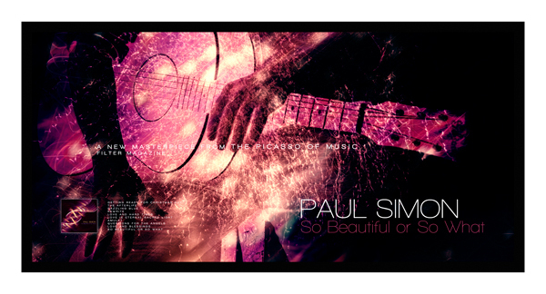
Graphically, ‘a new beginning’ was the main concept to reflect under a context of art. Like in Paul’s music, where you go discovering different sensations and emotions when you are listening, in the artwork, the layers are becoming present at the time you progress in the reading. It was intended as a kind of three-dimensional poster, starting from the front with Paul Simon title, then going to the background, then coming back again to the claim and ending with the album artwork and track list. The texts in different scales seem to float over the image, giving the illusion of depth.
Trying to find the right balance in the composition, could say, a balance like poetry and pop, thought it was a good idea positioning a title just in the middle, with a strong message on it. And after seeing the positive reviews from media, thought it was nothing more appropriate than the one from Filter Magazine, “A New Masterpiece from the Picasso of Music”. The other two elements that contributed to this balance were the Paul Simon’s title and the album artwork.
So the design includes many of the characteristics from the album, something brilliant, vibrant, with motion, original and fresh. And the final message was that the spectator could get a bit from the whole experience just looking at the poster, and asking himself, this is So Beautiful or So What.
With one of the most anticipated albums of the year, the release of Paul Simon’s new work ‘So Beautiful or So What’, his eleventh studio album, released in April 2011, was considered by the press as a big promise. Between the media, Rolling Stone Magazine mentioned ‘Best since Graceland’, NPR affirmed ‘So Beautiful or So What balance great poetry and pop’ and First Magazine declared ‘It’s a new masterpiece from the Picasso of music’.
Paul Simon has earned numerous honors and awards, among them, 12 Grammy Awards won -one of them, a Lifetime Achievement Award for his work as half of the duo Simon and Garfunkel-, five Grammy nominations, an Oscar nomination for the song ‘Father and Daughter’, he is on the Rock n' Roll Hall of Fame, was honored by BMI at April 12 2011, celebrating the more than 100 million performances of his songs on radio and TV on the United States, and selected by Time Magazine as one of the ‘100 People Who Shaped the World’.
To promote the worldwide release of the album of this mayor artist, the Official Album Poster was designed. It was a strong requirement that the design complemented the main style of the current album’s artwork while a new content were added.
The Creative Process
In the search of a creative and original proposal, a different kind of inspiration was needed. And trying to follow the steps that Paul did with his new work, the exploration was the main key to a different and attractive result.
The process started listening to his music, which indeed is a big part for the project design, but most of all, trying to capture the true essence of the album in all its shapes. And was not only related with the final album, as well, the method that he used to create, the atmosphere felt, the reviews from the press, and comments left from many people in social media sites, all contributed to the inspiration.
He sees the composing as an ‘art form’. So that was the main theme, Art. And the design was developed as a piece of art.
The Graphic Resolution
Graphically, ‘a new beginning’ was the main concept to reflect under a context of art. Like in Paul’s music, where you go discovering different sensations and emotions when you are listening, in the artwork, the layers are becoming present at the time you progress in the reading. It was intended as a kind of three-dimensional poster, starting from the front with Paul Simon title, then going to the background, then coming back again to the claim and ending with the album artwork and track list. The texts in different scales seem to float over the image, giving the illusion of depth.
Trying to find the right balance in the composition, could say, a balance like poetry and pop, thought it was a good idea positioning a title just in the middle, with a strong message on it. And after seeing the positive reviews from media, thought it was nothing more appropriate than the one from Filter Magazine, “A New Masterpiece from the Picasso of Music”. The other two elements that contributed to this balance were the Paul Simon’s title and the album artwork.
So the design includes many of the characteristics from the album, something brilliant, vibrant, with motion, original and fresh. And the final message was that the spectator could get a bit from the whole experience just looking at the poster, and asking himself, this is So Beautiful or So What.

Cretis & Info
Photograhpy, Art Direction, Graphic Design, Textures and Words: Leonardo Porrés.
Dimensions: 28 x 14 inches. / 711 mm. x 356 mm.
Photograhpy, Art Direction, Graphic Design, Textures and Words: Leonardo Porrés.
Dimensions: 28 x 14 inches. / 711 mm. x 356 mm.

