NORWEGIAN WOOD
Poster Design
Poster Design
About
Published in 1987 and since translated into 33 languages, NORWEGIAN WOOD, written by Haruki Murakami, is a nostalgic story of loss, love and sensuality set in Tokio in the late 1960s. This time, the bestselling novel is brought to the screen by Oscar nominee Tran Anh Hung, Golden Lion winner for ‘Cyclo’ and Academy Award nominee for ‘The Scent of Green Papaya’.
The film starring Matsuyama (Death Note, Detroit Metal City), also Oscar nominee Rinko Kikuchi (Babel), alongside newcomer Kiko Mizuhara, give life to the book portraying the Japanese youth against a backdrop of global unrest. Some of the themes treated in the story: unfilled desires of youth, the choice of life or death, the process of growing up, elements to include for the design of the Official Movie Poster.
There were a few requirements for the concept to show. The design had to embody some characteristics from the book, it was really important that the design were visually strong, and also a typographic poster could be interesting.
The Creative Process
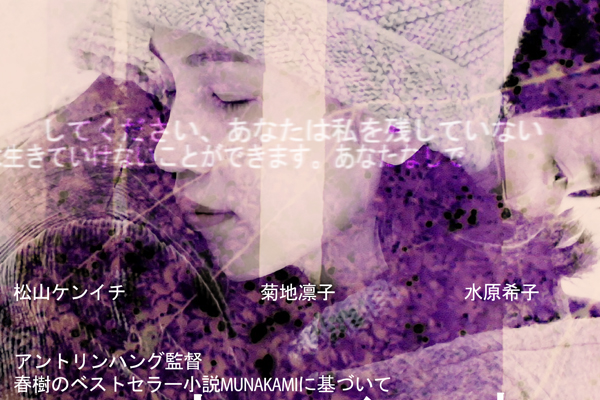
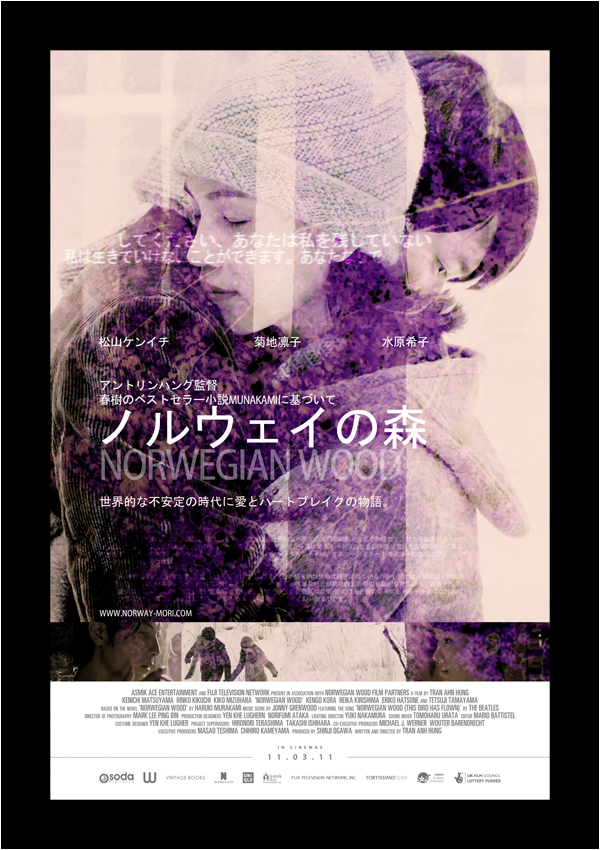
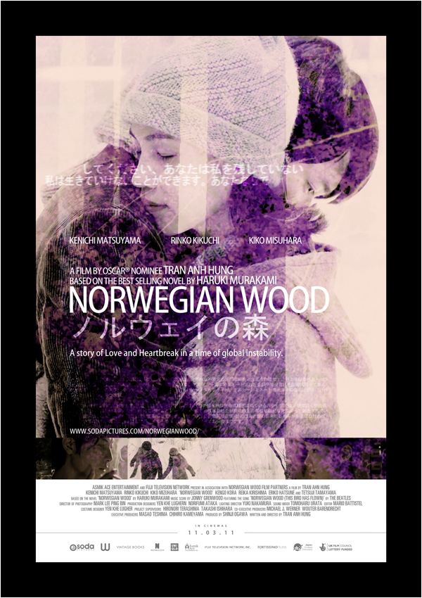
In this case, the method for designing was very different to that used in other works. From the beginning to the end of the project, the design was always conceived as a compact block overloaded with information. It started just with typography in mind, assigning different levels, scales, weights, and densities, and each time the process was moving, more layers were added.
In the same way it happened later with the photos and textures. The post processing on the images was important to express and make feel the spectator, the true emotion of the story. Once all the elements were in the right place in the layout, the next step was giving some air between the different contents.
The final composition is a perfect balance between white spaces and condensed areas of information, wide margins and images full bleeded, and the stiffness of the mosaics with the freedom of the textures.
The Graphic Resolution
The idea was to express all the feelings, experiences and thoughts related with love, loss and the breakups.
Many are the elements that compose this story. Textures resembling the different layers of a relationship, dense blocks of text like they were experiences and blurry titles like it were thoughts.
Even when the whole layout of the texts is interesting, maybe the most intriguing part to other cultures could be the one written in Japanese, located between the faces of the main characters. And the meaning is, “Please don’t live me... I couldn’t live without you”.
Considering the importance of Art in the history of Japanese culture, and bearing in mind the Japanese National Tourism Organization as one of strategic partners, the design was intended to act more as a Work of Art, rather than a poster, but without losing its main objective.
Published in 1987 and since translated into 33 languages, NORWEGIAN WOOD, written by Haruki Murakami, is a nostalgic story of loss, love and sensuality set in Tokio in the late 1960s. This time, the bestselling novel is brought to the screen by Oscar nominee Tran Anh Hung, Golden Lion winner for ‘Cyclo’ and Academy Award nominee for ‘The Scent of Green Papaya’.
The film starring Matsuyama (Death Note, Detroit Metal City), also Oscar nominee Rinko Kikuchi (Babel), alongside newcomer Kiko Mizuhara, give life to the book portraying the Japanese youth against a backdrop of global unrest. Some of the themes treated in the story: unfilled desires of youth, the choice of life or death, the process of growing up, elements to include for the design of the Official Movie Poster.
There were a few requirements for the concept to show. The design had to embody some characteristics from the book, it was really important that the design were visually strong, and also a typographic poster could be interesting.
The Creative Process
In this case, the method for designing was very different to that used in other works. From the beginning to the end of the project, the design was always conceived as a compact block overloaded with information. It started just with typography in mind, assigning different levels, scales, weights, and densities, and each time the process was moving, more layers were added.
In the same way it happened later with the photos and textures. The post processing on the images was important to express and make feel the spectator, the true emotion of the story. Once all the elements were in the right place in the layout, the next step was giving some air between the different contents.
The final composition is a perfect balance between white spaces and condensed areas of information, wide margins and images full bleeded, and the stiffness of the mosaics with the freedom of the textures.
The Graphic Resolution
The idea was to express all the feelings, experiences and thoughts related with love, loss and the breakups.
Many are the elements that compose this story. Textures resembling the different layers of a relationship, dense blocks of text like they were experiences and blurry titles like it were thoughts.
Even when the whole layout of the texts is interesting, maybe the most intriguing part to other cultures could be the one written in Japanese, located between the faces of the main characters. And the meaning is, “Please don’t live me... I couldn’t live without you”.
Considering the importance of Art in the history of Japanese culture, and bearing in mind the Japanese National Tourism Organization as one of strategic partners, the design was intended to act more as a Work of Art, rather than a poster, but without losing its main objective.
Cretis & Info
Photography: Norwegian Wood Press Photos.
Art Direction, Graphic Design, Textures and Words: Leonardo Porrés.
Dimensions: 20 x 30 inches. / 508 mm. x 762 mm.
Photography: Norwegian Wood Press Photos.
Art Direction, Graphic Design, Textures and Words: Leonardo Porrés.
Dimensions: 20 x 30 inches. / 508 mm. x 762 mm.

