Nutrilab - Advancing Sustainable Nutrition Through Innovative Research
INTRODUCTION
Nutrilab is a pioneering concept in the field of nutrition research, dedicated to revolutionizing the production of wholesome, healthy food using sustainable energy sources and carefully selected ingredients. With a strong emphasis on innovation and sustainability, Nutrilab envisions a future where food production and consumption contribute positively to both human health and the environment.
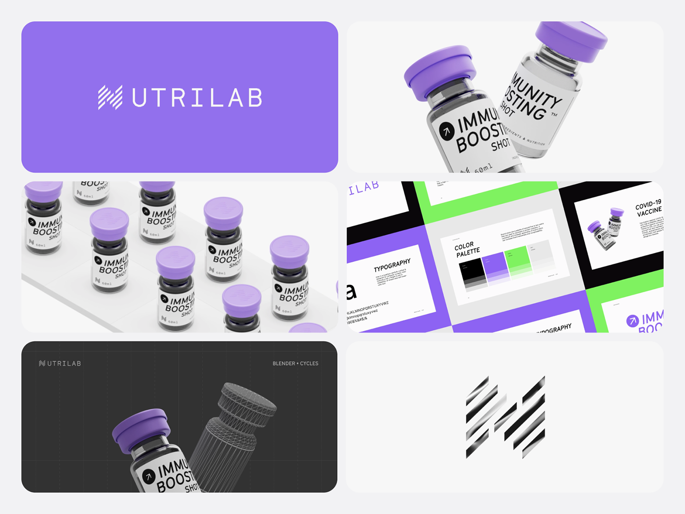
To establish a unique and impactful visual identity that resonates with its mission, Nutrilab has developed a forward-thinking brand solution centered around the letter "N," formed using laser-cut shapes, and a progressive violet color palette.
Challenges
Sustainability Integration: Nutrilab aims to merge advanced nutrition research with sustainable practices. The challenge is to convey this intricate balance of science and health consciousness in their visual identity.
Scientific Innovation: Communicating cutting-edge research and technological advancement while ensuring accessibility to a broad audience poses a design challenge.
Brand Differentiation: The nutrition and health industry is saturated with brands. Nutrilab needs to stand out and create a distinctive identity that captures attention and conveys its unique mission.

Conceptual approach
Nutrilab's visual identity is rooted in the idea of transformation, symbolizing the company's mission to transform the way we perceive and interact with nutrition. The letter "N" forms the core of the identity, symbolizing Nutrilab's name and acting as a visual anchor. This letter is intricately constructed using laser-cut shapes, representing the precision and meticulousness of scientific research.

IMPLEMENTATION
Logo and Wordmark: The laser-cut "N" serves as the logo, appearing on all branding materials. The wordmark is designed in a clean, modern typeface to ensure readability and balance the intricacies of the logo.
Color Application: The violet color is used consistently across all brand assets, from packaging to digital media. Its application is balanced with white or light gray backgrounds to maintain clarity and readability.
Packaging Design: Nutrilab's product packaging showcases the laser-cut "N" as a central design element. Information about the product's nutritional benefits, ingredients, and sustainability practices are displayed clearly and concisely.
Digital Presence: The violet color and laser-cut "N" are carried through Nutrilab's website and social media channels. Engaging infographics, videos, and articles communicate the science behind Nutrilab's research in an accessible manner.


This distinctive visual identity sets Nutrilab apart in a competitive biotech industry, attracting both consumers seeking healthier food options and investors interested in advancing nutrition science and sustainable practices. As Nutrilab continues to drive innovation in nutrition research, its visual identity will serve as a powerful emblem of its transformative impact on food production and consumption.