


LOST LINDENBERG
The fifth project and the first in Indonesia, from the young Frankfurt hospitality company, LINDENBERG. Just as with their previous concepts, LOST LINDENBERG focuses on the collective experience of the guests, who are invited to spend their time together in the property’s communal areas. Retreat is offered in each of the eight lovingly-designed rooms, which are elevated high amongst the treetops of the West Balinese palm jungle, set on a long and pristine, glistening black lava sand beach. We designed the overall hotel identity, wayfinding, signage, and illustration concepts combining art and design. The eclectic design are combined with neon as the colour of modern and urbanity.
The fifth project and the first in Indonesia, from the young Frankfurt hospitality company, LINDENBERG. Just as with their previous concepts, LOST LINDENBERG focuses on the collective experience of the guests, who are invited to spend their time together in the property’s communal areas. Retreat is offered in each of the eight lovingly-designed rooms, which are elevated high amongst the treetops of the West Balinese palm jungle, set on a long and pristine, glistening black lava sand beach. We designed the overall hotel identity, wayfinding, signage, and illustration concepts combining art and design. The eclectic design are combined with neon as the colour of modern and urbanity.
Architecture – Alexis Dornier & Studio Jencquel
Arch Photo – Pempki & Robert Reiger
Contractors – Bali Construction
Front Facade – Tobias Rehberger
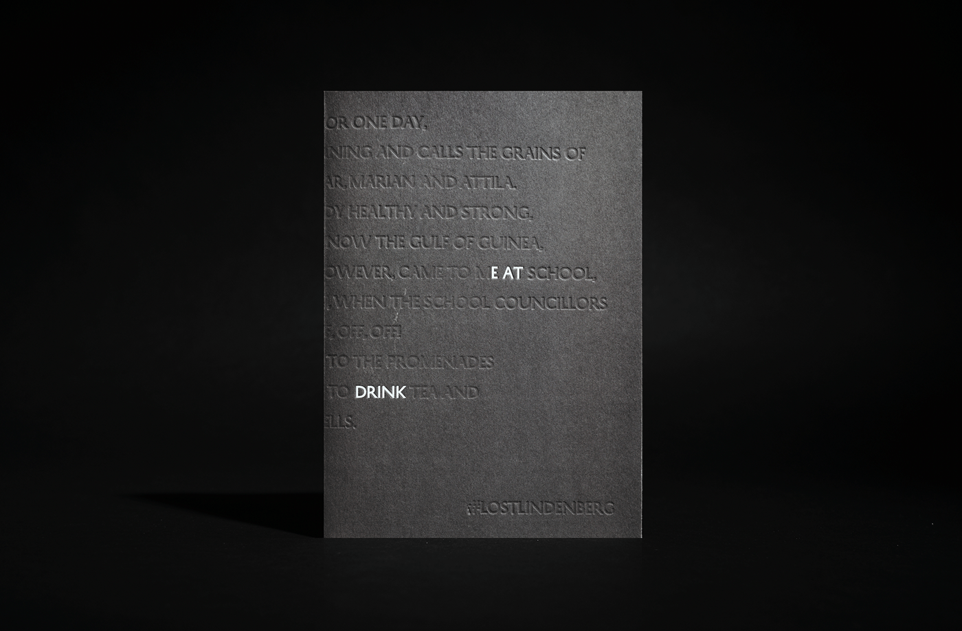
Poem – Artur Becker
Graphic Design, Branding, Illustration – Sciencewerk
Arch Photo – Pempki & Robert Reiger
Contractors – Bali Construction
Front Facade – Tobias Rehberger
Poem – Artur Becker
Graphic Design, Branding, Illustration – Sciencewerk

The architecture, thoughtfully designed by Alexis Dornier and Studio Jenquel, embraces a unique concept with 8 distinct rooms nestled harmoniously within the tropical jungle. This extraordinary retreat awaits in the untouched beauty of Medewi, a far-western paradise on the shores of West Bali, offering an unparalleled escape for discerning travelers.

Black sand stands as a prominent feature at Lost Lindenberg, and we have seamlessly integrated it with the captivating essence we refer to as the “Lost Boys” – an embodiment of the Lost Spirit. Together, they form an integral part of Lost Lindenberg’s unique identity, lending an enchanting charm to the overall experience.

As an integral part of LOST Lindenberg’s experiential design, the colorful urban facade, envisioned by German artist Tobias Rehberger, establishes a striking contrast by interweaving vibrant neon elements amidst a jungle setting, evoking a sensation of being pleasantly lost in an exotic realm. As guests step inside the facade, they embark on a journey through jungle-like pathways that lead them to the heart of the hotel.

THE LOST BOYS
We devised ‘The Lost Boys’ as a representation of Lost Lindenberg’s
artistic essence. This narrative embodies the brand’s artistic spirit through the portrayal of two men who are consistently united, coexisting, and collaborating harmoniously. The surrealistic illustrations capture their diverse unity, engaging
in various activities that epitomize the essence of Lost Lindenberg.


The concept of ‘The Lost Boy’ is brought to life through merchandise and statues designed for daily utility and decoration, such as this book stand. The mascot is transformed into a captivating 3D resin art piece, ensuring that it transcends the limitations of a flat illustration, creating a more dynamic and immersive experience.


PRINT & COLLATERALS
After creating the illustration, it was further adapted into printed materials that
After creating the illustration, it was further adapted into printed materials that
narrate stories throughout the hotel. These stories can be found on various items, including welcome cards, keycards, books, and even the logo, enriching the overall guest experience with a cohesive and engaging visual narrative.


PRINTS & NARRATIVE
Embracing the fusion of Urbanity and Nature, we blend vibrant neon hues with the conventional muted colors, crafting simplistic yet impactful statements. This intriguing paradox infuses an urban vibe, while simultaneously creating a memorable identity that captivates and resonates with people. Embracing the fusion of Urbanity and Nature, we blend vibrant neon hues with the conventional muted colors, crafting simplistic yet impactful statements. This intriguing paradox infuses an urban vibe, while simultaneously creating a memorable identity that captivates and resonates with people.


SUSTAINABLE MATERIALS
At Lost Lindenberg,a commitment to sustainability shines through in every detail. From utilizing recycled wood-free papers to incorporating eco-friendly fabrics, all materials are consciously chosen to minimize environmental impact. Even our mascot makes subtle appearances as eco-conscious artwork, further exemplifying our dedication to a sustainable approach.


LOST TABLETS
The LOST signage draws profound inspiration from ancient tablets discovered in historical ruins. Through coded hieroglyphs derived from the illustrations, we evoke a sense of antiquity, complemented by the use of bronze metal to add an artistic and traditional touch. While the space is designed for easy navigation, our approach to wayfinding leans towards experimentation, crafting it as a unique and captivating artwork rather than adhering to traditional wayfinding formats. Using bronze as a consistent material choice, we extend its application to room names, wayfinding elements, and even “do not disturb” signs. Through simple phrases like “yes yes” and “no way,” we convey a distinct urban flair, breaking away from the formality commonly associated with traditional hotels. This creative approach lends a clear voice to the space, exuding a modern and relaxed atmosphere that sets Lost Lindenberg apart.


Lost, yet not adrift, it seeks to be, One with the sea, and wild and free. Within the depths, a soul unbound, In harmony with nature's profound sound.
@sciencewerk / www.sciencewerk.net for Lost Lindenberg
@sciencewerk / www.sciencewerk.net for Lost Lindenberg


