MIKUNA
Logotype + Collateral Material
Problem: Based on the ancient Peruvian culinary traditions that date back to the Inca Empire, comes Mikuna. Founded by chef, Gaston Acurio, it aims to increase awareness of Peruvian cuisine amongst the world. They approached us in the early development with the “Mikuna” name and the menu items. We expanded on their vision, focusing on a target audience of young adults ages 25 to 50 years old in the area of Los Angeles. We were focusing on trend-setters, innovators and influencers. We were appointed responsible of branding the restaurant, including the logotype, business cards, letterheads, envelopes and menus.
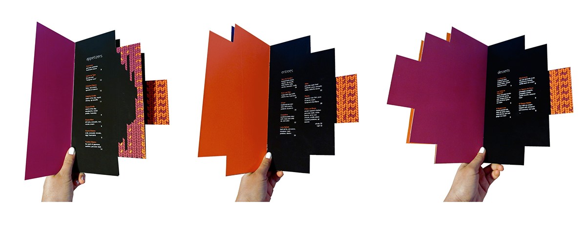
Solution: We developed a design strategy inspired in the Inca tradition, with an appropriation of native textiles, featuring bright colors and geometric patterns. The logotype is a stylized version of “Mikuna” using Johnston Sans typeface, chosen for its humanistic characteristics. We applied two pantone colors in the ID system and menu for branding consistency. The business card, envelope flap and menu allude to the Inca cross, the “inti.”