


BORYUNG BR TOX
Services / Brand Identity Design, Packaging Design
Client / BORYUNG Pharm. / 2023
Boryung Pharmaceutical, a big pharmaceutical company in Korea, wanted to launch a line of cosmetics with a cosmeceutical concept by fusing cosmetics and pharmaceutical technology. The main mission of our BX design was to showcase the features of Boryung's newly developed anti-wrinkle technology on the product, and we wanted to do more than just showcase the technology, we wanted to deliver a sophisticated and environmentally friendly brand experience to the customers who purchase the product. We also wanted to design the product's usability to be easily recognizable from the brand identity and packaging.
© 2023 GRAFY DESIGN

Graphic Motif
Turning back time is at the heart of the BR TOX brand. Boryung Pharmaceutical's new wrinkle reduction technology shows a noticeable improvement rate compared to past products that require long periods of use, and to achieve this, it has a usability that requires regular use of products divided into morning, lunch, and evening. Based on this, we utilized a clock and the passage of time according to morning, noon, and evening as graphic motifs.

Brand Identity
The BR TOX brand identity is like an essence gathered through the lens of the graphic motifs we defined earlier. We drew lines to each touchpoint in the user's lifestyle and time, creating a triangle and laying out the wordmark in that shape. The products in the BR TOX line may have different names for different contexts, but the basic layout follows the same rules.

Color & Typography
Since we used eco-friendly recycled paper for our packaging and applications, we felt that using a lot of color would go against this concept, so we strived to create a modern, upscale identity using a gray and black monotone. We combined the highly legible sans serif Aten New with the serif typefaces Minion Pro and Halcom to create a consistent image with magazine-like editorial elements. The accent color, blue, serves to offset the monotony of the monochromatic color scheme and was used on the inner container rather than the packaging.


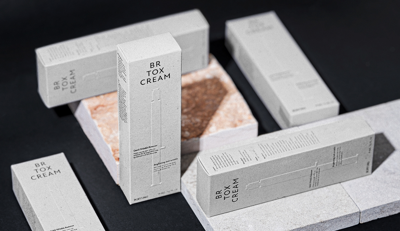
Packaging Design
¹ Design for BR TOX brand recognition
The packaging was designed with a balanced triangular brand identity at the top center, artwork representing the product's container, and various selling point words. We took care to utilize a grid, which is often used in editorials, for a simpler and more organized arrangement, and the central selling point words were placed in the form of touching the two ends while the pendulum of a chiming clock swings left and right.
ㅤ

² Design For Environment And Sustainability
As Boryung Pharmaceutical is a company that adheres to ESG management policies, we thought that the company's brand should also communicate with customers in one voice and one language along with the company. Therefore, we proposed to use recycled paper for all packaging and applications that make up the BR TOX brand, which meant that we had to use limited printing methods and colors, but we tried to express the maximum brand essence within the limitations.
ㅤ

ㅤ

ㅤ
ㅤ

© 2023 GRAFY DESIGN
GRAFY B/D 2-3F, 350, Dongil-ro, Gwangjin-gu, Seoul, Republic of Korea
contact / info@grafydesign.com / +82 70 8633 7222
-
If you want to see more projects, click on the links below
And our Instagram


