_
With the announcement of 20th FIFA World Cup edition it came to your mind to do self initiative project about it. This eventually led us to look at a strong, playful and eye-catching concept.
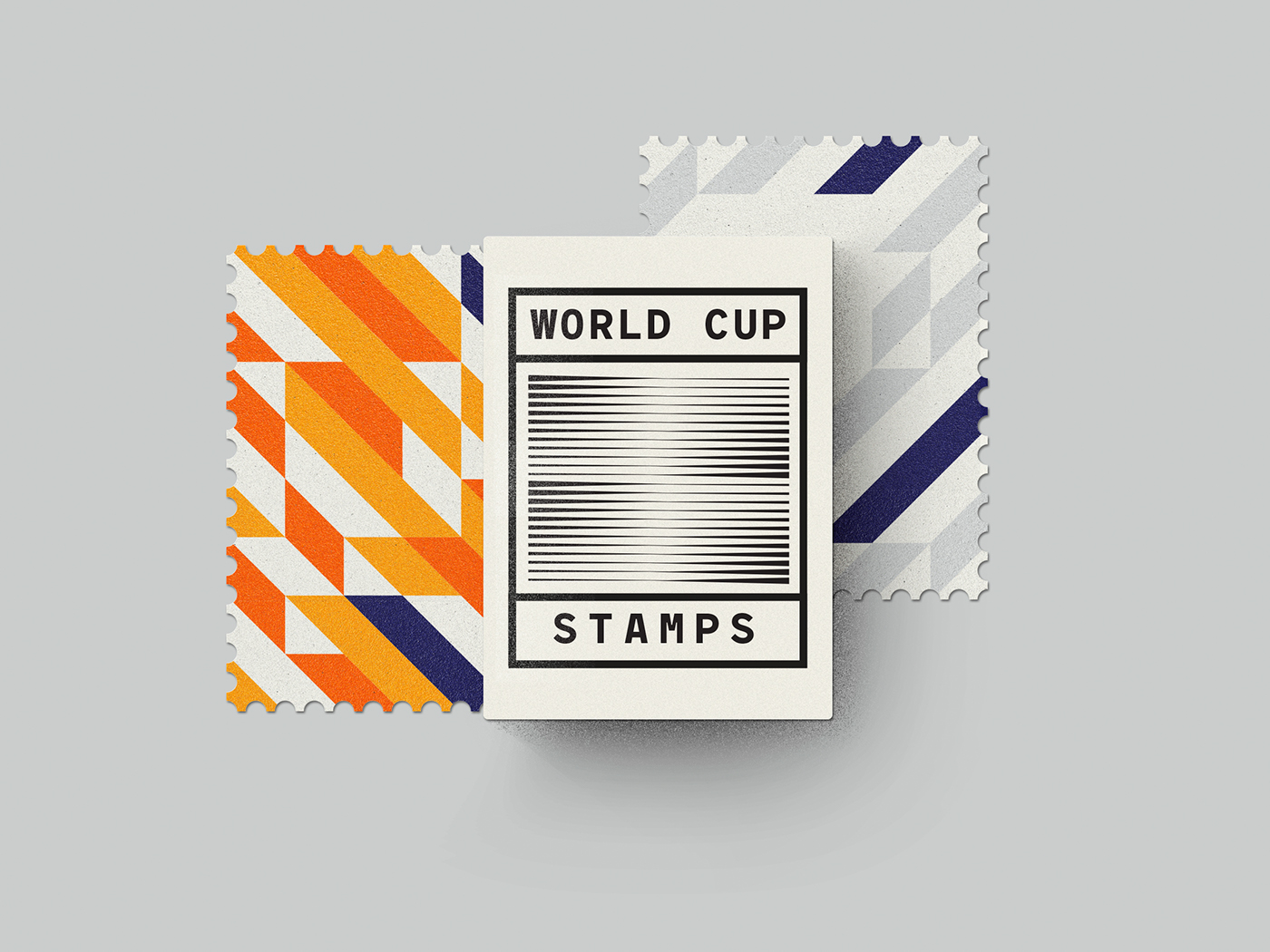
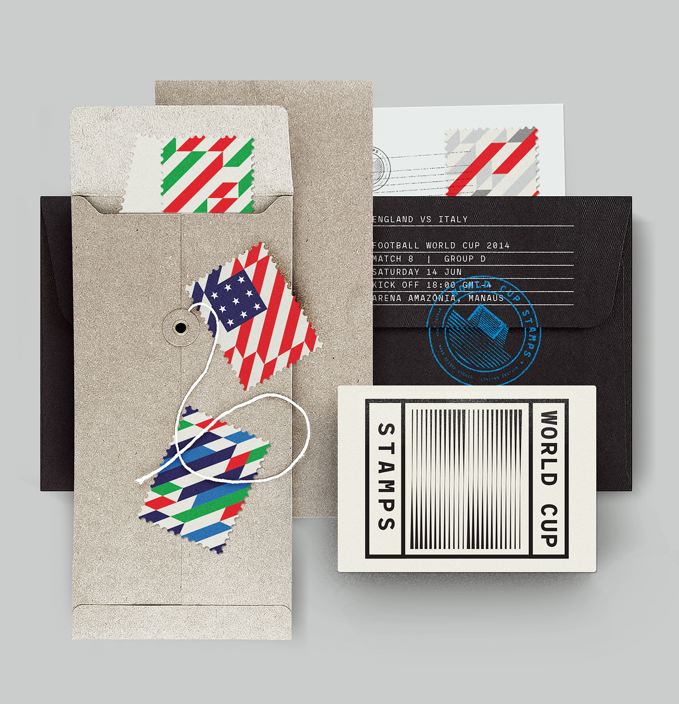
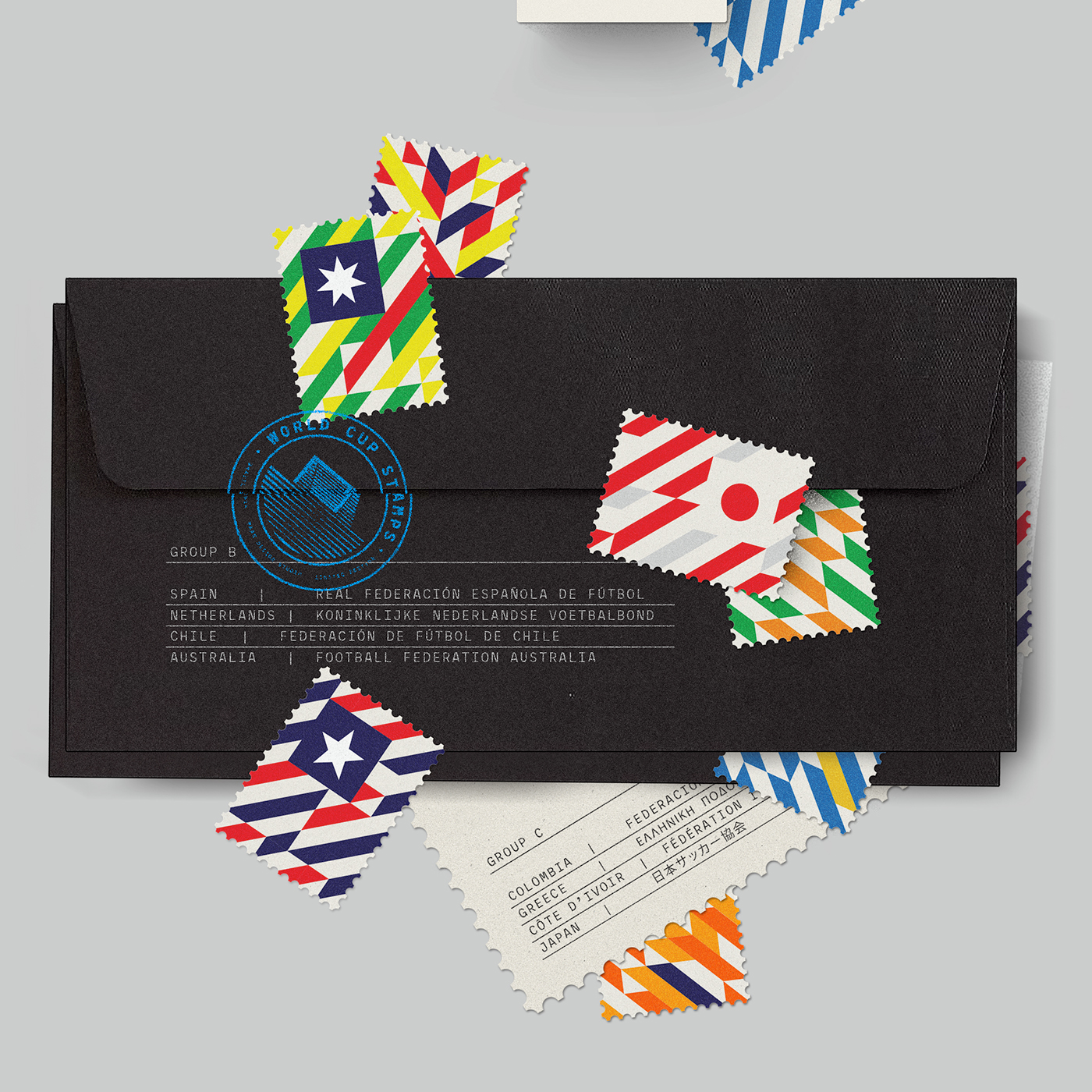
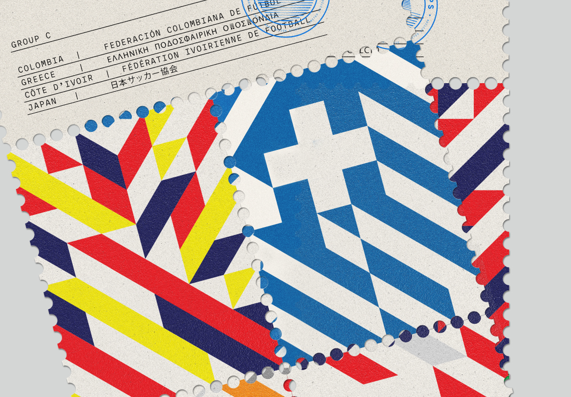
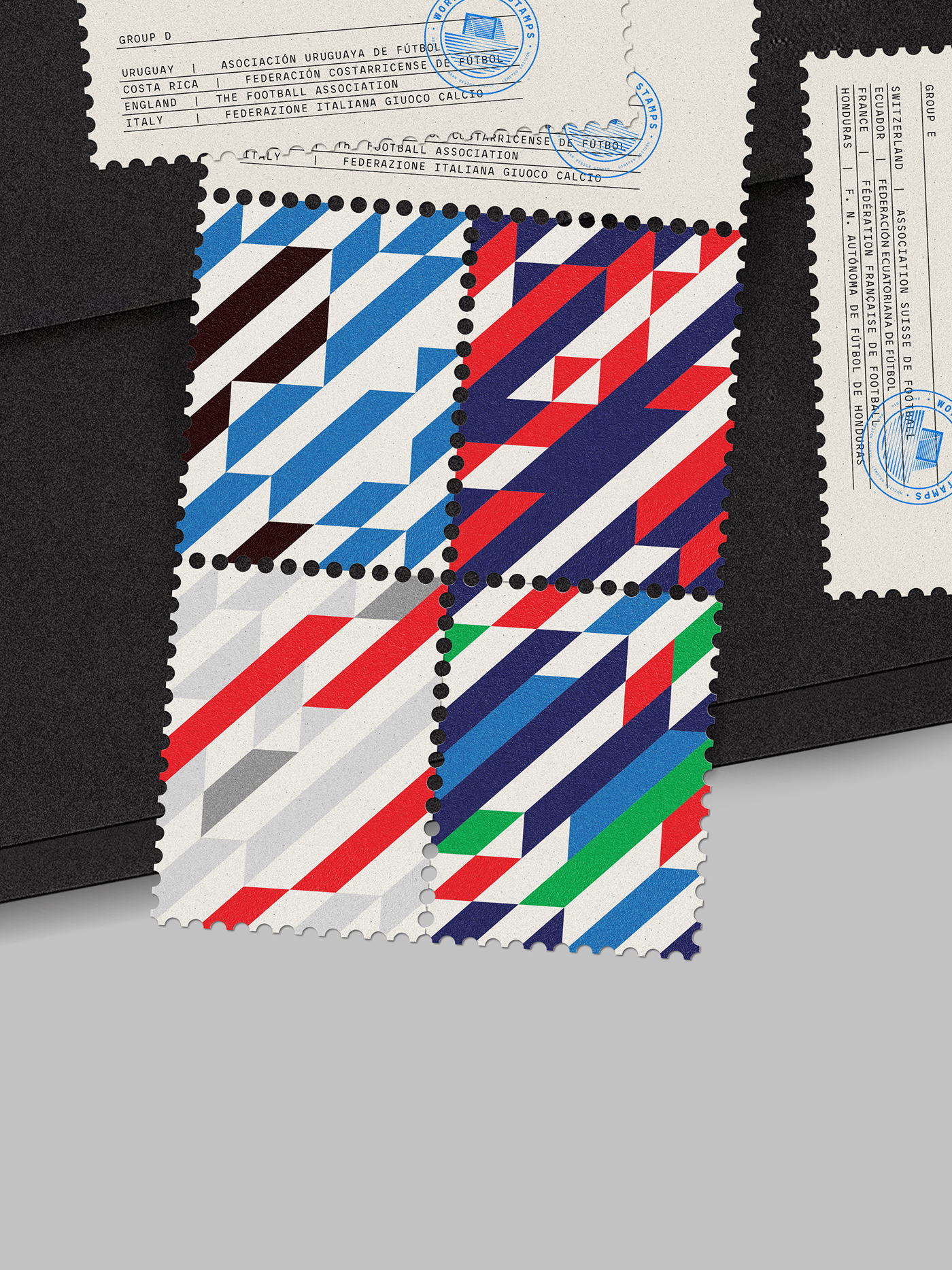
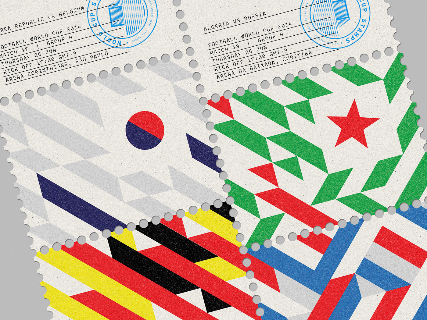
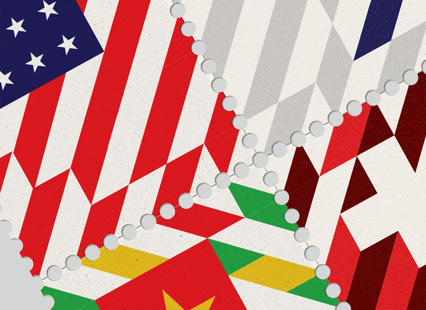
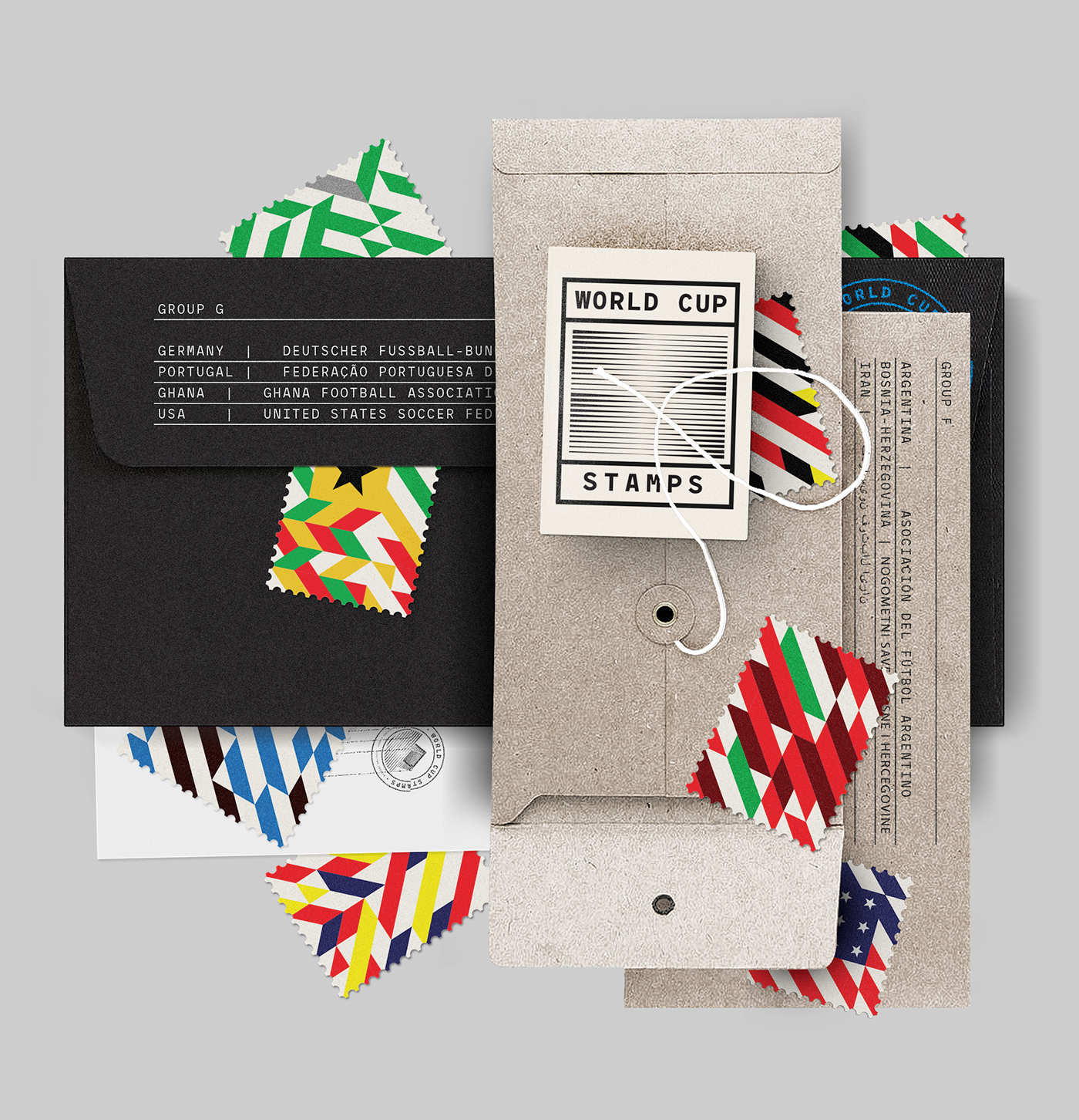
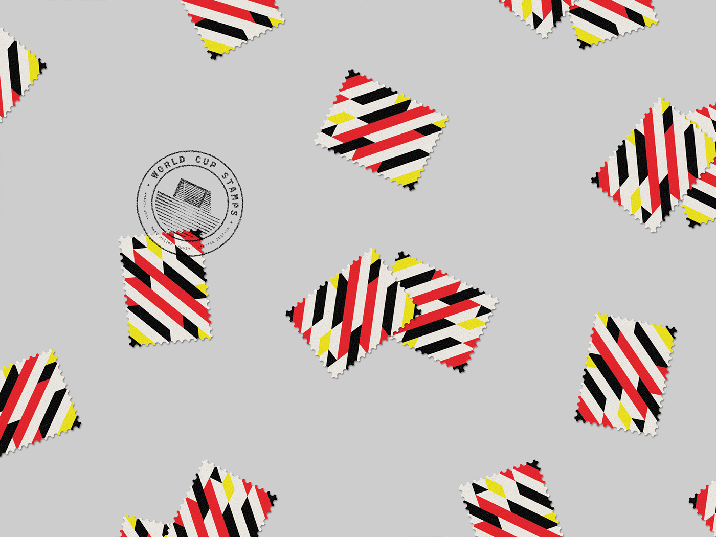
Since we are stamp collectors and true football (soccer) lovers we thought we could combine these two on a project. This gave us and exciting opportunity to invent unique compositions, which we believe can create strong emotional responses. Before the design process began, we needed to agree on what our goals were for the brief and what we were hoping to achieve — a travel across every national team with a matchless personality.
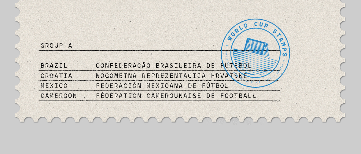
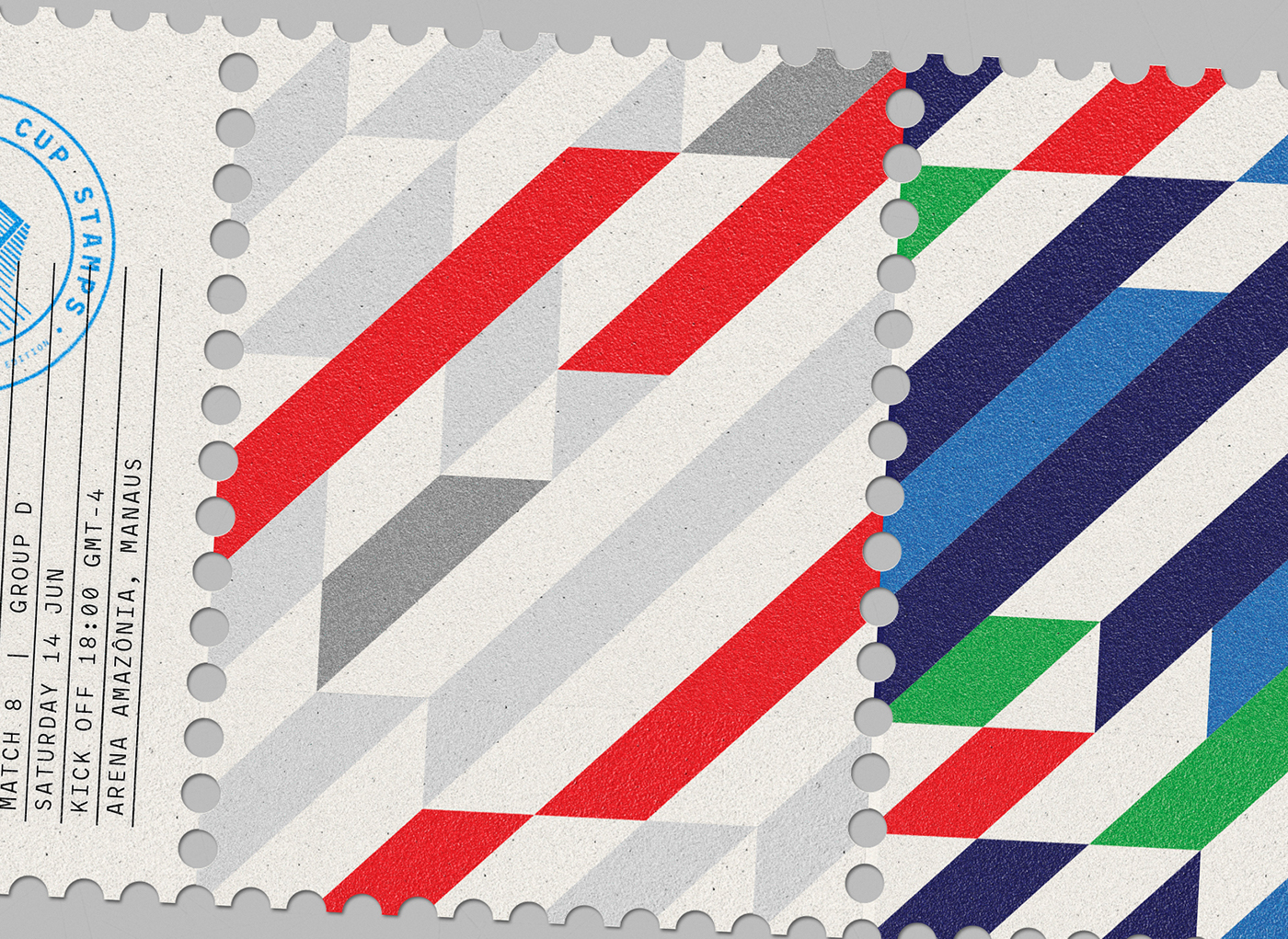
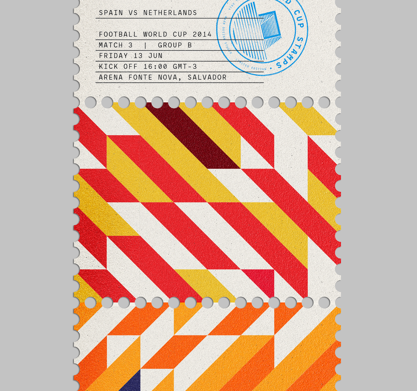
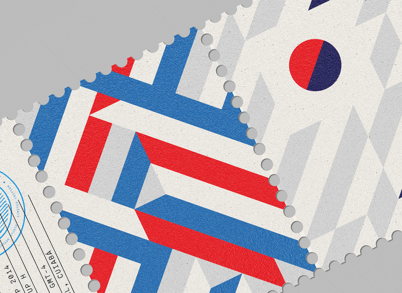
With Motion as the main principle — sense of traveling and sport. It felt natural and the most logical approach creating a diagonal based grid system, it helps with the visual rhythm but it also gave the composition formal context — energy, suggesting a feeling of movement, feeling of activity and it also indicates depth. Since we had to represent 32 nations and color is naturally emotive we choose just 12 colors (including variations) to form a strong and balanced aesthetic, the most obvious advantage is that it gives them a distinguishable unique visual language.
Emphasis is placed on a consistent layout system in order to create eye-catching and representative geometric graphic composition.
_