Brand Strategy & Visual Identity Design
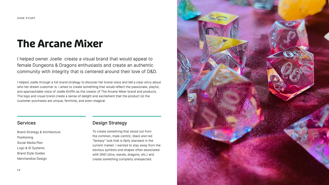
The Arcane Mixer
Creative Strategy
The goal was to create a visual brand that would appeal to female Dungeons & Dragons enthusiasts and create an authentic community with integrity that is centered around their love of all things Dungeons & Dragons.
The strategy behind the visual brand was to create something that stood out from the common, male-centric, black and red "fantasy" look that is fairly standard in the current market. I wanted to stay away from the obvious symbols and shapes often associated with DND (dice, wands, dragons, etc.) and create something completly unecpected. I aimed to create something that would reflect the passionate, playful, and approachable voice of Joelle Kniffin as the creator of The Arcane Mixer brand and products.
The logo and visual brand create a sense of delight and excitement that the product(s} the customer purchases are unique, feminine, and even magical. The guiding concept for the entire brand is Enchanting Elements''. "Enchanting Elements" refers to the various materials that are used in each set of custom dice, but also the enchanting effect the world of DND has on its players. Even the words themselves are meant to appeal more to the female audience and embody the sentiment I needed to communicate.
When combined with the brand voice and with the business goals in mind, this concept sets the foundation of a visual brand identity that will set The Arcane Mixer apart in the DND space. It is a fresh perspective for geeky females who want a DND brand for them. From the colors to the visual elements, to the fonts; every element was chosen carefully and designed with the concept, goals, and dream client in mind.