carmot therapeutics identity & website
Carmot Therapeutics is doing groundbreaking biotech work in the field of metabolic diseases, but their logo and web presence were dated and didn’t reflect their breakthrough technology. We took inspiration from their name: “carmot,” referring to the elusive active ingredient in the Philosopher’s stone, and considered the key to eternal health, and gave their visual presence some new life.
logo & branding

Our gem not only stands for the precious stone of their name, but the layering within recalls the iterative process of Carmot’s proprietary technology. Our branding guidelines also include a new, cool color palette and modern typography. We also paired geometric textures with soft gradients to give their brand balance and variety.

website
Carmot's new website uses bold, eye-catching color, clean and fresh page layouts, and large images in hero areas. User experience elements like full screen leadership details or a carousel of target molecules provide excitement, and also reward engagement.


Among the unique challenges for this site was translating a complicated series of interactions between the organs of the human body and Carmot’s science. Our solution led to a complex, interactive graphic that shows two separate molecules’ individual actions on each organ.
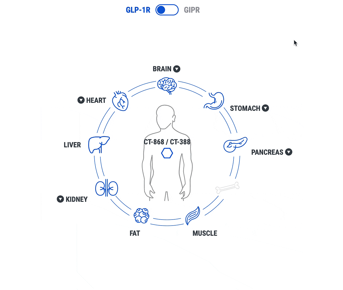
Now, Carmot’s website befits their position as a pioneer in the metabolic disease space in biotech, honoring their groundbreaking science with beautiful visuals.
Read more about the logo process and see more images here: https://micaelabrody.com/carmot-therapeutics/

