
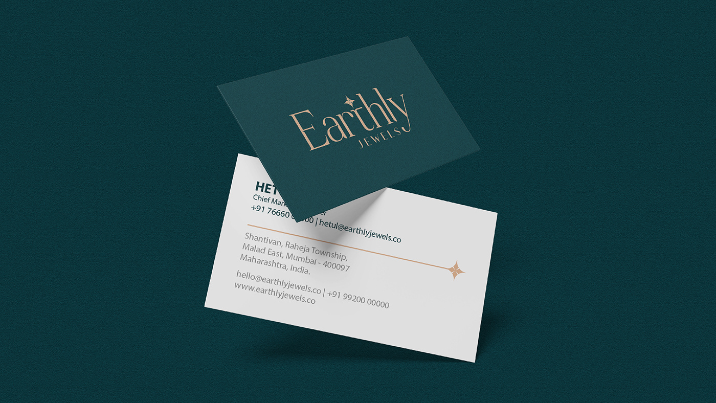
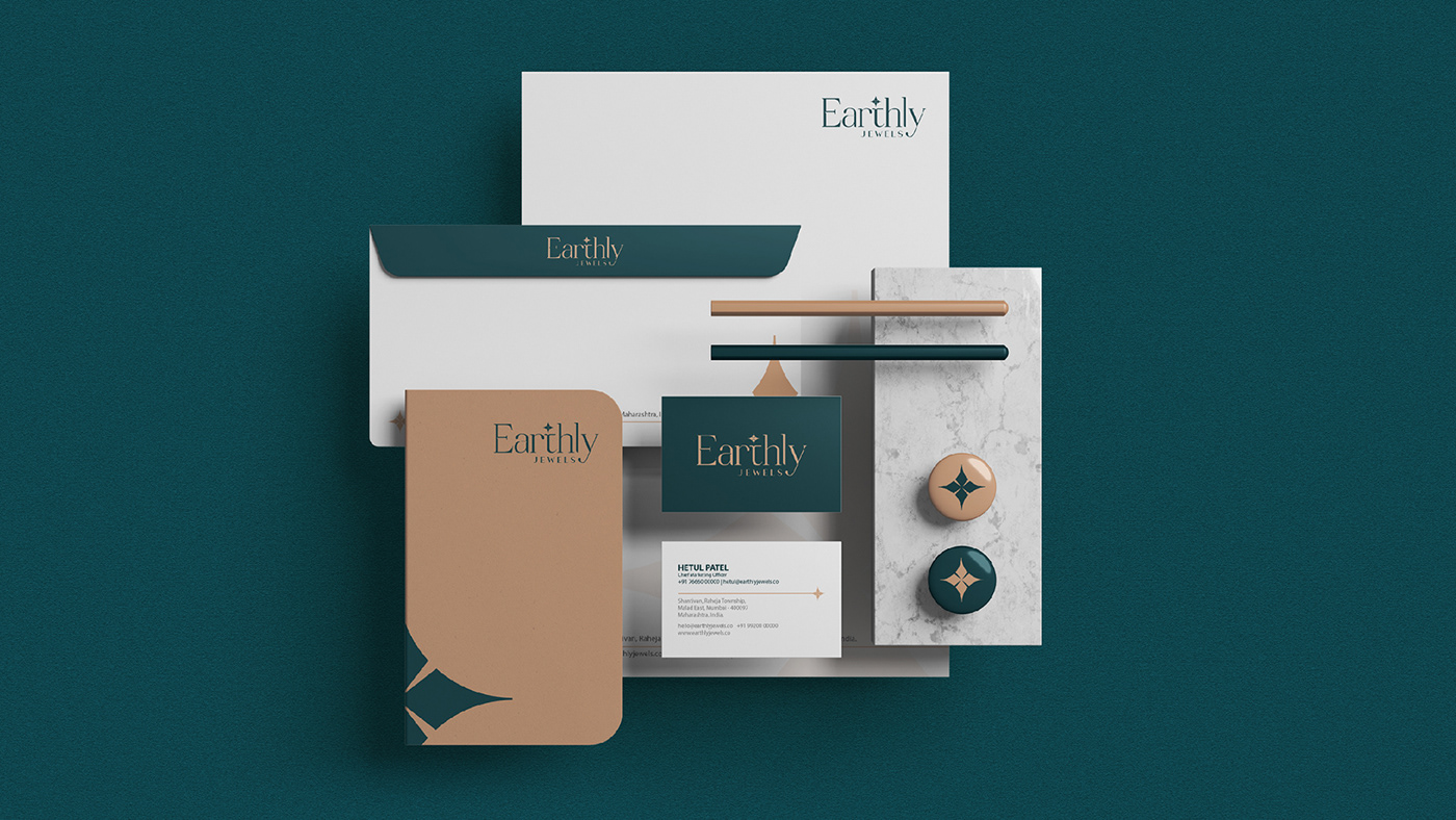
In collaboration with Earthly Jewels, We developed a logo that fulfilled the client's objective of "less is more." The elegant serif typeface exudes sophistication and timelessness, perfectly aligning with the brand's values. The star mark above the letter "T" represents the sparkling sign of diamonds, adding a touch of enchantment to the logo. The resulting design encapsulates the elegance and beauty of Earthly Jewels' diamond jewellery collection, serving as a memorable and timeless representation of the brand.


THANK YOU FOR WATCH
If you like this work, Please don't forget to
APPRECIATE
Are you looking for logo design/brand identity design?
Say Hello! on
Email: hello@bowarrowdesign.com
WhatsApp: (0)9033206409


