


Peekaby Brand Design
client / ordinary magic
services / strategy, identity, product, package & application
Shifting the cognition of the play itself, We proposed a 'trustworthy and positive value' that both a child and parent could appreciate for the brand that will bring a new trend in the child playtoy market. We established the brand value, and from the basis of this, the brand name and slogan, 'Peekaby' and 'Time to explore baby's world, were developed to intuitively deliver positive cognition to the brand and the brand experience. In addition, We designed the brand experience as an effective playtoy brand and parenting supporter by utilizing visual assets related to the brand image.
© 2023 GRAFY DESIGN

Brand Story
Two years after childbirth is a challenging period in parenting. A lot of labor, physical, and psychological resources will be put into this period of maternity and parenting, and those resources contribute to the increase of parenting quality and efficacy of a family. We branded Peekaby with a mission to be a trustworthy and helpful supporter for those who just now gave birth, and are in parenting. Days are full of Joy and surprising plays to children. The brand name, Peekaby, is a mixture of 'Peeka-a-boo' and 'baby', and it presents a brand mission: Add marvelous surprises in mundane days to children who will find the play ordinary by making parents join it with children.
Brand Value & Slogan
As a parenting service platform and play kit which gives aid to growth both of child and parent, Peekaby presents the joy of enjoying the play itself to children and confidence and efficacy in childrearing to a parent. We developed the slogan ' TIME TO EXPLORE CHILDREN'S WORLD' based on the content of the service that encourages parents to take part in raising children. The core brand value of Peekaby represents by three keywords: 'Boundless, 'Reliable, and 'Enjoyable.' We made them construct an invariant and distinctive brand image by expanding them to the omnidirectional brand experience.


Design Principle
Peekaby's design principles are 'Flexible and Minimal, Vivid and Lively, Friendly and Thoughtful.' Those are derived from the established brand's core values: infinity, joy, and trust. They create a consistent brand identity that applies to the visual expression from product design to brand application.
Key Visual
Peekaby, a play kit brand that tailors a suitable toy for each monthly period, needed the brand logo and visual assets that flexibly apply to their products and packages with different designs and colors. To address this, We utilized a circle motif that symbolizes a platform itself or a ball that brings infinite joy to children, for designing a logo symbol, and further expanding it as the core graphic motif of the brand by applying various contents.
Brand Identity Design
We applied a circle motif that reminds a bouncing ball to a letter K and B to express the brand's distinct cheerful mood, and we also rounded the end of a bold Gothic font to form its images which are friendly and easily accessible.

Typeface & Color System
We used Jalnan font as the main font since it has a similar aesthetic layout to the main logo to deliver a stable yet upbeat mood. KoPub Dotum and Rix Modern Gothic are selected and applied as the main text font to deliver a consistent impression to the brand. Also, We designated key colors for each month and applied them to the corresponding products and contents with a consideration of the product that is a tailored play kit for each age group of children.

Graphic Motif & Pattern
As a brand of personalized playkits for every age, Picabee needed a brand logo and visual assets that could be flexibly adapted to products and packaging with different designs and colors. We created a logo symbol using the circle motif, which represents the platform itself and endless fun, and expanded it into a core graphic motif that could be applied to a variety of content.


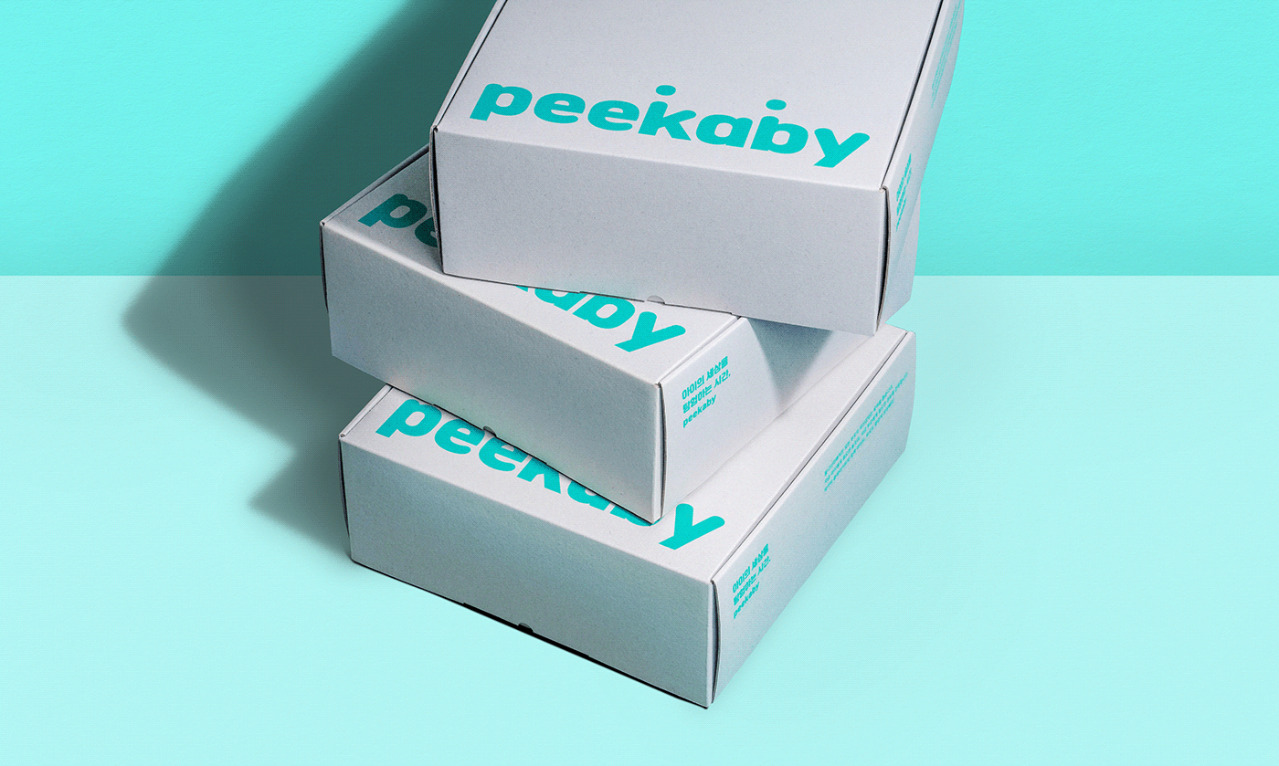
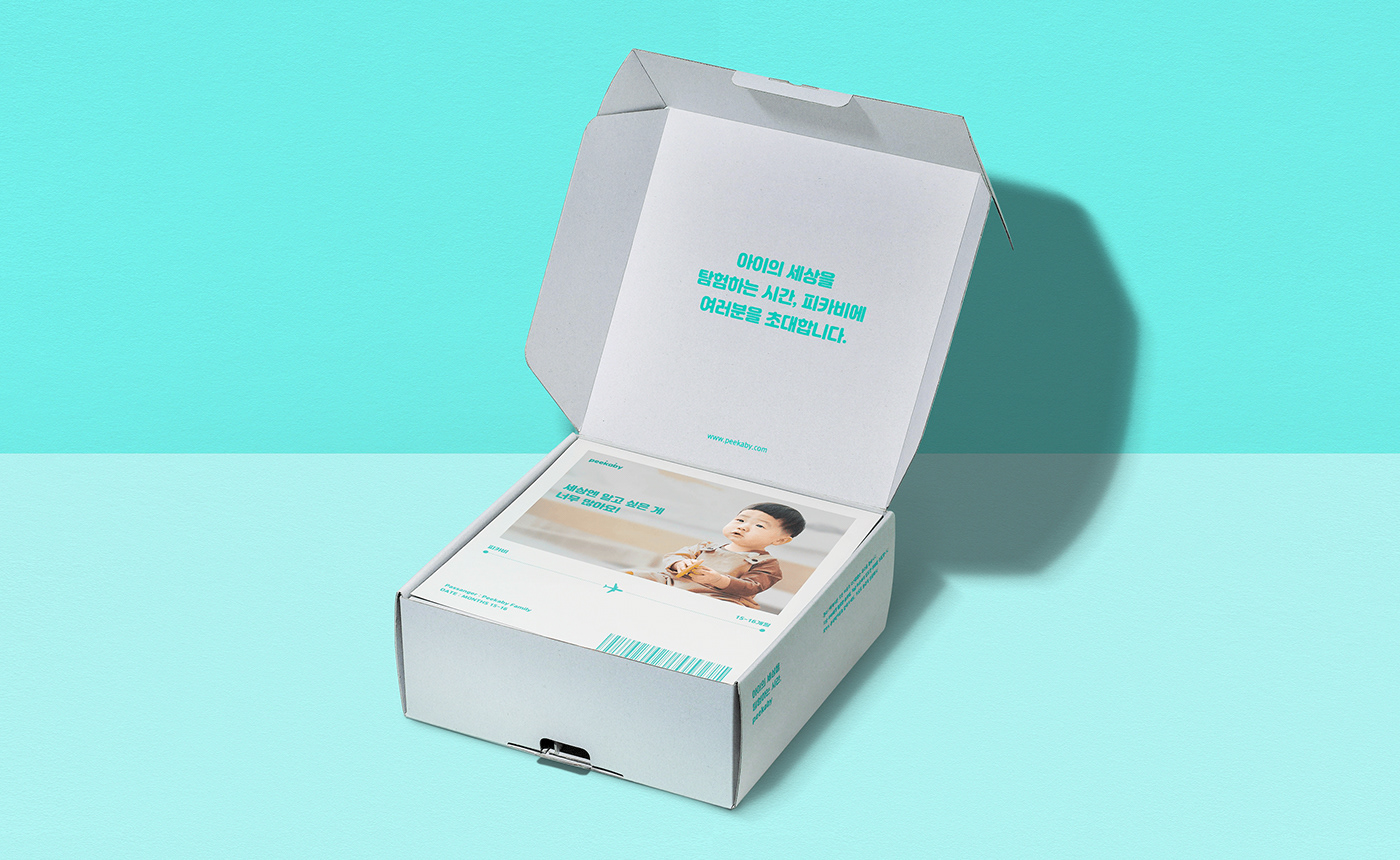
Delivery box Package Design
Peekaby provides joy in unboxing and play toys suited to the children with suitable content curated according to their age. As the subscription service of this is the main content, We wanted to enhance the age group recognition by designing a package box in a simple letter with the Peekaby logo based on an achromatic box to be naturally applied to all the various product lines.


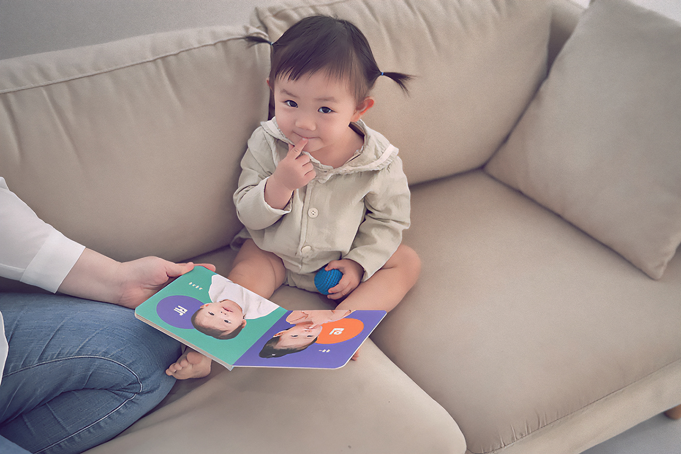
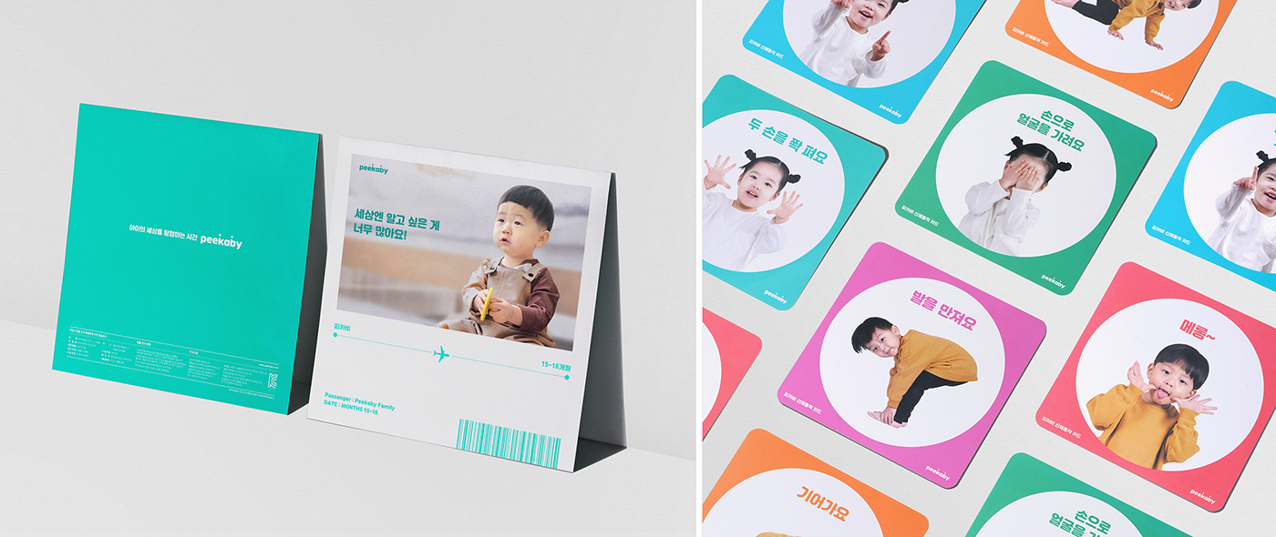
Guide & Welcome Card
Before the user tries the play kit, Peekaby provides a helpful guide to introduce products and teach how to use them. This guide is a leaflet template made to hang on the wall to be accessible anywhere. It provides visual interest to a child as if exploring with an indication on a map, and valuable reading and information to parents.


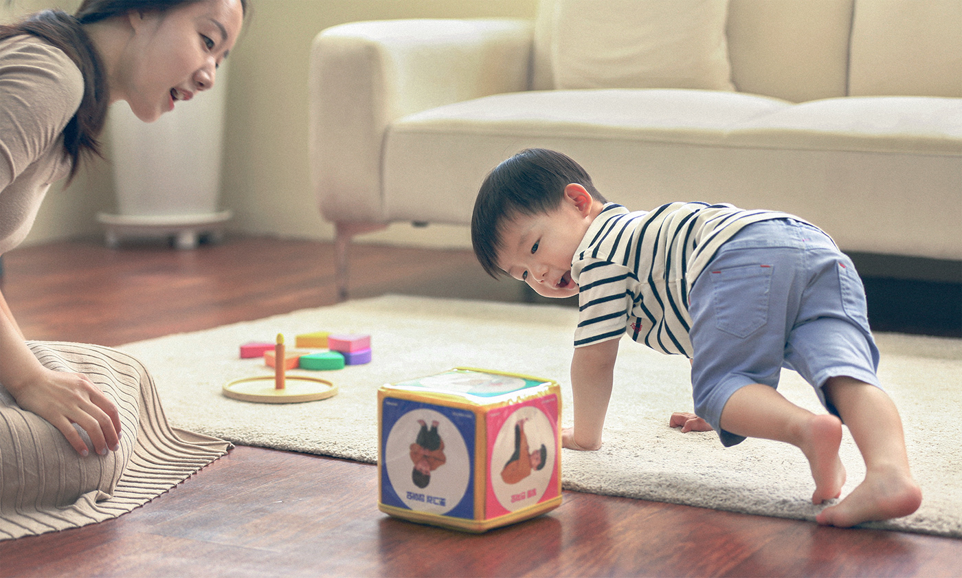

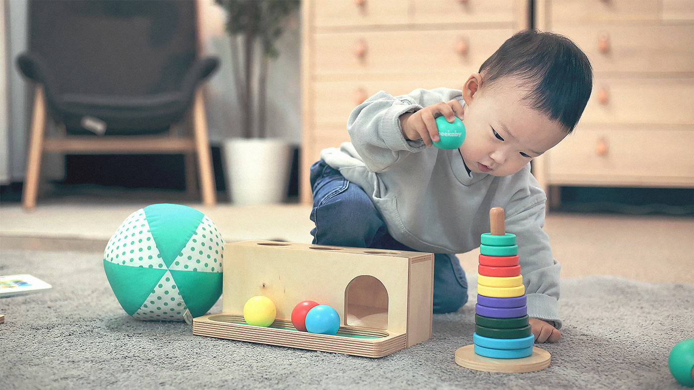
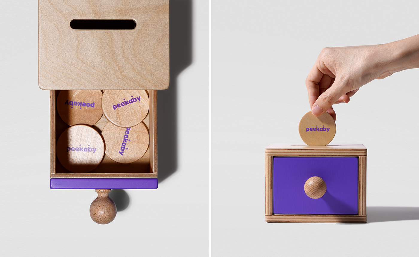
Toy design & Board book
For each stage of growth for infants who are 0 to 24 months old, Peekaby is a brand that helps the jolly growth of both children and parents by providing necessary play kits that thoroughly stimulate children's all parts of physical, emotional, sensational, cognitive, and social domains. For this, we made principles for the brand and product by establishing the brand's systemic structure with key color applications to each month's play kits and enhancing safety and durability by using natural wood.


© 2023 GRAFY DESIGN
GRAFYDESIGN B/D 2F-3F, 350, Dongil-ro, Gwangjin-gu, Seoul, Republic of Korea
+82 70 8633 7222
info@grafydesign.com
-
More Project
Instagram
@grafydesign


