Hawkleap is a cloud-based platform that was designed specifically for the aviation industry. It provides an all-in-one solution for airlines, allowing them to manage all aspects of their operations from a single location. This includes everything from flight scheduling and crew management to maintenance and ground operations.
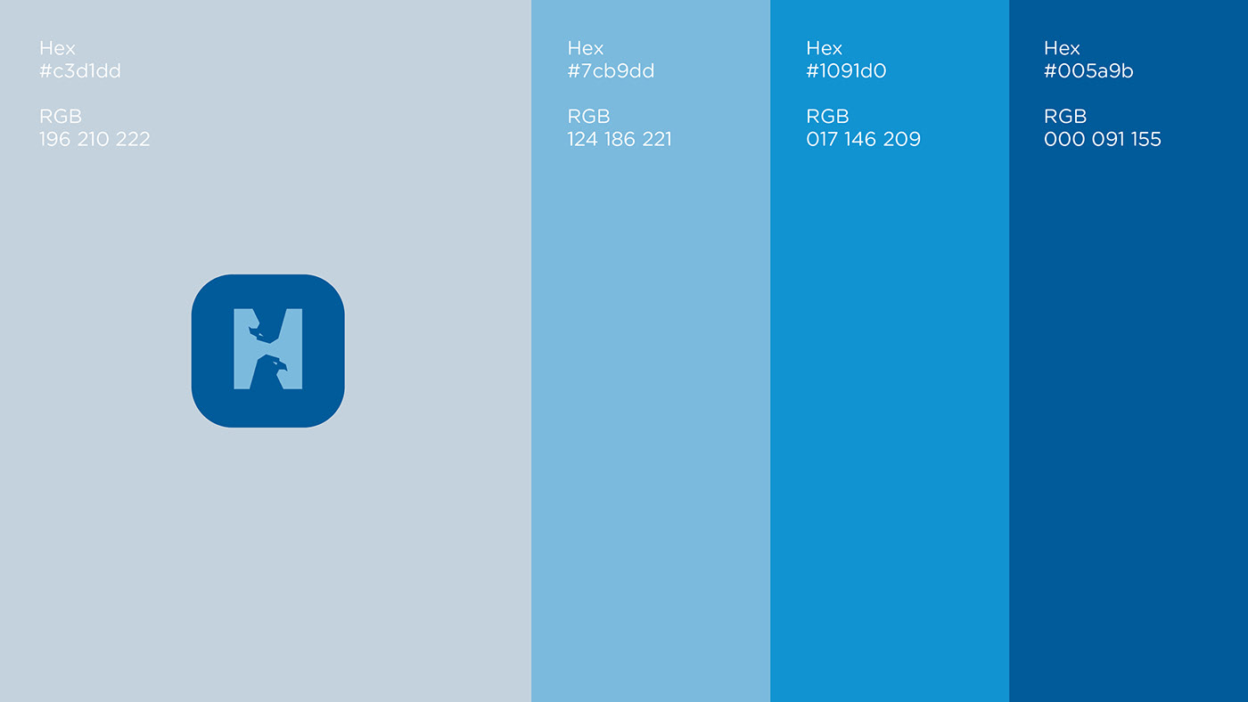
The hawk in the logo not only represents the company name, but also serves as a powerful symbol of speed, agility, and precision - characteristics that are essential in the aviation industry. Through its innovative platform and intuitive design, Hawkleap showcases its unwavering commitment to excellence, efficiency, and customer satisfaction. With its exceptional services and unparalleled expertise, Hawkleap stands out as a leader in the aviation industry and a trusted partner for airlines seeking to optimize their operations for success. The typography used in the logo is bold and modern, with a sans-serif font that is easy to read and highly legible. The use of all-caps lends an air of authority and confidence to the brand. The color palette used in the logo is primarily blue, with a pop of shades for contrast. Blue is a common color in the aviation industry, representing trust, reliability, and professionalism.