Clients
Capture Photo Festival
Shumka Centre for Creative Entrepreneurship
Audain Faculty of Art
Emily Carr University of Art + Design
Shumka Centre for Creative Entrepreneurship
Audain Faculty of Art
Emily Carr University of Art + Design
What can a photograph reveal?
Stranger Than Fiction is the end product of Capture x Emily Carr, a year-long partnership between Audain Faculty of Art, Shumka Centre for Creative Entrepreneurship, and Capture Photo Festival. Work in this exhibition was created during a Photography course in Fall of 2021 taught by Birthe Piontek. Participating photography students received mentorship from Emmy Lee Wall and other leading industry professionals. Participants also received the opportunity to exhibit the works they produced in a prestigious exhibition during the annual Capture Photography Festival in 2022.


In order to allow the works being exhibited in the show to truly shine, I chose to pursue the crystal-goblet approach to the visual identity. An uncomplicated serif typeface did the heavy lifting, with a minor distortion applied to the main wordmark or major typographic element. This allowed the visual system to retain the elements of subjectivity, malleability, and time-specificity referred to in the exhibition statement.
Final deliverables include:
General exhibition poster
Digital exhibition catalog
Typographic vinyl decals
Poster of exhibition floor plan
Dynamic wayfinding poster
Social media graphics
Digital exhibition catalog
Typographic vinyl decals
Poster of exhibition floor plan
Dynamic wayfinding poster
Social media graphics
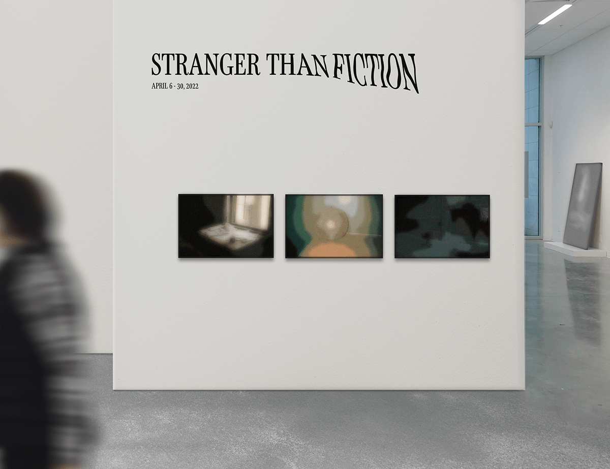
The installed vinyl decal of the primary wordmark for the Stranger Than Fiction exhibition.


More of the materials for the exhibition were installed, as shown in these images.

Left to right: Digital exhibition catalog, artist statement, exhibition statement, and social media graphics.
Constrained by an incredibly small space and a large number of pieces, the curators chose to forego tags for each work with information about the artist and work. In place of this, I created an easily accessible digital exhibition catalog to be used on-site for the duration of the exhibition.
The result is an interactive pdf hosted online through InDesign’s Publish Online feature. This allowed exhibitiongoers to access the document without downloading any additional apps or documents. This method also allowed for a single URL to be used for the duration of the visual development phase, ensuring that existing QR codes would remain constant on printed materials and while making ongoing edits to the document.
The visual system’s main colour palette consists of black and white supplemented by desaturated colours, taken from each image for straightforward navigation. Each of the colours is unique to its artist.

Installed wayfinding posters for the exhibition, directing viewers in a variety of directions. :)
The Emily Carr campus is known to be frustrating and complex to navigate. On top of this, posters are restricted to certain designated areas of the campus hallways and studio spaces. This exhibition was open to the public, which led to the dire need for some form of wayfinding to keep visitors on the right track.
These requirements and budget constraints resulted in a single, dynamic poster. The wayfinding consists of a clear wordmark and a bold set of intersected lines. When put in place, an arrowhead is drawn onto one of the 4 ends, indicating the direction in which the exhibition can be found. This allowed the simple poster to be easily duplicated, removed, and replaced in any position or at any of Emily Carr University’s many entrances and exits. In addition, the poster is able to be tiled on walls and columns for more prominence in busy areas.


The final exhibition poster for "Stranger Than Fiction."