Problem Solving with Design EP 02
In today's episode, we will examine the placement of call-to-action (CTA) buttons in mobile apps, with a focus on a popular app used in Czechia, which will remain unnamed.
Given the app's popularity, one would expect it to have an excellent user experience (UX) and user interface (UI), based on research and user data. However, we have encountered a simple mistake in the placement of its CTA buttons.
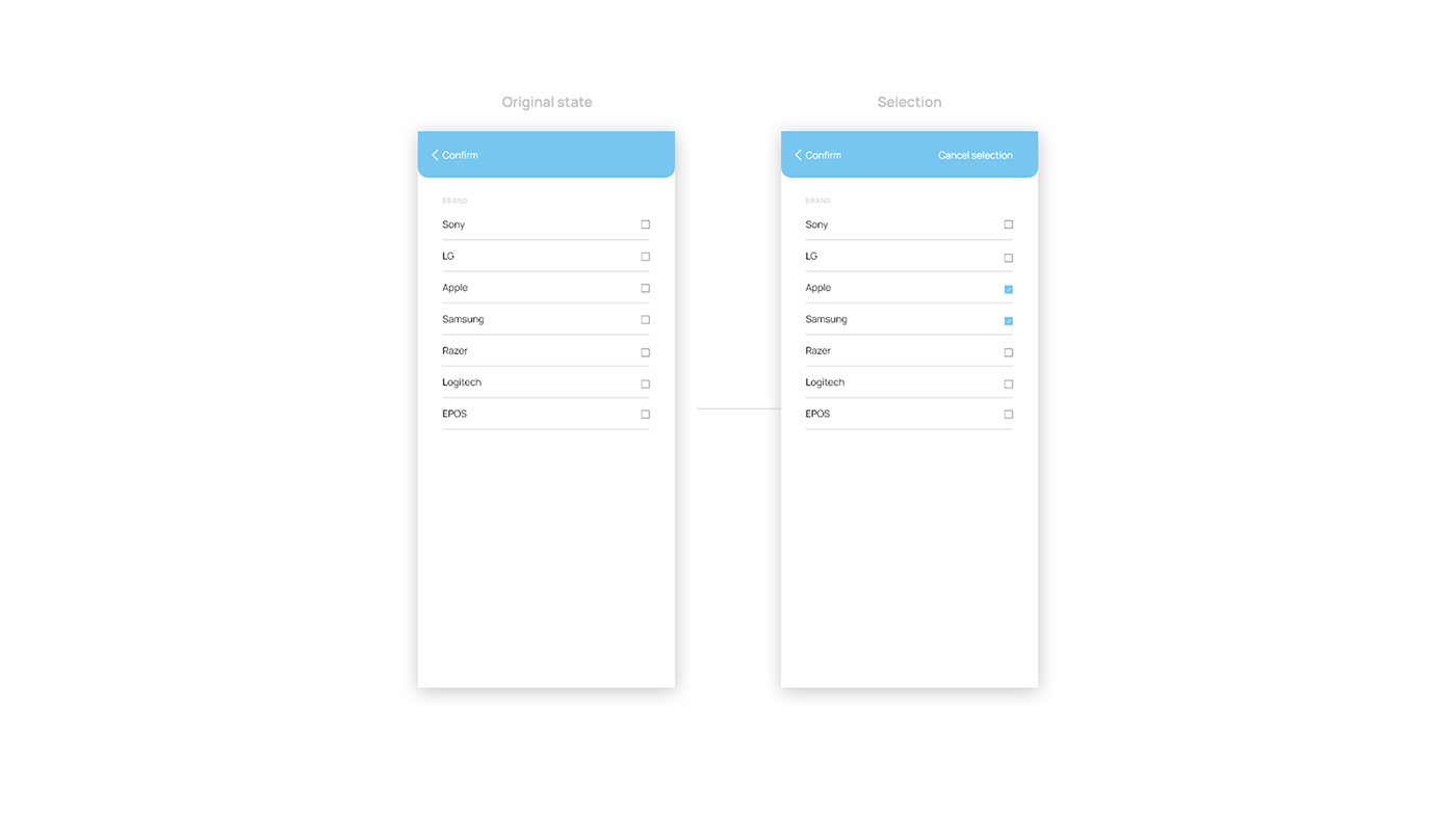
When filtering a product selection, a screen appears that allows the user to choose which brand to display.
However, there are three mistakes we need to address.
Firstly, the text of the CTA buttons needs to be improved. "Confirm" alone is not sufficient. When a user selects some options, a second CTA button appears on the opposite side that says "Cancel selection". While the meaning of the buttons is straightforward, it is strange that one refers to "selection" while the other does not. Therefore, we should unify the language and use "Confirm selection" and "Clear selection", or "Confirm" and "Cancel". I recommend the former, as it is more straightforward.
Secondly, there is inconsistency in the use of icons. Why does "Confirm" have an icon while "Cancel" does not? The solution is simple: we should use icons for both or for neither.
The third and more significant issue is the placement of the buttons. If we proceed to the next screen, we can see where our thumbs reach on our screens. Regardless of whether we are left or right-handed, one of the CTA buttons is always in the red zone, which is uncomfortable to reach.

The solution is straightforward. First, we should add two separate buttons at the bottom of the screen, with fixed positioning. I have also made some color coding enhancements to help users understand the buttons' functions better. Our brains automatically associate the color red with canceling, while green usually means confirm, so we should use this to our advantage. This is one bonus step towards improving the UI.
I have also used two simple icons - a cross and a checkmark - to make the buttons easier to process quickly. I have retained the "Go back" button in the left corner for users who accidentally land on this page and do not want to select a brand. This button is not as crucial as the other buttons and is therefore less affected by placement issues.
Finally, to prevent users from clicking on the buttons before making a selection, I recommend "turning off" the buttons. This can be done by lowering the opacity of the entire element to around 20-80%, depending on the colors you're using. It needs to be clear that the button is not clickable until the user selects some options. Once a selection is made, the buttons can be activated by changing the opacity back to 100%.
I have also illustrated how the buttons would look if there were more options that cover more than 100 VH of our screens. This can be easily solved by putting a gradient behind the buttons and in front of the options, that creates a soft fade out. This is intuitive and easy to implement.

That concludes today's episode. I hope you found it informative.
Vojtěch from Uneven.cz
DIGITAL DESIGN AGENCY I VOJTECH@UNEVEN.CZ I INFO@UNEVEN.CZ

